8 Digital Public Health Surveillance
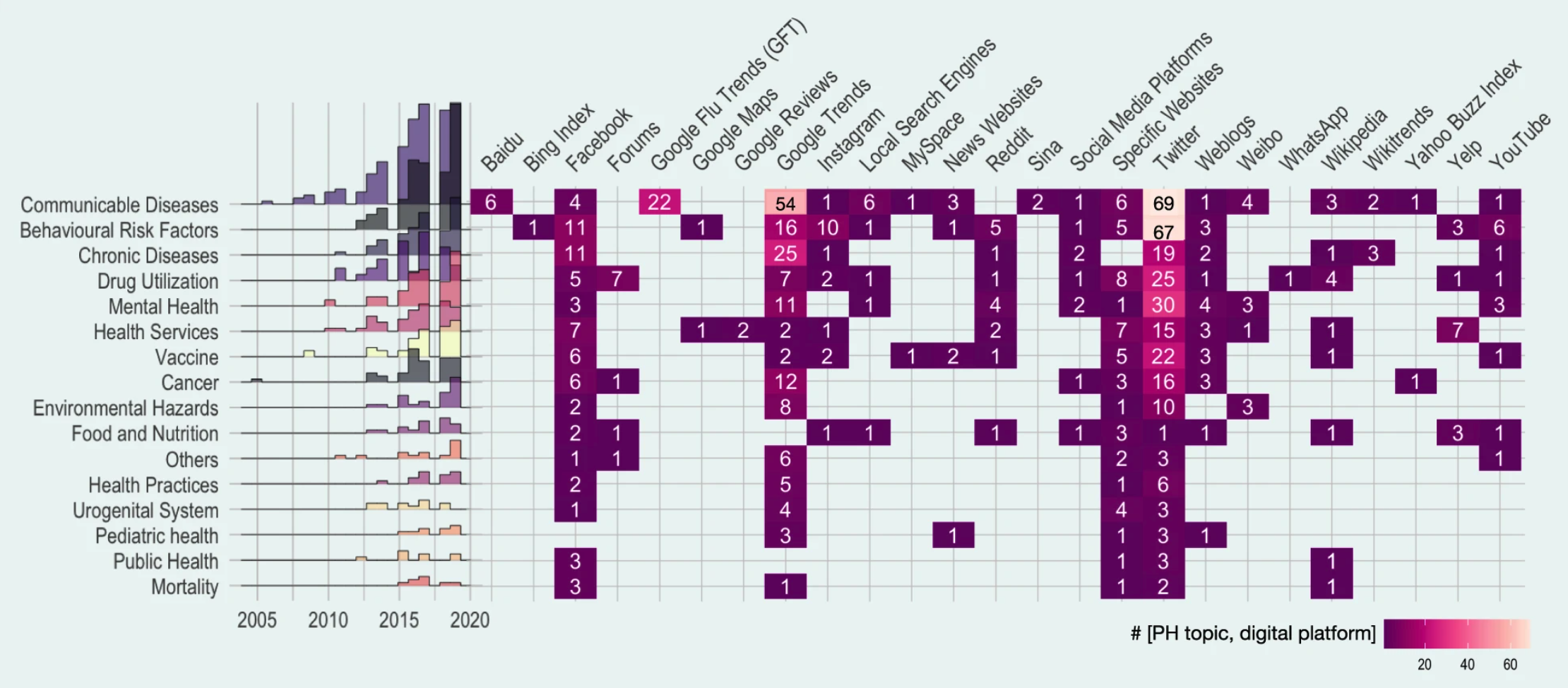
In the first chapter, we briefly touched on the crucial role of public health surveillance. We looked at some of the different types of surveillance (active vs. passive, population-based vs. sentinels, case-based vs. aggregated, and syndromic vs. laboratory-confirmed). In this chapter, we will explore how mobile devices and digital data sources can substantially expand the means of public health surveillance. Indeed, public health surveillance was among the first prominent use cases of digital epidemiology. A recent systematic scoping review of the field included 755 articles, grouping them into domains such as communicable diseases, behavioral risk factors, chronic diseases, drug utilization, mental health, and many more. Communicable disease was the most common topic (25%). Among communicable diseases, ILI (influenza-like illnesses) was the most common, likely reflecting the field’s historical roots, as we’ll see below. Nevertheless, the diversity of areas investigating digital public health surveillance approaches is staggering, as is the variety of data sources (Figure 8.1). Note that the review focused on “Internet-based sources” only, and did not take into account approaches that use device data, such as location data from mobile phones, or digital biomarkers from wearable sensors. We’ll cover these further below.
It’s challenging to pin down the earliest efforts for digital public health surveillance, but two of the first services to utilize the Internet that still remain in use today are ProMED1, and GPHIN, both founded in 1994 and 1997, respectively. ProMED (Program for Monitoring Emerging Diseases) gathers information on emerging and re-emerging disease outbreaks from across the world, and makes them accessible to anyone, most commonly through the use of email via its ProMED-mail subscription list. ProMED is widely considered the most extensive publicly available disease outbreak system in the world, and is known for its speed, as demonstrated once again during the COVID-19 pandemic. Its message from December 30, 2019, titled “UNDIAGNOSED PNEUMONIA - CHINA (HUBEI): REQUEST FOR INFORMATION”, is generally regarded as the first public alert of the outbreak at the root of the COVID-19 pandemic2. Importantly, however, the message notes that “there have been numerous tweets about this as yet undiagnosed outbreak”, indicating that social media was likely the earliest source of information. GPHIN (Global Public Health Intelligence Network) collects information from various online sources, which is then processed for epidemiological decision-making. The system has evolved substantially over time (Carter, Stojanovic, and Bruijn 2018), and has been credited for early detections such as the 2009 H1N1 influenza A outbreak that rapidly developed into a pandemic (Brownstein, Freifeld, and Madoff 2009). Over time, as more such systems appeared, the need for automation became more urgent. One of the most well-known systems is HealthMap (Freifeld et al. 2008), which launched in 2006, developing a pipeline to collect and integrate outbreak data from a variety of sources.
In 2009, digital public health surveillance got its first poster child with the public launch of Google Flu Trends. The idea behind it was strikingly simple. When people come down with ILI, they will often search online for information related to their infection. As the dominant search platform by far, Google can access this information in real-time. If it could use this search query data as input for a model that outputs estimated ILI incidence, it would have a substantial time advantage on the reported incidence estimates by public health authorities. The latter are usually generated with sentinel data (see Chapter 1), requiring patients to visit healthcare professionals, collecting the data, and other time-consuming steps. In the accompanying paper “Detecting influenza epidemics using search engine query data” (Ginsberg et al. 2009), the underlying method of fitting a model to ILI-related search queries was developed to improve early disease detection by leveraging the millions of ILI-related searches that Google receives around the world each day. A few years later, Google closed public access to the system, after it had massively overestimated ILI incidence in the 2012-2013 flu season in the US.
The paper marked a turning point for the field, as it was the first time that digital data, generated for a purpose (online search) other than epidemiology or public health, had been used at scale for digital public health surveillance. In the following years, multiple new approaches were proposed, with data sources going beyond search queries, including social media, online forums, news outlets, website access logs, and data from mobile devices, to mention just a few. Until 2019, the dominant sources for digital public health surveillance studies were Twitter, Google Trends, and Facebook (Shakeri Hossein Abad et al. 2021). However, in the same sense that the definition of digital epidemiology can be broader than epidemiology with digital data that was not generated with the primary purpose of doing epidemiology (see Chapter 7), any definition of digital public health surveillance can be broadened to include approaches that are enabled by the tools and data sources of the digital age. This includes crowdsourcing efforts to collect epidemiologically relevant data directly from citizens.
In the following sections, we will look at some of the key data approaches in public digital health surveillance. The goal is to understand the potential of the approaches, their limitations, and possible ways to overcome them in the future.
8.1 Search queries & access logs
As mentioned above, Google Flu Trends (GTF), a digital public health surveillance system based on search queries, represents a key development in the young history of the field. It’s important to note that the researchers at Google were not the first to think about the usefulness of search query data for ILI surveillance. A 2006 paper (Eysenbach 2006) developed the same idea, but because independent researchers didn’t have access to Google’s search volume data at the time, he had to resort to a simple yet powerful idea: estimating the volume of search queries by geographic region for ILI-relevant terms by leveraging the Google advertising system normally used for commercial advertisers. His results, limited to Canada, demonstrated that clicks on an ad that was shown when people were searching for “flu” or “flu symptoms’’ correlated highly with next-week flu incidence (measured by the number of lab tests and cases in the following week). Interestingly, the correlation between next week’s incidence and click counts on the Google ad was higher than that between next-week flu incidence and ILI reported by sentinel physicians. Similarly, a 2008 study (Polgreen et al. 2008) showed that US search query data from Yahoo! (a once popular search engine) for certain flu-related terms correlated strongly with influenza disease activity.
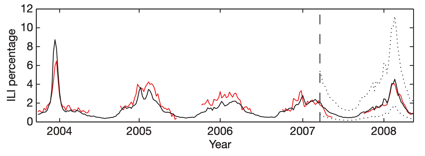
Google Flu Trends built on this work by extending it in three significant ways. First, it operated at a scale previously unheard of, processing hundreds of billions of searches. Second, rather than just running a one-off research study, GFT developed an automated system that it made publicly available for many years. Third, rather than choosing search terms based on domain expertise, GFT developed a method of selecting ILI-related search queries from a list of 50 million candidate queries. A linear model fitted to weekly ILI percentages between 2003 and 2007 for all US surveillance regions resulted in a mean correlation of 0.90 (Figure 8.2). It further showed that its estimates were consistently 1-2 weeks ahead of published reports by the CDC sentinel network.
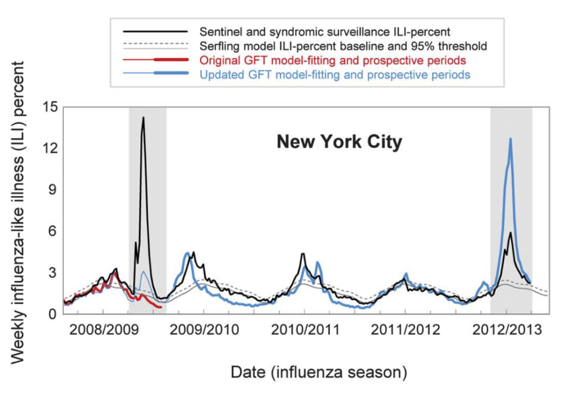
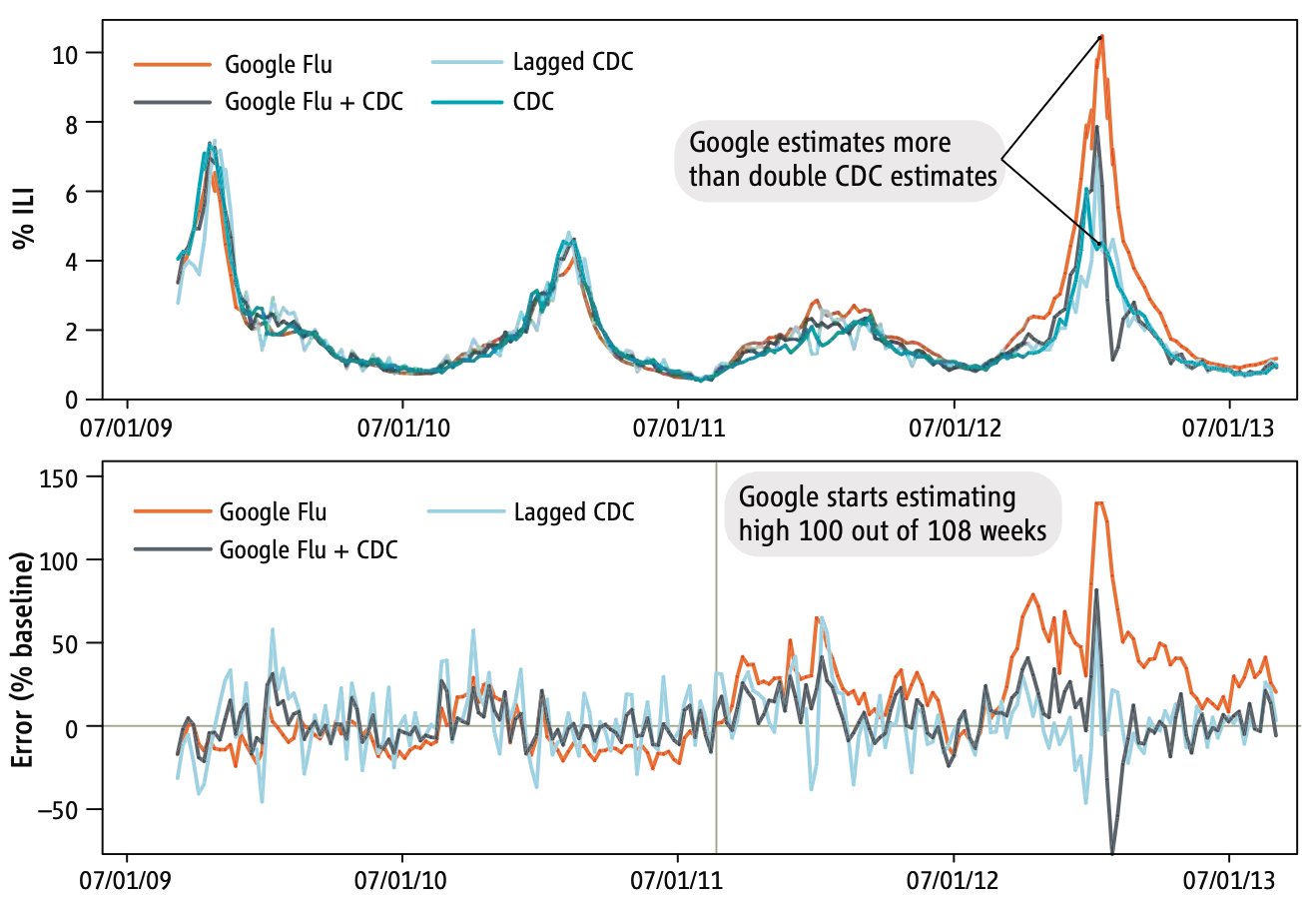
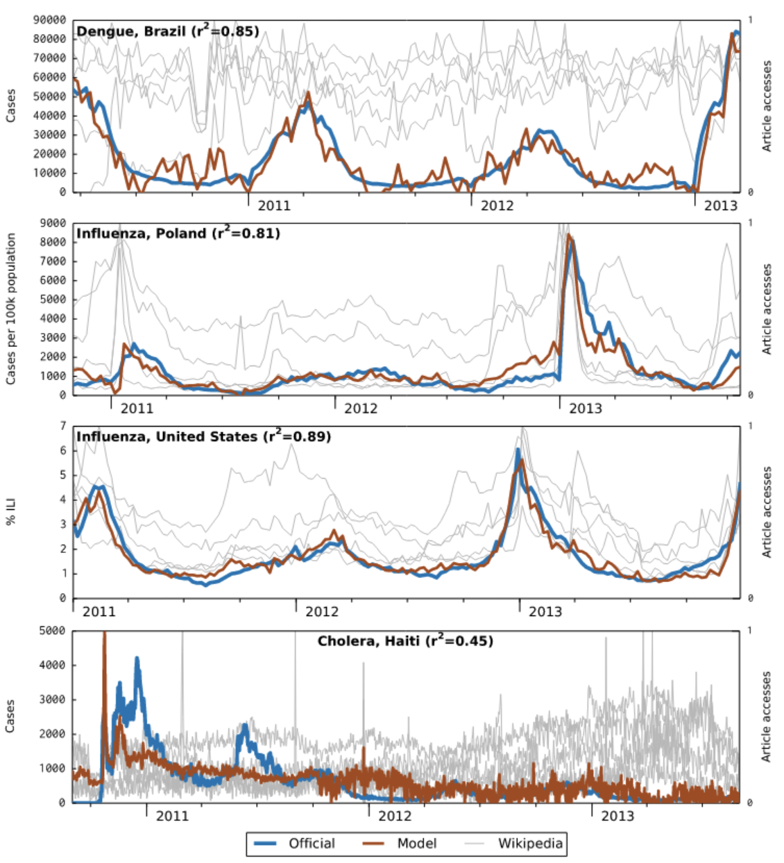
GFT was a welcomed addition to the portfolio of public health surveillance indicators. However, it was not without its problems, as stated in the paper clearly (“Despite strong historical correlations, our system remains susceptible to false alerts caused by a sudden increase in ILI-related queries.”). Nobody could guess that just a few weeks after the publication of the paper, the system would undergo its first stress test with the emergence of pandemic influenza A H1N1 in the spring of 2009. Post-pandemic analyses have shown that the model did not produce good estimates (r = 0.29) in the summer of 2009, and some weeks in the spring have to be excluded from search query analyses due to the enormous media attention during those weeks (Cook et al. 2011). Any system can be forgiven to crack under such a severe stress test of a highly unusual event right after its launch, and indeed, an updated model produced again very good results (r = 0.95). However, in the 2012/2013 US flu season, GFT produced estimates that were at times double the size of the estimates by the health authorities (Olson et al. 2013), as shown in Figure 8.3 and Figure 8.4.
Several factors likely contributed to these outcomes. First, the search terms that made it into the original GFT model may have shown a strong seasonal pattern, coinciding with flu seasonality. This would explain why the pandemic influenza A(H1N1) wave went undetected by GFT, as it occurred during a time of the year (mid- to late spring) by which seasonal flu has usually all but disappeared. Furthermore, even for search terms closely related to influenza, the query volume would be greatly influenced by public interest, which may be driven by both media coverage and actual flu cases. This could explain the overshooting in 2012/2013, an unusually strong flu season during which media interest in the flu was high. Making conclusive statements about these hypotheses is difficult as the search terms included in GFT models remain unknown. It is also worth noting that the relative search volume may be affected by “blue team” and “read team” issues. The former refers to the fact that the relative search volumes themselves may be affected by the Google search algorithm and its results. The latter refers to malicious attempts to modify search volumes for someone else’s gain. As with the other issues, it is virtually impossible to determine the factors influencing the performance of GFT.
At first, these results look sobering, and one could be tempted to think that digital public health surveillance with search queries is simply not good enough. In 2015, Google closed public access to GFT, limiting access to researchers 3. But we should consider that the GFT predictions were not all that far off most of the time, and that the system was in its early days. Subsequent work has shown that on the one hand, GFT can be improved, and that on the other hand, the official reports are not without problems either. Indeed, ILI reports by the CDC are only partial data, and the complete ILI reports are only published 2-3 weeks later, after most decisions related to influenza incidence have been made. Thus, to make the comparison fair, predictions from any GFT-like model should be contrasted with the ILI estimates available at the time of the comparison, an important factor that retrospective analyses need to take into account. Further, ILI predictions from a corrected GFT model - a random forest regression model with ILI and GFT rates from the previous three weeks as predictors - were at least as accurate as the ILI estimate from the CDC, and very often more accurate, even in atypically large outbreaks such as the 2017/2018 and 2018/2019 outbreaks in the US (Kandula and Shaman 2019). Finally, another way to improve the models is to leverage additional, different data sources, for example from social media. We’ll return to this later in the chapter.
During COVID-19, search queries were shown to be a useful data source for models generating incidence estimates (Lampos et al. 2021). Unlike ILI models, COVID-19 models could not be trained on existing data over many years. Nevertheless, they were sufficiently useful that some public health agencies (e.g. Public Health England) integrated them into the weekly COVID-19 surveillance reports.
A key initial criticism of GFT was that the search query data was not publicly available. While this remains true, Google has in the meanwhile made estimates of search volume for any given query publicly available via Google Trends 4. As Figure 8.1 shows, Google Trends has become an important data source for research on digital public health surveillance. For example, using data from 36 countries, Google Trends was shown to be useful in identifying recurrent seasonal varicella zoster virus (chickenpox) outbreaks, and in forecasting their magnitude and seasonal timing (Bakker et al. 2016). However, only few studies use the data to make forecasts, or even nowcasts (i.e. model predictions of the present state) (Mavragani, Ochoa, and Tsagarakis 2018). A creative alternative to Google search query data has been proposed in the use of publicly accessible Wikipedia access logs. The open encyclopedia Wikipedia now has over 6 million articles in English, and millions in other languages. Pageview statistics are available via an API since 2015 (the Wikimedia REST API5) at the granularity of days, but the data were already available earlier as downloads. A 2014 study (McIver and Brownstein 2014) demonstrated that Wikipedia access logs can be used as an input for a model to estimate ILI activity. The paper used pre-defined terms to select the relevant Wikipedia articles, and was limited to influenza in the US as a use case. Later work in the same year (Generous et al. 2014) extended this work by demonstrating the utility of Wikipedia access logs for multiple diseases in multiple languages, combining pre-defined term selection with a model-based filtering step that reduced the number of relevant articles to 10. Of 14 disease-location combinations, the model worked well in 8 cases, but failed in 6 cases (examples are shown in Figure 8.5).
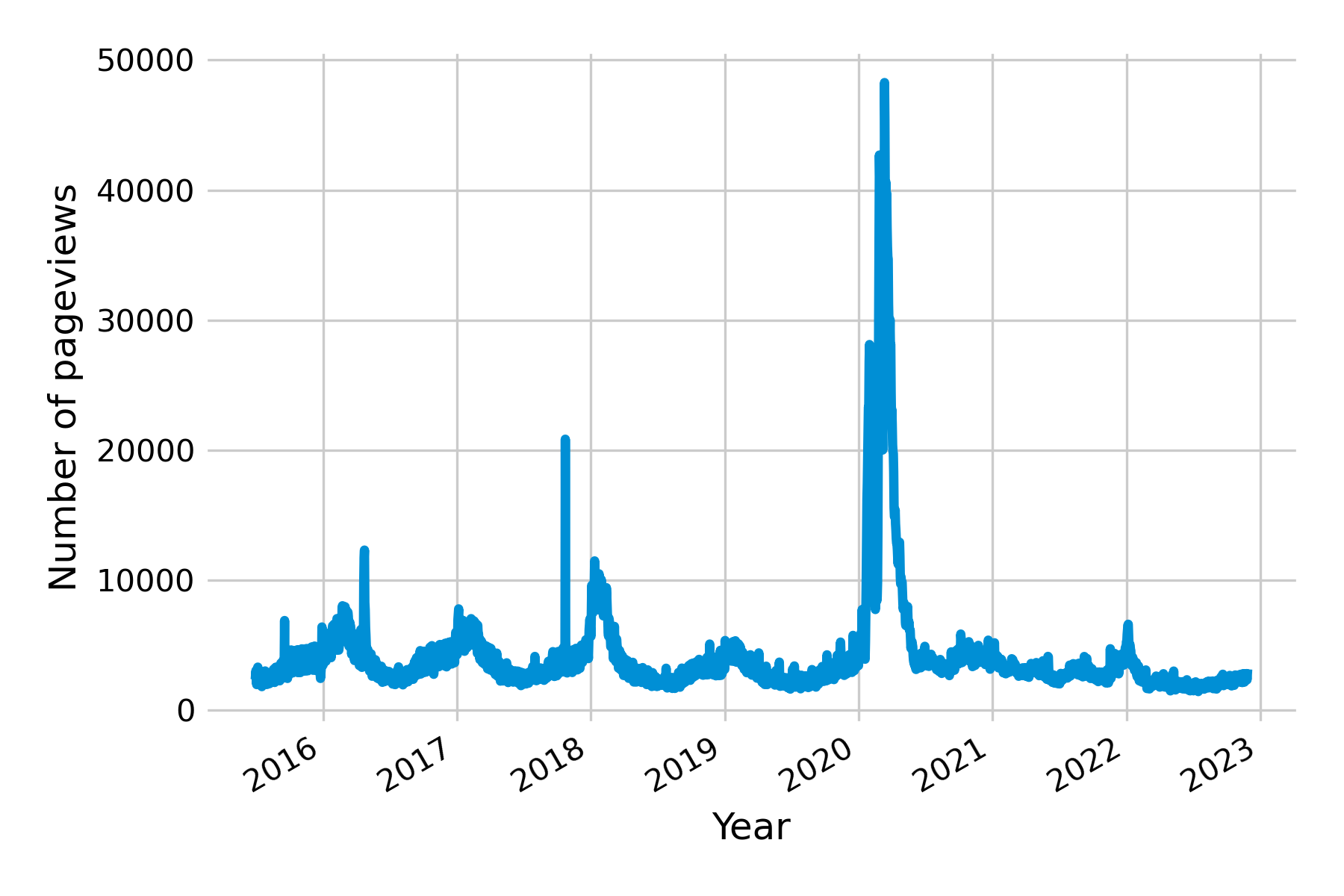
All of the examples discussed so far point to one of the key challenges in digital health surveillance systems based on internet activity: disentangling the online activity caused by actual disease on the ground from the activity caused by media interest. Let’s recall what the original premise of these systems is, namely, that people having a disease will in one way or another consult online resources (e.g. search, Wikipedia, etc.) about that particular disease. However, for there to be a signal in search query and access log data, a number of assumptions must be met. First, the people getting the disease must be able to access these online resources. This may not always be the case, especially in countries where internet access is not yet widely distributed, as was the case, for example, in Haiti after the 2010 earthquake (see bottom panel in Figure 8.5). Partial internet connectivity would not be a problem per se if access to the internet were equally distributed across the population. However, poorer parts of the population are less likely to have internet access, while they are more likely to suffer from many diseases, both infectious (Bhutta et al. 2014) and non-communicable (Niessen et al. 2018). As internet access becomes more widespread across the globe, this may turn out to be a temporary problem. Second, the search patterns may be driven by interest unrelated to disease incidence. This is particularly a problem when the threat of a disease is high, as is the case at the beginning of disease outbreaks. For example, public interest in influenza was at a historic high in early 2020 due to the COVID-19 pandemic (Figure 8.6). Note that this does not necessarily need to translate into an overestimation of influenza, as the first version of GFT demonstrated when it completely missed the influenza A (H1N1) pandemic. Nevertheless, the challenge for any model will be to distinguish noise from signal under all circumstances - including those never seen before.
8.2 Participatory surveillance
Search queries and access logs can help estimate disease activity, but they are ultimately proxies of disease activity measurements through people’s search and browsing behavior. In contrast, participatory surveillance systems approach the issue from the other side, and actively invite the population to participate in the disease surveillance process, by reporting the presence or absence of disease symptoms. This approach offers direct measurements of disease (albeit subjective) instead of proxies, and the potential for meaningful data at a large scale due to increasingly widespread internet access.
Once again, ILI provided the first use case for this type of digital public health surveillance. In 2003, a small team in the Netherlands and the Dutch-speaking part of Belgium launched a system called “De Grote Griepmeting”, which translates to ‘the great flu survey’. Volunteers could share data about themselves, and report ILI symptoms every week. Originally designed to be a source of information for the public about influenza, it quickly became clear that the system was collecting near-real-time data about ILI at the postal code level (as postal codes were part of the survey)(Marquet et al. 2006). Portugal implemented a similar system shortly thereafter, and launched “GripeNet” in 2005 (Noort et al. 2007), while Italy launched “Influweb” in 2007. Other countries followed suit. In 2007, “FluTracking” launched nationwide in Australia (Dalton et al. 2009); Mexico launched its first platform, “Reporta” for participatory surveillance of respiratory disease in 2009; in the US, “Flu Near You” launched in 2011 (Smolinski et al. 2015); and in Brazil, “Dengue na Web” launched in 2011 as the first system to target non-respiratory diseases (Wójcik et al. 2014). Some of these systems have continued operation to the present day, while others have stopped and are not maintained anymore. Some have joined forces to build common platforms, such as the European “Influenzanet” platform (Paolotti et al. 2014), which deployed a common platform in many European countries (Koppeschaar et al. 2017). “Global Flu View” is a further consolidation step, bringing together InfluenzaNet, Flu Near You, and other systems around the globe (Crawley et al. 2019).
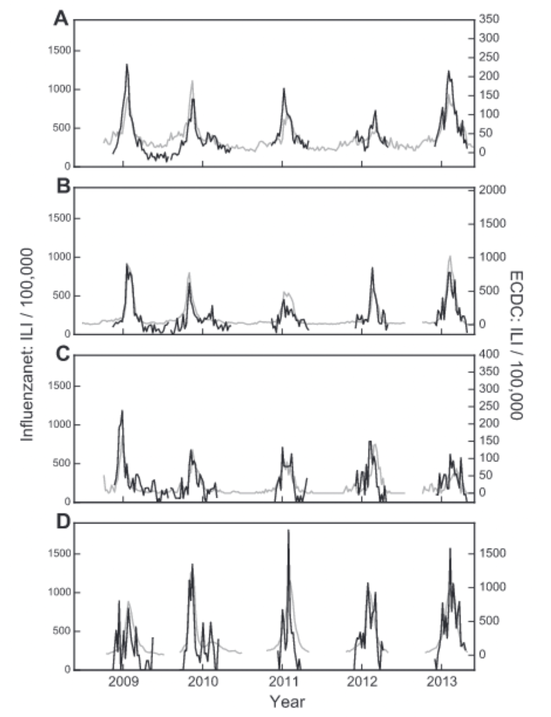
Participatory surveillance systems have been shown to be able to complement conventional, sentinel-based surveillance. In Italy, forecasts of seasonal influenza data could be improved by integrating participatory surveillance data with sentinel data (Perrotta, Tizzoni, and Paolotti 2017), producing national accurate weekly forecasts of ILI activity up to four weeks in advance. In France, data from the participatory surveillance system showed very good agreement with official trends (Guerrisi et al. 2018). Similar results were reported in other countries, and participatory surveillance systems generally show good agreement with official ILI estimates (Noort et al. 2015) (Figure 8.7).
Importantly, participatory surveillance systems don’t face the problems associated with search query systems, where sudden bursts in media interest strongly impact the data. On the contrary, increased media attention may drive more participants to the participatory surveillance platforms. Participatory surveillance systems further enable the systematic collection of data that goes beyond the case definition, such as demographic data, behavior, and other health aspects. Participatory surveillance systems have looked at the association of several factors with ILI risk factors, including household situation, gender, public transportation use, vaccination status, chronic diseases, health behaviors such as smoking, and others. They can generally reproduce well-known risk factors such as living with children, being female (even when corrected for family situation (Guerrisi et al. 2019)), having asthma / diabetes, being unvaccinated, young age, and smoking. At the same time, they also identify interesting but yet-to-be-fully-explored associations such as public transport and living with pets. Some participatory ILI surveillance systems found an association between public transport use and ILI (Guerrisi et al. 2019), while others didn’t (Guerrisi et al. 2016). Data indicating that living with pets was associated with a higher ILI risk warrants further investigation (Guerrisi et al. 2016), and once again points to the power of participatory surveillance systems as generators of interesting hypotheses to explore. Data from a participatory ILI system in the UK also enabled an assessment of how quality of life was affected by ILI, which among other things is important to understand the cost-benefit ratio of control measures (Camacho et al. 2013). Samples collected in participatory systems are often non-representative and biased, for example towards younger people (Perrotta et al. 2017). Correcting for these biases is important, but it should be noted that surveillance from sentinel data has its own biases as well (Souty and Boëlle 2016).
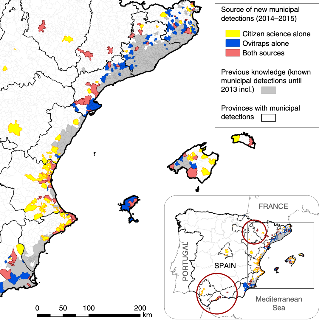
Today, the landscape of participatory surveillance systems is topically and geographically diverse. A recent review identified 60 ongoing participatory surveillance systems (McNeil et al. 2022), not including systems focussing solely on COVID-19. The systems span five continents and the entire spectrum of “One Health”, i.e. human, animal, and plant health. This remarkable diversity reflects the fact that participatory surveillance systems build on the citizen science approach, where the public participates in the data collection effort, and which has been used in a wide range of scientific fields. It is instructive to look at participatory surveillance systems involving disease vectors, such as mosquitos (the most important among all animal vectors of human diseases). The “Mosquito Alert” system, which encourages the public to report sightings of tiger mosquitoes (Aedes albopictus), is a Spanish citizen science system that was shown to be a reliable and scalable tool for tracking tiger mosquitoes. In particular, when comparing around 5000 citizen science reports on tiger mosquito sightings with data from ovitraps monitored from 2014 to 2015, the system was able to provide early warning information and human–mosquito encounter probabilities of a quality that was similar to the conventional surveillance system by ovitraps (Palmer et al. 2017).
Examples like these highlight the broad strengths of participatory surveillance approaches and the diverse health issues that can be addressed with them. They also emphasize a key challenge: evaluating performance against what is currently considered the ground truth. ILI often serves as the experimental benchmark for new digital epidemiology approaches, because ILI incidence is seasonal and widespread, and conventional approaches provide ground truth data for comparing the performance of new methods. However, this argument is sometimes used to criticize early work on ILI surveillance: if there is already reliable ground truth data on ILI, what is the point of these new approaches?
The answer is that no system is perfect. Official disease estimates are typically gathered by experts (such as health experts participating in sentinel systems for ILI), which is why we place a great deal of confidence in them. However, the data can be quite limited. Participatory surveillance systems can expand the scope of ILI surveillance by collecting diverse data from participants. Moreover, participatory surveillance can broaden the scale of surveillance, as demonstrated by Mosquito Alert. Instead of having a mosquito surveillance system limited by geographical range and the number of available ovitraps, anyone with a mobile phone and a camera can voluntarily participate in data collection. On the other hand, the voluntary nature of these systems can make participant retention challenging (Guerrisi et al. 2016).
The digital landscape has changed significantly since the early days of participatory surveillance systems. While initial platforms were web- or even email-based, many systems have since transitioned to mobile phone applications. This shift became particularly visible during the COVID-19 pandemic. In early 2020, the COPE (Coronavirus Pandemic Epidemiology) Consortium repurposed the digital infrastructure of a mobile app (the ZOE app), originally used for personal nutrition studies, to enable self-reports on COVID-19 infections and pandemic-related behaviors (Drew et al. 2020). The COVID Symptom Study app initially asked users for their location, age, and core health risk factors, and then requested daily updates on symptoms, COVID-19 test results, and healthcare visits, among other data. This data collection approach allowed for rapid assessment of the symptoms and symptom combinations that were most predictive of COVID-19. For example, early data quickly demonstrated that anosmia - loss of smell - was a better predictor for COVID-19 than fever alone (Menni et al. 2020). A weighted prediction model based on symptom reports from over 2 million app users showed that this approach captured COVID-19 incidence a few days ahead of conventional surveillance systems.
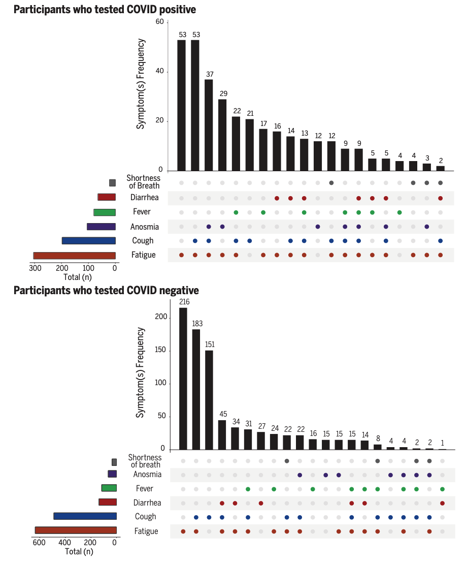
Once again, because participatory surveillance systems can collect a wide range of data, and rapidly change data collection protocols (at least from a technical perspective), they can generate insights into ongoing outbreaks on many different questions with great agility. The COVID Symptom Study app was able to collect data that provided insights into a wide range of outcomes of interest. A study based on data from the app showed that a substantial fraction of COVID-19 cases reported symptoms for much longer than expected from the regular duration of acute illness, providing important insights into the emerging phenomenon of “long COVID”, or post-COVID condition (C. H. Sudre et al. 2021). The data showed that experiencing more than 5 symptoms in the first week of illness was associated with long COVID (OR = 3.53 [95% CI 2.76–4.50]). The setup of data collection via participatory surveillance allowed the study to report these results from the general population earlier than conventional approaches (the initial pre-print was published in October 2020 (C. Sudre et al. 2020)). Most case reports on post-COVID syndrome initially emerged directly from patients on social media platforms, and the first studies published in peer-reviewed journals focused on hospitalized patients (Callard and Perego 2021). Another early study based on data from the app showed that healthcare workers were at least at a threefold increased risk of getting COVID compared to the general population (Nguyen et al. 2020). Later in the pandemic, data from the app were used to compare the side effects of the Pfizer-BioNTech vaccine (BNT162b2) and the Oxford-AstraZeneca vaccine (ChAdOx1 nCoV-19), and to demonstrate that both vaccines reduced infection risk for a time period up to 60 days (Menni et al. 2021). The app was even able to provide data on the effect of COVID-19 on diet patterns (Mazidi et al. 2021).
8.4 Mobile phones
As mentioned earlier, the way we communicate online has changed dramatically over the years. While most communication and information seeking on the web initially happened on a personal computer, today, mobile phones are the dominant devices through which we access the internet. Since around 2016, most website traffic has come from mobile devices12. This change is significant because many of these phones are smartphones, meaning they have substantial computation and storage power, enabling the emergence of a rich ecosystem of mobile applications, or smartphone apps. Besides the ability to connect to websites, smartphones can collect and generate vastly richer data than text data, including, but not limited to, image and video data, network data, location and movement data, and other data enabled by a growing array of smartphone sensors.
We’ve already mentioned two examples of leveraging smartphone capabilities: digital contact tracing, and mobile participatory surveillance. Let’s now look at some examples that leverage the smartphone’s capability of determining its geographic location. Almost all smartphones can track the user’s location with GPS or cell tower location, and these data can be helpful for epidemiological purposes. We’ve seen in the chapter on spatial models that long-distance connections can have an enormous impact on disease dynamics. For this reason, movement patterns have long been highly relevant in understanding epidemics. Still, until the rise of smartphones, we had to rely on official data sources such as air travel patterns (Balcan et al. 2009). Other creative approaches to infer movement data included the location tracking of dollar bills via crowdsourcing websites “Where’s George?” (Brockmann, Hufnagel, and Geisel 2006). However, obtaining movement patterns from mobile phones has two critical advantages over previous approaches. First, mobile phones are now widespread around the globe, which means that movement data are available even in low-income countries. Second, because mobile phones are with the person almost constantly, location data from the phones can capture all human movement, from the very local scale to global air travel.
A study published in 2011 looked at population displacement in Haiti after the 2010 earthquake, using location data of SIM cards, determined by the mobile phone towers through which calls were made (Bengtsson et al. 2011). The data from 2.8 million SIM cards was able to produce human movement reports in the early days of a Cholera outbreak, which were later used to predict the spatial spread of Cholera (Bengtsson et al. 2015). In 2012, a study using mobile phone data in Kenya showed that geographic parasite sources and sinks could be identified by combining the travel patterns of nearly 15 million people with malaria prevalence maps (Wesolowski et al. 2012). Similarly, using location data of nearly 40 million SIM cards in Pakistan, a 2015 study showed that an epidemiological model based on movement estimates from mobile phones predicted the timing and geographic spread of Dengue epidemics in the country (Wesolowski et al. 2015). Indeed, one of the most thorough assessments of the spatial distribution of the vector transmitting Dengue and other infectious diseases (Aedes aegypti and Aedes albopictus) uses location data from mobile phone calls and texts, as well as GPS location data from Baidu, a Chinese consumer technology company (Kraemer et al. 2019). Mobile phone data provides not only high spatial resolution, but also high temporal resolution, which can be important for disease dynamics. For example, mobile phone data revealed the epidemiological importance of mass gatherings and the resulting overcrowding during the 2005 Cholera outbreak in Senegal (Finger et al. 2016). More recently, mobile location data highlighted the effect of human movement around local holidays on the 2017 Chikungunya outbreak in Dhaka, Bangladesh (Mahmud et al. 2021).
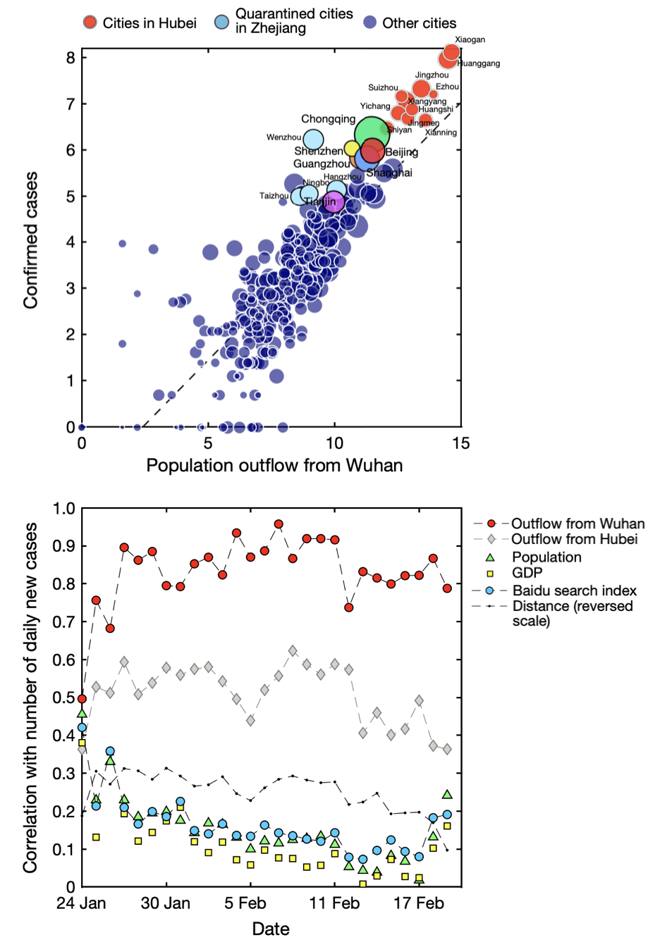
These and many other studies highlighted that mobile phones are a useful data source for epidemiology (Lai et al. 2019). This shouldn’t surprise us: when people move, they take their pathogens with them. The COVID-19 pandemic provided once again a powerful demonstration of the utility of this approach. Early in the pandemic, location data from mobile phones in China provided insights into movement patterns before the Chinese lockdown of Wuhan, and its effect on the spread of SARS-CoV-2 (Kraemer et al. 2020). Figure 8.11 shows the strong correlation between population outflow from Wuhan, where the virus first emerged, and the confirmed cases in the different cities. The figure also shows that population movement was the best predictor of new cases, compared to the distance from Wuhan, GDP, population size, and Baidu searches.
Location data obtained from Tencent, another sizeable Chinese consumer technology company, was used in a mathematical model of disease dynamics to suggest that substantial undocumented infections were driving the early COVID-19 outbreak in China (Li et al. 2020). Similar data from companies providing location-based services (LBS) and mobile phone carriers were used to investigate the effect of non-pharmaceutical interventions during the first few weeks of the outbreak in China (Tian et al. 2020). In the US, location data from 98 million people - obtained from SafeGraph, a company that aggregates location data from mobile applications - was integrated into an SEIR model, identifying specific points of interest as potential superspreader locations (Chang et al. 2021). In Italy, data of anonymously shared positions of about 170,000 de-identified smartphone users before and during the first COVID-19 wave was made available (Pepe et al. 2020). Among other use cases, the data were used to assess the impact of containment measures on epidemic dynamics (Gatto et al. 2020). In the US state of Massachusetts, mobility data enabled highly accurate hospital-specific COVID-19 admission forecasts 21 days ahead (Klein et al. 2023).
The value of data from mobile phones in understanding and controlling the COVID-19 pandemic has long been recognized, along with its challenges (Oliver et al. 2020; Buckee et al. 2020). From digital contact tracing to individual and public health surveillance to informing epidemiological models, mobile phones have demonstrated a breadth of utility that we are only beginning to understand (Pandit et al. 2022).
8.5 Wearable sensors
Wearable devices such as the Apple Watch or Fitbit have grown in popularity since launching a few years ago. They are highly relevant to digital epidemiology because they are marketed explicitly as health devices based on an increasing array of built-in sensors. Fitbit, which clearly emphasizes health in its name, touts itself as an activity tracker. Apple Watch also positions itself primarily as a health device. As I write this in late 2022, five of the six sentences used in the product’s marketing summary refer to health (women’s health, crash detection, sleep, workouts, and the future of health). While these devices are currently nowhere near as ubiquitous as smartphones, their adoption is increasing rapidly. A recent US study found that more than 20% of respondents own a fitness tracker or smartwatch, and a majority would like to get one (Holko et al. 2022). Their importance for digital epidemiology will thus increase substantially in the future.
Already before the COVID-19 pandemic, data from wearable devices showed promise in improving ILI estimates. Sleep and resting heart rate data from Fitbit devices in the US improved estimates of state-level ILI activity (Radin et al. 2020), showing the potential of wearables for digital public health surveillance. A cohort study showed that data from wearable devices could be used to detect pre-symptomatic COVID-19 (Mishra et al. 2020). The DETECT study (Digital Engagement and Tracking for Early Control and Treatment), which collected participants’ sensor data along with health records, self-reported symptoms, and other data revealed that while neither resting heart rate, sleep, or activity alone were better than self-reported symptoms at discriminating between presence or absence of COVID-19, combining all data outperformed all other approaches (Quer et al. 2021). In the same vein, smartwatch data was shown to be more sensitive to post-vaccination reactions and return to pre-vaccination baselines than survey responses (Guan et al. 2022).
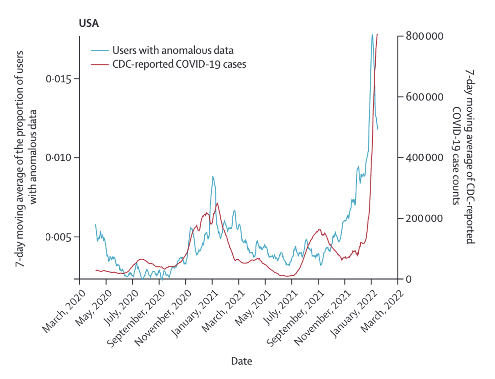
The DETECT study also investigated the predictive value of wearable sensor data to estimate SARS-CoV-2 activity at the population level over time (Radin et al. 2022), and it’s worth looking at it in more detail. The study was open to adults with a smartwatch or fitness tracker that connects to Apple HealthKit or Google Fit. Apple HealthKit and GoogleFit are APIs that allow apps on the smartphone to access data from compatible sensors, such as Apple Watch and Fitbit, and use this data in particular ways (for example, to share them with a study like DETECT). The sensor data of interest were resting heart rate, and step count. People with COVID-19 are expected to have a higher resting heart rate compared to their baseline, as the body fights the infection, and fever in particular is known to be associated with higher heart rates. At the same time, step counts are expected to decrease, as even mild COVID-19 disease severity can be quite exhausting. Thus, anomalous sensor days were defined as days in which both signals were sufficiently different from baselines in the directions expected with COVID-19. These data were then compared to CDC-reported COVID-19 cases in the entire US, and the state of California alone (Figure 8.12 shows the comparison for the US). The correlation (Pearson’s r) was 0.68 (95% CI 0.64 - 0.72) for a real time comparison, and 0.79 (95% CI 0.76 - 0.82) and 0.84 (95% CI 0.82 - 0.87) for comparisons 6 and 12 days in the future, respectively.
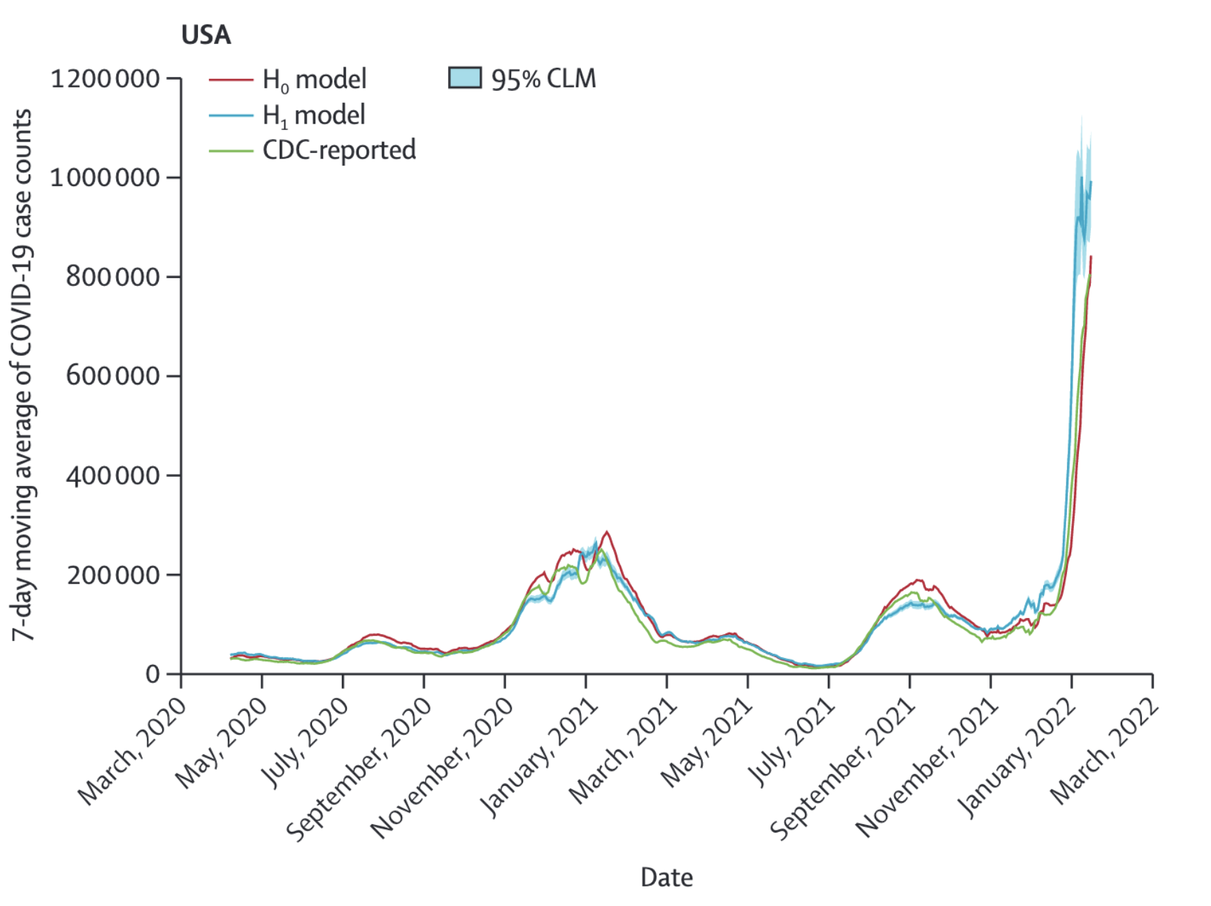
While this is already a strong correlation, the authors looked at the potential of wearable sensor data to improve a prediction model using past CDC data. To do this, they used a negative binomial model to predict CDC-reported 7-day moving average of COVID-19 cases, with an autoregressive term using COVID-19 case data reported 3 days before a given time period of interest. The two models compared were H0, where anomalous days from wearable sensor data did not play a role in the model, and H1, where it did. Figure 8.13 shows the 7 day moving averages from both models, along with the official CDC case counts. For the US, the predictions 6 and 12 days in the future improved from 0.92 (95% CI 0.91 - 0.93) for H0 to 0.97 (95% CI 0.97 - 0.98) for H1, and from 0.82 (95% CI 0.79 - 0.84) for H0 to 0.92 (95% CI 0.91 - 0.93) for H1, respectively. This represents a 12.2% improvement in the correlation for the 12 days prediction. Results for the state of California alone were even stronger, with a 12 days improvement of 32.9%.
Overall, such studies highlight the potential of wearables for digital public health surveillance. Indeed, a 2022 systematic review of studies using wearables to predict SARS-CoV-2 infection concluded that the studies showed promise while calling for prospective studies under ideally controlled conditions (Mitratza et al. 2022). This once again highlights the patterns of evidence accumulation we discussed earlier in the book, where early reports and pragmatic study designs provide the rationale for ever larger and more controlled studies to provide increasingly strong evidence.
8.6 Challenges of digital public health surveillance
We’ve seen above a few examples of five different types of digital public health surveillance. These are not exclusive, and other types also exist, but they represent major developments in the field. It is worth going back to the discussion on surveillance earlier in the book, where we looked at active vs passive, sentinel vs population-based, case-based vs aggregate, and syndromic vs laboratory-confirmed surveillance. We have seen examples of different types in this chapter. For example, Google Flu Trends is a passive, aggregate, syndromic surveillance system. It’s likely very close to a population-based surveillance system as well, because of its strong dominance in the search market. On the other hand, systems like DETECT or the COVID Symptom Study app are active, case-based surveillance examples, which can be either purely syndromic, or include laboratory-confirmed data such as results of lab tests.
Furthermore, studies may combine multiple types of digital public health surveillance, combining their respective strengths, and even combining them with traditional data sources (Santillana et al. 2015). A 2021 study on COVID-19 surveillance can serve as a particularly powerful example, bringing together data from six different sources: Google Trends, Twitter, search queries; mobility data, smart thermometer data, and output from a computational model (Kogan et al. 2021). More recently, a 2023 study analyzed different machine learning methods to build prospective and real-time early warning systems for COVID-19 in the US. The results showed that combining multiple data sources not only successfully anticipated most outbreak events between January 2020 and January 2022, but also had far fewer false alarms than single-source models (Stolerman et al. 2023).
Overall, digital public health surveillance has demonstrated its potential across a large number of research publications. However, its integration into practice by public health authorities is still only marginal. Why is that? Ultimately, digital public health surveillance must be useful and trustworthy; in other words, it must have clear goals, and it must be continuously evaluated. This is harder than it sounds and involves both scientific and technical challenges, as well as non-scientific issues such as having the right skills, stakeholder collaboration, clear communication, and others.13 Both public health practitioners and researchers can play an important role in addressing these, which is critical for transitioning from proof-of-concept to integration into regular public health practice (Althouse et al. 2015).
One of the challenges that is mentioned regularly is the availability - and ultimately ownership - of data. Google Flu Trends was heavily criticized because the underlying data was never publicly available. Other data sources, such as Twitter data, have been more easily accessible, but without binding agreements, access nevertheless remains at the mercy of the owner of Twitter Inc. There are countless examples like these, reflecting the fact that most data used in digital epidemiology comes from the private sector. However, this should not be an insurmountable obstacle. Many of the sources of traditional public health come from private, or semi-private healthcare actors already - extending this collaboration to the digital sector should be feasible, but must take into account a number of issues specific to digital data. First, there should be reasonable expectations on both sides regarding data availability and transparency. Any expectation about data availability must be aligned with the economic reality of the value of data to technology companies. An uncompromising demand to make all raw data publicly available is neither realistic, nor is it compatible with the data management capacities of most public health authorities. Second, the legal constraints regarding sharing private data with governmental actors must be addressed. People have understandably become wary of digital surveillance, and as we’ve seen in the chapter on digital contact tracing, the simplistic argument that surveillance is done for the public good, or addressing a health crisis, is not sufficient to address these concerns. Privacy-preserving methods using a privacy-by-design approach will undoubtedly be part of the solution to this challenge. Third, the environment in which technology providers operate is generally much faster-paced than that of traditional healthcare providers. While public health ideally has continued access to data and services, there needs to be a clear understanding of how quickly certain data sources can disappear, and new ones can emerge. Correspondingly, and in line with the observations mentioned above, multiple data streams should be used in parallel, and adjusted continuously.
Another key challenge is bias. Bias - here using the definition of “a systematic distortion in the sampled data that compromises its representativeness” (Olteanu et al. 2019) - is a general problem in science, but digital data sources present some specific challenges. Data from digital services is generated by people who use those services. Thus, if access and usage of such services are not representative of the general population, the resulting data will be biased. That’s not a problem per se, but it needs to be considered before making sweeping statements about the generalizability of results. Bias can also be introduced during the data analysis process, for example if an annotation step is part of the analysis. But perhaps most importantly, online services such as search engines, social media, or mobile phone applications can easily be algorithmically confounded - that is, the services themselves have economic goals that can strongly influence how users are led to interact with the services (Salganik 2019).
Further, as most people can personally relate to, our digital self is often quite different from our true self. What we share on online services is already highly selective. As an example, consider studying nutrition intake on social media. Food can have a strong impact on health, but the exact path from nutritional intake to any given health outcome is often unclear. Measuring food intake is typically already the first challenge in understanding this path, and so it’s not surprising that researchers may want to turn to social media to study food intake. A recent analysis comparing food behavior captured on Twitter with data from a photo-based food tracking app14 revealed that food posts on Twitter are perceived as more delicious, higher in calories, less healthy, less likely to have been consumed at home, more complex, and larger in portion size compared to foods that are tracked and consumed (Gligoric, Dordevic, and West 2022). While the analysis was limited to Switzerland, the results are hardly surprising - food pictures on Twitter are like holiday pictures on Facebook or Instagram: extraordinary snapshots of a personal experience that is most likely highly selective, i.e. different from the average experience. That said, social media data may be an excellent data source when it comes to assessing what type of food is considered socially desirable. The pitfalls of bias really do depend on the context of each individual study.
In addition, digital systems do inherently suffer from challenges related to computer-generated content and fake identity accounts. The extent of bot-generated internet traffic is generally underappreciated. Cloudflare, one of the largest providers of internet servers, reported that in 2022, about one-third of all internet traffic was generated by bots15. Bots are an enormous problem on social media: a 2022 report suggested that almost a third of Twitter content in the US is generated by bots16. Indeed, social bots are known to play an outsized role in spreading articles from low-credibility sources (Shao et al. 2018). A 2018 study demonstrated that falsehood diffused faster and more broadly than the truth across a number of categories (Vosoughi, Roy, and Aral 2018), underscoring the problem of health misinformation (Wang et al. 2019) that became very visible during COVID-19 (Loomba et al. 2021). Similarly, so-called “trolls” - accounts specifically designed to sow discord - have in the past amplified discussions on health topics, for example debates about vaccines (Broniatowski et al. 2018). Given the rapid advances in AI-driven content generation, especially with the recent developments of large language models, these problems will get worse in the future. There are potential solutions to address these issues, such as identity verification for online services, but as the forces that benefit from bots and trolls will likely adjust, we may find ourselves in a perpetual race of measures and counter-measures (also referred to as information war (Schiavo 2020)).
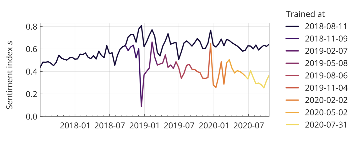
Last but not least, as we’ve seen at the very beginning of the chapter, digital epidemiology models trained on historical data from dynamic environments can over time deteriorate quite significantly. Online behavior and content can change rapidly, reflecting the fast pace of the technology and information environment. If models are not adjusted continuously, they may experience performance degradation, commonly referred to as the problem of concept drift (Bayram, Ahmed, and Kassler 2022). While generally an issue, the problem can be exacerbated during a crisis, as Google Flu Trends’ difficulty in picking up the 2009 influenza A (H1N1) pandemic highlighted. More recently, the COVID-19 pandemic offered similar examples. For example, sentiments about vaccination seem to have deteriorated considerably in 2020, but models trained on pre-COVID-19 data might have easily missed this trend (Müller and Salathé 2020).
How to deal with all of these issues is beyond the scope of this book, and will depend on the details of each study. But being aware of the problems is the first step to addressing them. No system is perfect, and exploration is an essential aspect of any field, especially in young fields. But as a field matures, it must get more serious about developing rigorous methods that are capable of addressing its underlying, or sometimes even unique, problems.
8.7 The future of digital public health surveillance
In this chapter, we’ve looked at how the internet has changed public health surveillance. In the early days, the internet was mostly used to aggregate data rapidly from different locations, often relying on simple methods such as email. As mass adoption of the web took off, search engine data became an important source for digital public health surveillance. The widespread usage of the web also enabled the emergence of participatory surveillance systems. The rise of social media represented yet another milestone, when log data as a proxy for interest in certain topics was replaced by the analysis of content written by people themselves, thereby broadening the scope of public health surveillance. The rapid adoption of smartphones, and more recently wearables, marks the latest development in the field, but certainly not the last. It’s thus prudent to look ahead at possible future developments.
The old saying that predictions are hard, especially about the future, applies here just as it does elsewhere. It’s not useful to speculate about technology developments that have not yet demonstrated scalability, so we are going to focus on those that have. Two of those are advances in machine learning, colloquially referred to as artificial intelligence (AI), and miniaturization. AI will impact digital public health surveillance in multiple ways. Already, machine learning is used heavily in text content analysis, as we’ve seen above. Most modern machine learning approaches are based on deep learning, where multi-layered (artificial) neural networks are trained to perform tasks such as image recognition, language processing, and decision-making. Major recent developments revolve around the concept of generative AI, where the networks are trained to generate content of any type, including text and images - increasingly at the level of human capacities or even beyond. AI is a transformative technology across domains, and will thus impact all aspects of digital public health surveillance. While almost all examples in this chapter were in one way or another based on text (search queries, participatory surveillance questionnaires, social media posts, etc.), surveillance applications that are image-based will become increasingly common. For example, apps that can automatically assess user-uploaded images - of disease vectors (Pataki et al. 2021), plant diseases (Sharada P. Mohanty, Hughes, and Salathé 2016), food (Sharada Prasanna Mohanty et al. 2022), or any other visual phenomenon - will substantially expand the scope of participatory surveillance.
Miniaturization refers to the fact that more and more biological and medical measurements can be done anywhere, and increasingly at home. This development is significant in many ways. Consider for example the gold standard of ILI surveillance, where sentinel physicians share reports about ILI - including in the form of test results, the strongest form of evidence - with public health authorities. The COVID-19 pandemic has seen the emergence of the rapid antigen home test, and it’s likely that other such tests will soon be available as mass products. With the right incentive structures, and more accurate self-tests, digitally self-reported test results could enable large-scale, highly accurate participatory surveillance systems. More generally, while data collected from wearables always need to be assessed for accuracy, they are increasingly shown to be able to give a better depiction of vital signs than clinical measurements (Dunn et al. 2021).
Continuous and longitudinal assessment of physiological measurement will become common, enabling new forms of digital public health surveillance at scale. Efforts like DETECT, the Covid Symptom Study app, or the German “Corona Datenspende”17 (a participatory surveillance effort by the Rober Koch Institute), are examples of the power of this approach. Population-wide, long-term digital cohorts can collect an ever-growing variety of health signals at a scale beyond even the largest sentinel systems. Those signals can be combined with on-site biomarker collection as needed. That said, even the collection of biological samples - including blood collection18 - can increasingly be done at home, giving rise to the emergence of fully digital health cohorts. The COVID-19 pandemic has highlighted the critical importance of data from large-scale, long-term cohorts. Countries around the world are working on establishing such cohorts, which are almost certainly going to be digital. In the next chapter, we’ll take a closer look at digital cohorts and trials.
https://ai.googleblog.com/2015/08/the-next-chapter-for-flu-trends.html↩︎
https://www.itu.int/hub/2021/11/facts-and-figures-2021-2-9-billion-people-still-offline/↩︎
https://investor.fb.com/investor-news/press-release-details/2022/Meta-Reports-Third-Quarter-2022-Results/default.aspx↩︎
https://investor.twitterinc.com/financial-information/default.aspx↩︎
https://developer.twitter.com/en/blog/product-news/2021/enabling-the-future-of-academic-research-with-the-twitter-api↩︎
https://about.fb.com/news/2018/04/restricting-data-access/↩︎
https://developer.twitter.com/en/docs/twitter-api/tweets/filtered-stream/integrate/build-a-rule↩︎
https://gs.statcounter.com/platform-market-share/desktop-mobile/worldwide/#yearly-2011-2022↩︎
https://www.ecdc.europa.eu/en/publications-data/digital-technologies-key-public-health-functions-results-ecdc-expert-consultation↩︎
https://www.similarweb.com/blog/insights/twitter-bot-research-news↩︎
https://digitaltrials.scripps.edu/the-inner-workings-of-site-less-digital-clinical-trials-part-2-the-at-home-blood-collection-kit/↩︎
8.3 Social media
Social media provides an important data source for digital public health surveillance (Figure 8.1). Platforms like Facebook, Instagram, and Twitter have become major online information exchanges, some of which have billions of users. Over 60% of the global population had internet access in 2021, amounting to a staggering 4.9 billion people6. With an estimated 4.2 billion social media users in the same year, nearly everyone with internet access is also a social media user. Unlike most other websites, social media platforms are often designed to encourage users to share personal information - including information about their health. Soon after these platforms emerged, the first studies began investigating how their data could be used for public health purposes, including digital public health surveillance.
Notably, the popularity of a given social media platform does not seem to correspond with its usage as a data source. In particular, the predominance of Twitter as a data source for digital public health surveillance is in stark contrast to its relatively limited use compared to services such as Facebook, Instagram, or Whatsapp. The latter boast over 3.7 billion monthly active users on all platforms combined, with nearly 2 billion monthly active users on Facebook alone, in the third quarter of 20227. In contrast, just in the quarter before, Twitter reported 237.8 million monthly active users8. Thus, while Facebook has a monthly active user base more than eight times larger than Twitter’s, its usage as a data source (67 studies) dwarfs that of Twitter (294) by more than a factor of 4.
A key difference, and likely the dominant reason for this stark contrast, is that Twitter data has been relatively easy to acquire until recently. Twitter provides a high-performance API that allows third parties to access publicly available user data. In 2021, it took further steps toward researchers by offering privileged data access via an academic research product track9. In contrast, obtaining data from the Facebook/Meta family of platforms is quite difficult, especially since the Cambridge Analytica scandal, when research access to Facebook data was misused for political campaigning10. Facebook has made some data available to select researchers, but data access remains challenging (Hegelich 2020). The difference in data access policies is at least partially due to the different privacy expectations of users on these platforms: Twitter posts are publicly viewable by default, whereas posts on various Facebook/Meta platforms are non-public by default. It should be noted, however, that a recent change in Twitter’s ownership has led to significant changes in how researchers can access its data.
Early explorations into using Twitter as a digital public health surveillance data source focused on influenza-like illnesses (ILI), for reasons described earlier. Starting in 2010, a number of papers (e.g. Chew and Eysenbach 2010; Culotta 2010; Lampos and Cristianini 2010; Corley et al. 2010; Signorini, Segre, and Polgreen 2011) examined the use of Twitter data to estimate ILI activity in the US. Shortly thereafter, Twitter data was used to assess a wider range of illnesses (M. Paul and Dredze 2011) and health behaviors such as vaccination (Salathé and Khandelwal 2011). Since then, the range of health issues addressed using Twitter data has expanded, covering areas from both infectious and non-communicable diseases, health services, health behaviors, environmental hazards, nutrition, and more (Figure 8.1). The key strength of social media analyses, as opposed to search query analyses and participatory surveillance, is that they are based on user-generated content created without any specific request from health researchers or practitioners. This allows for content analyses. Furthermore, because social media occurs in the context of social networks, social media analyses also enable network analyses, for example, to understand the effect of social influences on health status or behaviors of interest (Salathé et al. 2013).
It is worthwhile to examine a typical process of social media analysis. In previous years, Twitter provided access to two types of data streams. The first is a random sample of 1% of all tweets, which, in the case of about 500 million tweets per day, still corresponds to a large number of tweets. The second is a filtered stream, which allows filtering according to certain rules11. The most basic rule is the presence of a specific keyword, but rules can also constrain filters to certain geographic regions, languages, whether tweets are retweets, whether they have images, and so on. The filtered stream was capped at 250 tweets per second for academic research, corresponding to a maximum throughput of 21,600,000 tweets per day. Thus, in the first step, a decision must be made about tweet filtration to obtain meaningful raw data to work with. The Twitter API can also provide other information, such as counts of tweets, which is helpful when gauging interest in a given topic. Taking a random timepoint in the Fall of 2022 as an example, the average daily count across the most recent seven days was 18,432 tweets for “influenza,” 581,259 tweets for “COVID,” and 148,031 tweets for “vaccine.” Keeping in mind that these are just daily counts, it is easy to see how Twitter became such an interesting data source for digital public health surveillance.
The key challenge in terms of content analysis is making sense of the actual tweet content. While early work was based on simple counts of tweets with certain keywords, researchers increasingly used machine learning to explore the content of the tweets. They resort to either supervised or unsupervised approaches to do so. In the supervised approach, a machine learning model is trained to classify tweets based on a labeled dataset. For example, if we are interested in classifying tweets as negative, neutral, or positive, we will need a training dataset of tweets where we have already assigned those labels. The model can then learn based on this training data, and once it has achieved a certain accuracy, it can be used to classify other tweets. This NLP (natural language processing) approach is becoming ever more sophisticated. A decade ago, simple classifiers such as Naive Bayes and Maximum Entropy classifiers were commonly used (see, for example, Salathé and Khandelwal (2011)). Today, the current state-of-the-art approach leverages transformer models (Vaswani et al. 2017) such as BERT (Devlin et al. 2018), which can be pre-trained on specific target domains, such as tweets about COVID (Müller, Salathé, and Kummervold 2020). Large language models like GPT (Radford et al. (2018)) - which also uses the transfomer architecture - will almost certainly replace previous approaches. Unsupervised approaches, on the other hand, also attempt to categorize tweets but do so without knowing the categories in advance. A popular approach is topic modeling, which can identify topics by finding and clustering text patterns in documents. A popular example in the public health domain is the Ailment Topic Aspect Model (ATAM), which identified word clusters that mapped to real-world events without human supervision (M. J. Paul and Dredze 2014). A key advantage of unsupervised approaches is that they can identify novel, unknown patterns, which can be particularly important in emerging health crises.
It should be noted once again that Twitter is, of course, not the only social network, and more health-oriented networks may also provide pertinent information, especially in the early days of a health crisis. For example, the Chinese social network DXY.cn, a platform for people interested in healthcare, broadcast information from local and national health authorities during the early days of COVID-19. Extracting individual-level patient data from updates on the site, researchers were able to describe outbreak dynamics from 507 patients with COVID-19 reported until the end of January 2020 (Sun, Chen, and Viboud 2020). Figure 8.10 shows how the data captured the mortality of older people already at this very early stage of the unfolding pandemic. The data also aligned well with other aspects of COVID-19, such as the incubation period.
Social media analysis can be used for applications beyond disease surveillance. One area of growing interest is digital pharmacovigilance. As discussed in Chapter 4, pharmacovigilance refers to monitoring pharmaceutical drugs once they are on the market. Patients and healthcare professionals can report adverse drug reactions (ADRs) to pharmacovigilance systems provided by health authorities. However, these systems can be slow, and many people simply aren’t aware that they exist in the first place. Social media has been shown to be a complementary data source for ADRs (Freifeld et al. 2014). One study extracted ADRs related to HIV medication from Twitter and showed that they aligned well with the clinical picture, accurately capturing well-recognized toxicities (Adrover et al. 2015). In this study, starting from a body of over 40 million tweets extracted through keyword search, less than 2,000 were found to be actual ADRs reported by individual patients. Nevertheless, the example showed that even ADRs related to drugs for diseases that still carry a substantial stigma, such as HIV/AIDS, can be captured on social media.