2 Testing & Diagnostics
In the previous chapter, we learned about the fundamental questions in epidemiology, which are almost always related to cases:
- How can we identify cases?
- How many cases are there?
- What causes them?
- What are the consequences?
To determine if there is a case, we need a diagnosis of the disease. For most of medical history, diagnoses were based solely on observations of symptoms. As science has progressed, more diagnostic tools have become available beyond the description of symptoms. Nowadays, laboratory tests are available for many diseases and are often necessary to confirm a case, as we saw in the previous chapter.
Although the methods and tools for diagnosis have changed considerably, one thing has remained the same: any diagnosis ultimately involves uncertainty. Even for modern lab tests, such as SARS-CoV-2 tests, the accuracy is never 100%. Thus, regardless of how the diagnosis is made, we must be able to deal with the uncertainties involved. In this chapter, we will explore how a seemingly accurate test can lead to very misleading conclusions. We will establish the necessary framework to comprehend and navigate several such pitfalls and gain a thorough understanding of essential concepts such as sensitivity and specificity, which are relevant to various other domains outside of epidemiology as well.
2.1 False positives and false negatives
Let us start by assuming that we know with absolute certainty whether a person has a disease or not. In reality, this is often not the case, but let’s make this assumption to develop a concept. If we are talking about a dichotomous test - i.e. you either have the disease, or you don’t - then there are four possible scenarios.
- You have the disease, and the test is positive. This is called a true positive.
- You have the disease, but the test is negative. This is called a false negative.
- You don’t have the disease, and the test is negative. This is called a true negative.
- You don’t have the disease, but the test is positive. This is called a false positive.
Figure 2.1 shows these four outcomes in a 2 by 2 grid.
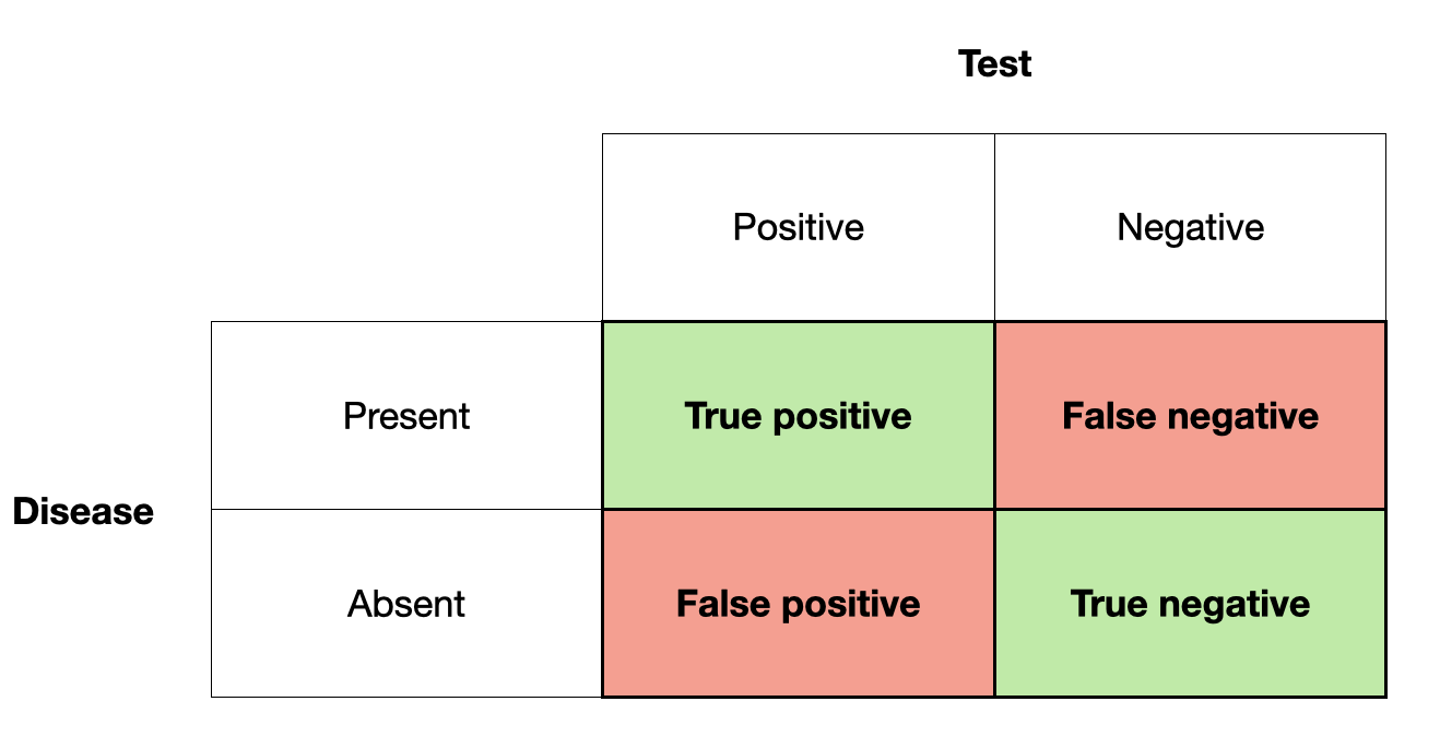
The primary reference of this terminology is the test result. If the test is positive, we talk about a positive (true or false), if it is negative, we talk about a negative (true or false). Whether they are true or false depends on their correctness with respect to the presence or absence of disease.
There are two types of errors here, false positives, and false negatives. In many fields, these errors are called type I and type II errors. Type I errors are when you think something is there, that isn’t actually there - a false alarm. Type II errors are when you miss something that is actually there. Which error is worse usually depends on the situation. For example, a false positive test may lead to a treatment with powerful negative side effects - even though there is no disease to which the treatment could respond in the first place. This is a clear case of a rather serious type I error. In contrast, missing a disease with a false negative test outcome can be just as bad, as the disease may not get the necessary treatment - a classical type II error. We’ll see examples of both errors throughout the book.
Many diagnostic tests work by measuring the presence or amount of a biomarker. A biomarker is a measurable biological indicator that can be linked to a particular state, such as a disease. Multiple biomarkers are sometimes available for certain diseases, while biomarkers are still lacking for others. In any case, to further develop the concept of test uncertainty, let’s assume there is a test for a disease based on a biomarker. Figure 2.2 shows a hypothetical distribution of the biomarker and its relation to disease.
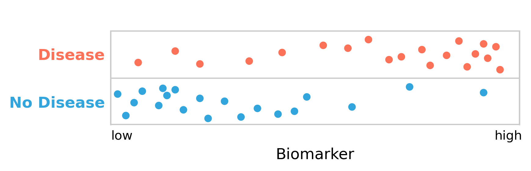
As can be seen, the people with the disease clearly have higher levels of the biomarker than those without it. The biomarker, which can be measured quickly and cheaply, can thus serve as a diagnostic test for the disease.
However, there is a substantial overlap between disease and non-disease with respect to the biomarker. We are therefore facing the difficult decision to define a cutoff point for the biomarker, above which we declare the presence of the disease. Given the substantial overlap, it is clear that there is no perfect cutoff. Let us begin by arbitrarily setting the cutoff in the middle (Figure 2.3). We can see how this now nicely matches the framework of false positives and false negatives from above: the test gives a negative result to five people who have the disease (false negatives), and it further gives a positive result to three people who don’t have it (false positives).
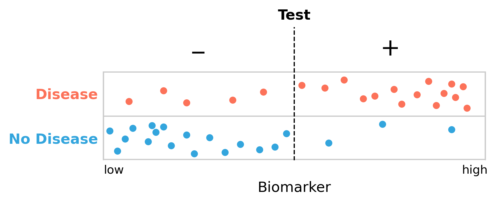
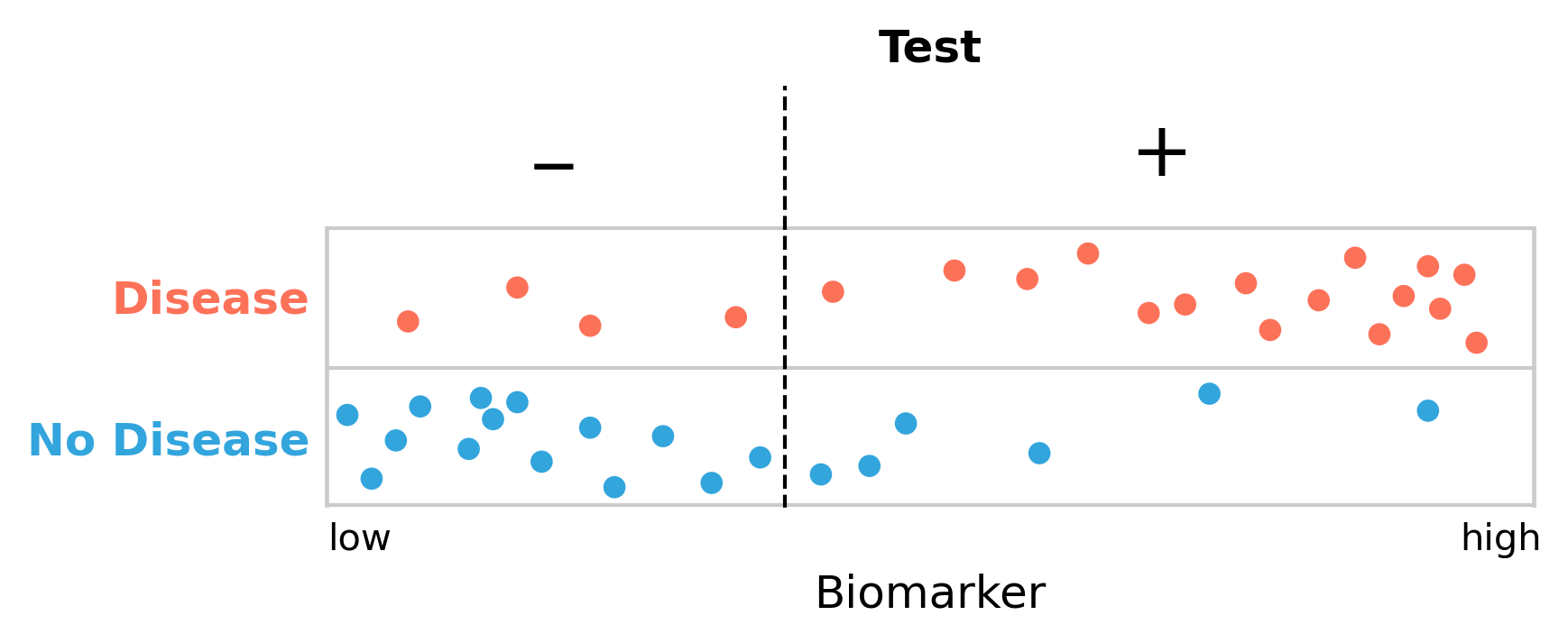
Missing five people with the disease seems a lot, so perhaps we should move our cutoff to reduce the number of false negatives. But it is easy to see (Figure 2.4) that this will inevitably increase the number of false positives. We are now only missing four people with the disease, but the number of people getting a false positive diagnosis has grown from three to seven.
Is this a tradeoff worth making? A substantial fraction of our non-diseased group will get a positive test result, possibly leading to lengthy and expensive treatments. In addition, getting a first positive test result may leave a lasting label on the person that may never be fully removed, even with subsequent negative tests. There is also the stress and anxiety that a positive test can induce. So perhaps it would be better to minimize the false positive rate, and move the cutoff point to the right? But what happens then, of course, is that we increase the false negative rate, as more people with the disease will get a negative test result. This can be just as bad, because these people may not get the treatment they need. Getting early treatment, however, can significantly improve the outcome of many diseases. Thus, missing cases is not good either.
This is clearly a difficult problem. We need a framework to deal with it.
2.2 Sensitivity and specificity
As we’ve seen above, false negative and false positive test results can have detrimental consequences. Depending on the disease - taking into account factors such as disease prognosis, available treatments, costs, and others - we may want our test to rarely miss people who have the disease, i.e. we want few false negatives. Another way of saying this is that we want our test to be very sensitive. Alternatively, we may want our test to not misclassify people as having a disease when they don’t have it, i.e. we want few false positives. In this case, what we want is a highly specific test.
These terms - sensitivity and specificity - have very clear definitions.
Sensitivity is defined as the number of true positives, divided by the number of people who have the disease.
Specificity is defined as the number of true negatives, divided by the number of people who don’t have the disease.
We can express this mathematically, using the terms of false negative (FN), false positive (FP), true negative (TN), and true positive (TP) as defined above, as follows:
\[Sensitivity = \frac{TP}{TP + FN}\]
\[Specificity = \frac{TN}{TN + FP}\]
Sensitivity is also sometimes called the true positive rate (TPR), while specificity is referred to as the true negative rate (TNR). To complete the terminology that you will encounter in the literature, we also need to define the false positive rate (FPR), and false negative rate (FNR), which are defined as follows:
\[False\ positive\ rate = \frac{FP}{FP + TN}\]
\[False\ negative\ rate = \frac{FN}{FN + TP}\]
We can see from looking at these definitions that \[TPR\ (i.e.\ sensitivity) = 1 - FNR\] and \[TNR\ (i.e.\ specificity) = 1 - FPR\]
Both of these terms, sensitivity and specificity, need each other in order to be meaningful. As an example, let’s assume we have a perfectly sensitive test (i.e. a test with a sensitivity of 100%) that would find all the people with the disease - no false negatives. If someone has the disease, the test will indicate it; that’s how sensitive it is. However, as we’ve seen above, the test may also identify people as diseased who don’t have the disease. Notice that in the mathematical expression of sensitivity above, there is no false positive term. Conversely, you can have a perfectly specific test (specificity of 100%) that never misclassifies non-diseased people as diseased. However, such a test may miss a lot of people who have the disease. Again, notice how the mathematical expression of specificity does not have a false negative term.
To make this point another way, let’s assume we have a “test” that is always positive. This is obviously a completely useless test - hence the quotes - but it helps make the point. Such a test will have a sensitivity of 100%. It will “find” all the people who have the disease. But it also has a specificity of 0%, because it will misclassify everyone who does not have the disease, too. The opposite example would be that of a test that is always negative, and thus has a specificity of 100%, as it doesn’t give anyone a positive test result, and thus there is no misclassification of healthy people. Here, again, the flip side of the coin is that this test has a sensitivity of 0%, as it won’t find any case at all, even in those who do have the disease.
Thus, specificity and sensitivity always have to go together. One value in isolation does not say anything meaningful about a test.
Using our test example above, we can now calculate the various values given different cutoffs. If we define the cutoff to be in the middle, as shown in Figure 2.3, we’ll have the following values:
\[FN = 5\]
\[TP = 15\]
\[TN = 17\]
\[FP = 3\]
\[Sensitivity = \frac{TP}{TP + FN} = \frac{15}{20} = 75\%\]
\[Specificity = \frac{TN}{TN + FP} = \frac{17}{20} = 85\%\]
If we move the cutoff to the left in order to reduce the number of false negatives, as shown in Figure 2.4, we get the following values:
\[FN = 4\]
\[TP = 16\]
\[TN = 14\]
\[FP = 6\]
\[Sensitivity = \frac{TP}{TP + FN} = \frac{16}{20} = 80\%\]
\[Specificity = \frac{TN}{TN + FP} = \frac{14}{20} = 70\%\]
Our test has become more sensitive - we are better at finding people with the disease - but it has come at the cost of becoming much less specific. There are now more people who are getting misclassified as diseased.
2.3 The ROC curve
So how do we make a decision on the cutoff point? We could try different cutoff points and see what that does to the tradeoff of the sensitivity and the specificity of the test. The most common way to visualize this is the ROC curve, which stands for receiver operating characteristic. The term was coined at its original conception for operators of military radar receivers back in World War II. Since then, ROC curves have been used in many different fields, and the name has stuck. ROC curves are now also heavily used in the fields of data science and machine learning.
A ROC curve shows the tradeoff between sensitivity and specificity by plotting the true positive rate, i.e. the sensitivity, against the false positive rate, which is \(1 - specificity\). In order to avoid a confusion of terms, some ROCs are drawn by inverting the direction of the false positive rate axis, going from 1 to 0, instead of 0 to 1, which is what we’ll do here as well.
A random test on a ROC curve would on average render a diagonal line. Tests with better sensitivities and specificities will render lines that move to the upper left corner. A perfect test with 100% sensitivity and specificity sits on the upper left corner (Figure 2.5).
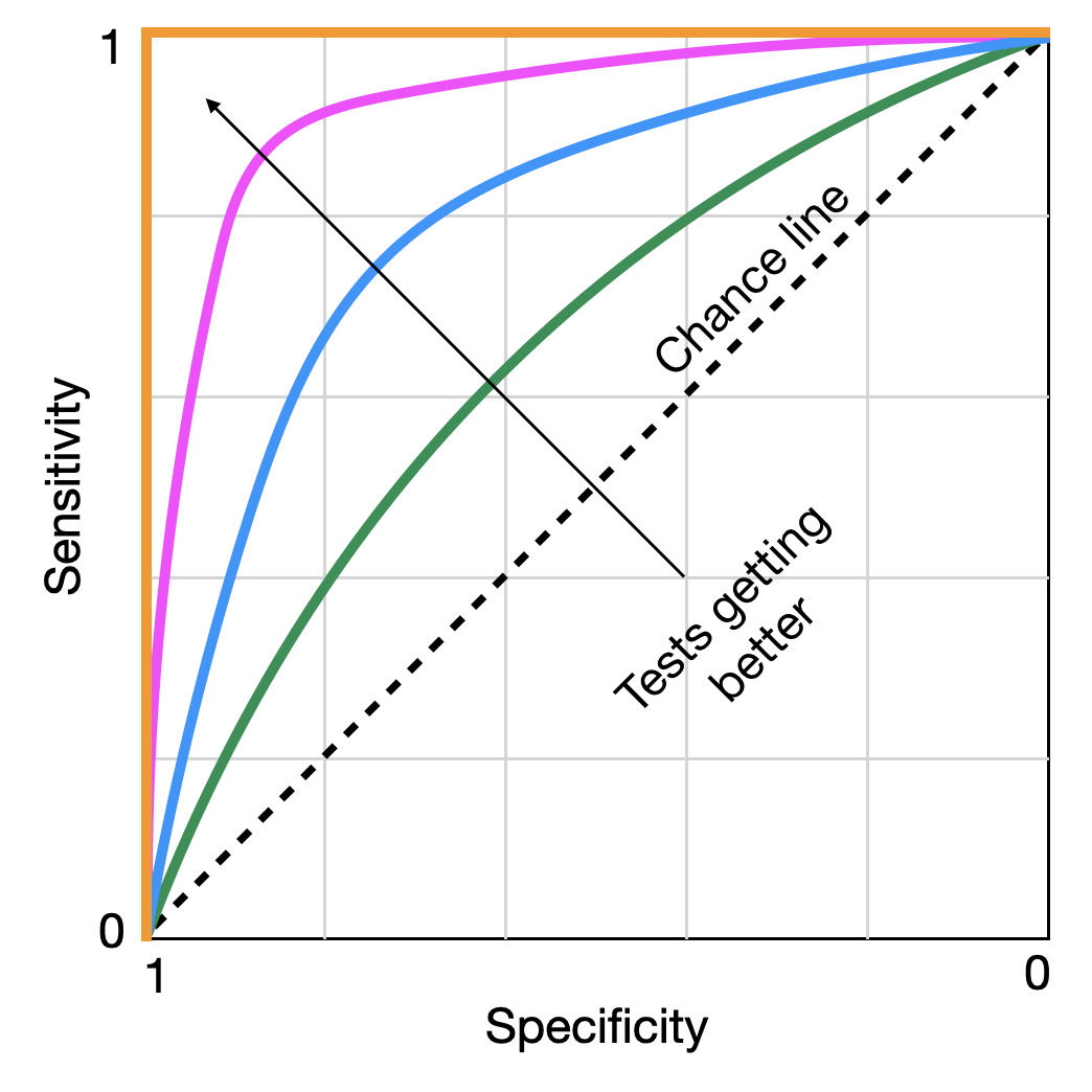
The arrow indicates a test getting better at discriminating between disease and no disease. If we start following a line at the bottom left, we start with highly specific tests that very rapidly also achieve high levels of sensitivity, without having to sacrifice a lot of specificity. With each small reduction in specificity, we gain a lot of sensitivity - a tradeoff worth making. However, eventually, we reach a point where each additional small reduction in specificity does not gain us a lot of sensitivity in exchange, and the tradeoff stops being valuable. These points typically sit “on the shoulder” of the curve towards the top left corner. This is our ideal cutoff. There are statistical methods to identify the ideal point, but discussing them would be beyond the scope of this book. What matters is that we have a framework in which we can identify the optimal cutoff rate for a test to be maximally discriminative. This is probably a good moment to also remind ourselves that no test - unless it has an ROC curve like the one plotted in orange in Figure 2.5 - is perfect, the implications of which we will discuss shortly.
Going back to our hypothetical test, let us use this methodology to determine the ideal cutoff. If we use different cutoffs from 0.1 to 0.9, in steps of 0.1, we will obtain the sensitivity and specificity values as shown below:
| cutoff | sensitivity | specificity |
|---|---|---|
| 0.1 | 0.95 | 0.2 |
| 0.2 | 0.9 | 0.45 |
| 0.3 | 0.85 | 0.6 |
| 0.4 | 0.8 | 0.7 |
| 0.5 | 0.75 | 0.85 |
| 0.6 | 0.65 | 0.9 |
| 0.7 | 0.55 | 0.9 |
| 0.8 | 0.4 | 0.95 |
| 0.9 | 0.2 | 0.95 |
Plotting them as an ROC curve, we obtain Figure 2.6.
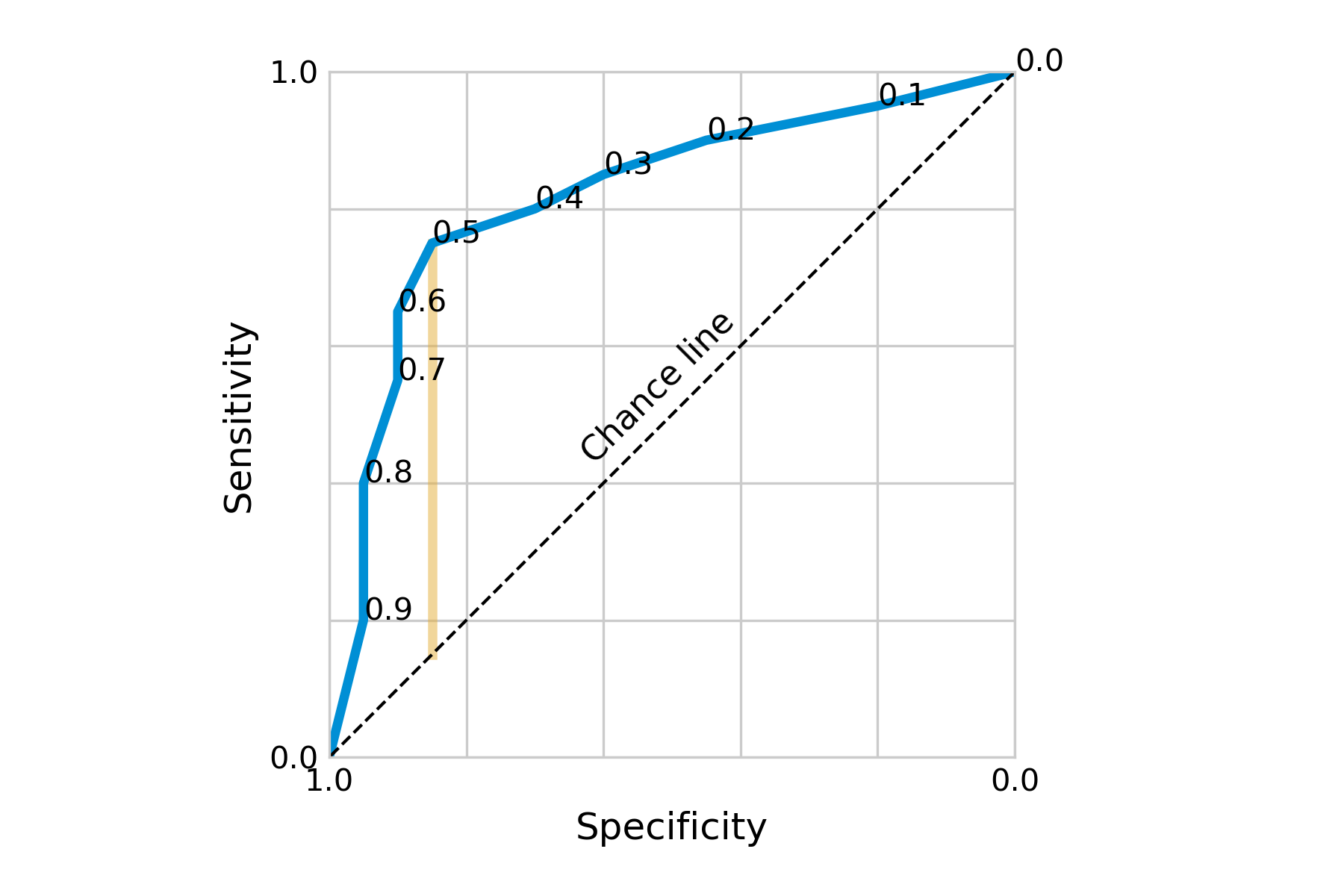
Visually, we can see that our initial cutoff point of 0.5 located at the shoulder of the curve was already quite ideal. Going into either direction from this point, we’d quickly lose sensitivity without gaining a lot of specificity, and vice versa. Depending on the costs of low specificity or sensitivity, it may nevertheless be a tradeoff worth making.
There are numerous ways to decide on the optimal cutoff point. Two of them are to minimize the distance from a perfect test, i.e. the point at the top left of the ROC curve; or to maximize the distance from a useless test, i.e. the chance line. The latter is captured by a quantity known as Youden’s index or Youden’s J statistic.
\[J = sensitivity + specificity - 1\]
Youden’s J can be visualized as the vertical distance between the ROC curve and the chance line (Figure 2.6). The two measures often identify the same cutoff point, but when they don’t, Youden’s J is the preferred choice (Perkins and Schisterman 2006). However, deciding on the optimal cutoff point may also involve other factors. For example, we may weigh sensitivity and specificity differently depending on the potential importance of false positives or false negatives.
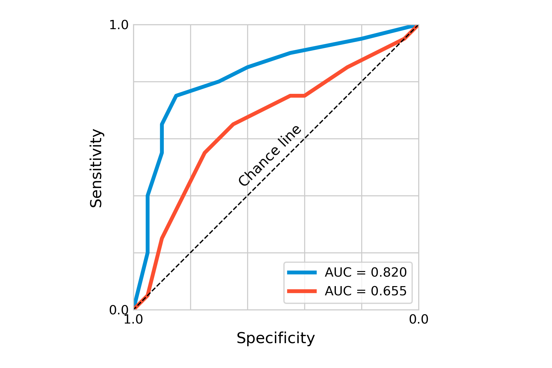
Another important concept of ROC curves is the area under the curve, or AUC, which is a measure of the overall accuracy of the test. As this area can be quantified, it provides us with a good statistic, in particular if we want to compare certain tests. Using a different hypothetical test for our disease, we can plot the ROC curve together with that of the first test, indicating already visually (Figure 2.7) that the first test is better. The AUC of the first test is 0.82, that of the second test 0.655. Here also, depending on the costs of these tests, it may nevertheless sometimes be useful to use less accurate tests first, if a large group needs to be tested, and only use a more expensive - but more accurate - test later.
Beyond diagnostic tests, ROC curves are heavily used in statistical modeling and machine learning, for example to assess the performance of binary classification models. In the corresponding literature, the x-axis usually shows the false positive rate going from 0 to 1, while the y-axis shows the true positive rate from 0 to 1. This is in line with our previous observation that sensitivity is just another term for the true positive rate, while the specificity corresponds to \(1-false \ positive\ rate\).
2.4 Positive and negative predictive values
So far, when looking at sensitivity and specificity, we have focused on the question, how accurate is this test in discriminating between disease and no disease? This question can be answered in an appropriate study setting, about which we will learn later in the book. Sensitivity and specificity need to be evaluated before diagnostic tests can be used in practice.
In this section, we will focus on a question that becomes relevant once the test is used in practice. Imagine you are getting diagnosed with a positive test. What is the probability that you actually have the disease? This is what the positive predictive value answers. The negative predictive value answers the exact opposite question, i.e. what is the probability that you don’t have the disease if your test result is negative? In the discussion that follows, we will focus on the positive predictive value; the reasoning for the negative predictive value is identical.
You might be tempted to think that the positive predictive value simply depends on the accuracy of the test. A highly accurate test, one would think, should also have a high positive predictive value. But as it turns out, that is only partially correct - the positive predictive value also depends on disease prevalence. Before we get to the details, let us use a concrete example. Imagine the following scenario. In a given population, the prevalence of a disease is 0.9%. You have a rather accurate test for the disease, with a sensitivity of 92%, and a specificity of 91%. You now test a random person of this population, and the test result is positive. What is the actual probability that the person truly has the disease?
Try to figure this out on your own before you continue reading.
It should be noted that getting to the correct answer is not trivial for most people, unless they’ve been trained to reason about this kind of problem. For example, when physicians were presented with this problem (albeit with different values), only 10% got it right (Hoffrage and Gigerenzer 1998). In what follows, we’ll develop both an intuitive and a mathematical way to get to the right answer - which is 8.5%. If you’re surprised that it is so low, you are in good company.
Let us first develop an intuitive understanding for what is going on. We noticed that the test was rather accurate, with a sensitivity of 92%, and a specificity of 91%. So far so good. But we also mentioned that the prevalence of the disease was only 0.9% in the population of interest. In other words, when you pick a random person, chances are that this person will not have the disease (the probability being equal to the prevalence of 0.9%). The specificity of 91% means that there are 9% false positives. Because the majority (99.1%) do not have the disease, those 9% false positives will translate into quite a few false positive tests.
We can make this even more intuitive by using absolute numbers. Indeed, the same research that showed how physicians struggled with obtaining the correct result also showed that the same physicians found it much easier to reason about the problem in absolute numbers instead of frequencies. We could thus reformulate the problem and say we have 1000 people, of which 9 have the disease, and 991 don’t. Of the 991 non-diseased, 9% will get a false positive test - that’s about 89 people. Of the 9 people who have the disease, 92% will get a correct positive test, which is about 8 people. Thus, a total of about 97 people will get a positive test, but only 8 of them actually have the disease. 8 divided by 97 is just a bit more than 8% (we have some rounding errors in this calculation that we didn’t address for simplicity). The key insight is that if most people getting tested do not have the disease to begin with, even a low frequency of false positives (i.e. even a test with a high specificity) will “overwhelm” the results in the sense that having a positive test doesn’t mean much.
Let us now develop a mathematical framework to get at this result. If you know the number of true positives out of those who got a positive test result, you can easily calculate the positive predictive value - it is simply the fraction of the true positives out of all positive test results, by definition. Recall that the positive predictive value is the answer to the question, “what is the probability that someone has the disease given that they have a positive test”? If you know the number of true positive tests, then the positive predictive value is exactly the fraction of all the positive tests that were true positive tests.
In reality, of course, you most often do not know who is truly positive and who is not. We need to arrive at the solution in another way. If the above subphrase “given that they have a positive test” has immediately made you think about Bayes’ theorem, you’re on the right track. If you’re not familiar with Bayes’ theorem, or need a quick reminder, it is stated as follows:
\[P(A|B) = \frac{P(B|A)\ P(A)}{P(B)}\]
The terms mean the following:
\(P(A|B)\): Probability of \(A\), given \(B\) is true
\(P(B|A)\): Probability of \(B\), given \(A\) is true
\(P(A)\): Probability of \(A\), notably independent of \(B\)
\(P(B)\): Probability of \(B\), notably independent of \(A\)
The positive predictive value can thus be denoted as \(P(D|T+)\), where \(D\) means having the disease, and \(T+\) means the test result is positive (we would write \(¬D\) and \(T-\) for not having the disease, and a negative test result). Thus, according to Bayes’ theorem:
\[P(D|T+) = \frac{P(T+|D)\ P(D)}{P(T+)}\]
We now need values for these three terms. \(P(T+|D)\) is the probability that someone is tested positive when having the disease, which is given by the sensitivity. \(P(D)\) is the probability of having the disease, independent of any particular test result, which is given by the prevalence. \(P(T+)\) is the probability of having a positive test result, whether diseased or not. This can happen in two ways: you either have the disease, and have a true positive result, or you don’t have the disease, and a false positive result. The probability of the former is \(P(T+|D)P(D)\), and the probability of the latter is \(P(T+|¬D)P(¬D)\).
Thus, the denominator \(P(T+)\) becomes the sum of these two terms, \(P(T+|D)P(D) + P(T+|¬D)P(¬D)\), and the entire expression becomes
\[P(D|T+) = \frac{P(T+|D)\ P(D)}{P(T+|D)P(D) + P(T+|¬D)P(¬D)}\]
This is quite a mathematical mouthful. We already saw above that \(P(T+|D)\) is the sensitivity, and \(P(D)\) is the prevalence. What about the terms \(P(T+|¬D)\) and \(P(¬D)\)? \(P(T+|¬D)\) is the probability of having a positive test when you don’t have the disease, which can be written as \(1 - specificity\). \(P(¬D)\) is the probability of not having the disease, which can be written as \(1 - prevalence\). Thus, we can reformulate the entire equation in terms that are by now hopefully familiar:
\[Positive\ predictive\ value = \frac{sensitivity * prevalence}{sensitivity * prevalence + (1 - specificity) * (1 - prevalence)}\]
If we plug in our values from the example above, we arrive at
\[Positive\ predictive\ value = \frac{0.92 * 0.009}{0.92 * 0.009 + (1 - 0.91) * (1 - 0.009)} = 0.085\]
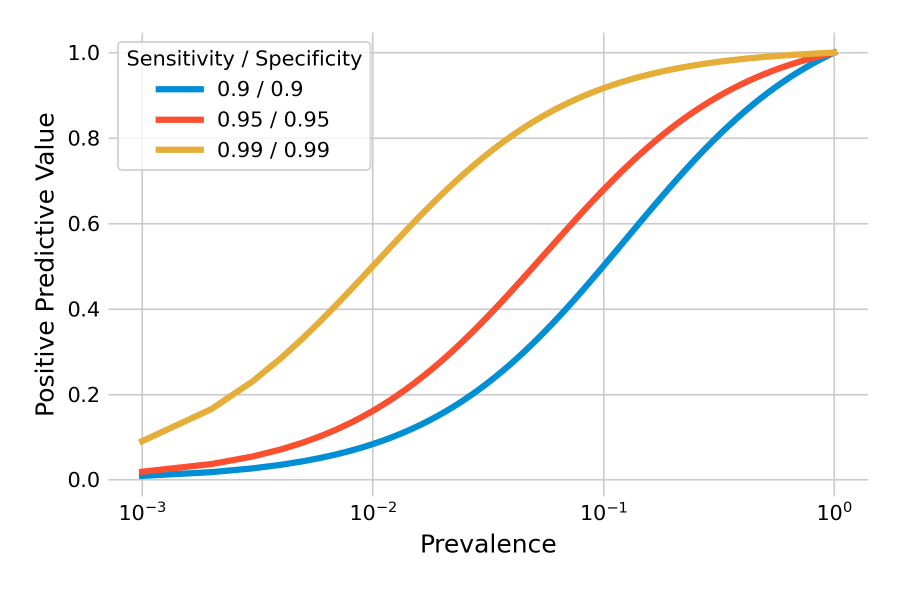
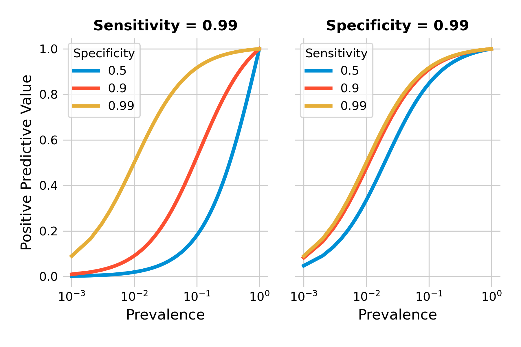
We can plot the positive predictive value as a function of prevalence for different values of sensitivity and specificity. As you can see in Figure 2.8, the positive predictive values can be quite low when prevalence is low (note the logarithmic x-axis). Even highly accurate tests with a sensitivity and specificity of 99% will have a low positive predictive value when the prevalence is under 1%.
Above, we developed an intuitive understanding about the problem, which was found to be the combination of low prevalence, and a sufficient number of false positives. False positives are related to specificity, as \(P(T+|¬D) = 1 - specificity\). Thus, specificity should matter a lot. Let’s confirm this by plotting the positive predictive value with different tests, keeping either sensitivity or specificity constant while modifying the other. We can see in Figure 2.9 that our intuition is confirmed. Specificity does matter a lot, even in a highly sensitive test, as shown in the left plot. The right plot shows that with a highly specific test, sensitivity matters only little with respect to the positive predictive value.
Testing low-prevalence populations can thus easily be a waste of resources, as the positive predictive values are so low even with relatively accurate tests. While we can’t change the prevalence in itself, we can change the population that we test. Ultimately, prevalence is the probability that someone has the disease before we test. Thus, if we ensure that this pre-test probability is higher - for example by focusing on high-risk groups for a given disease - we can increase the positive predictive value of a test.
2.5 Likelihood ratios
We now understand that sensitivity and specificity alone are not enough to interpret a particular test result. We also need to know the prevalence, which can then give us the positive (or negative) predictive value of a given test result. Thus, when considering doing the test, we can look at the prevalence, which corresponds to the probability of the disease before the test (or pre-test probability), and look up the corresponding positive predictive value, which gives us the post-test probability. We can then more easily answer the question whether it’s worth it to perform that test. As we’ve seen above, the answer can often be negative when prevalence is very low.
Because the positive predictive value depends not only on sensitivity and specificity, which are properties of a test, but also on prevalence, which is not, we cannot ascribe the positive predictive probability to a test. It would however be very convenient to have some idea about how performant a test is in providing a jump from the pre-test probability to the post-test probability - independent of the prevalence when the test is performed.
This is exactly what the likelihood ratio of a test is doing. The likelihood ratio of a test can be calculated with sensitivity and specificity only, both properties of the test. The positive likelihood ratio LR+ defined as follows:
\[LR+ = \frac{P(T+|D)}{P(T+|¬D)}\]
As we’ve seen above, \(P(T+|D)\) is the sensitivity, and \(P(T+|¬D)\) is \(1 - specificity\). The formula can thus be expressed as
\[LR+ = \frac{sensitivity}{1 - specificity}\]
The reasoning for \(LR-\) is the same:
\[LR- = \frac{P(T-|D)}{P(T-|¬D)}\]
which we can rewrite as
\[LR- = \frac{1 - sensitivity}{specificity}\]
In what follows, we will focus on \(LR+\), as in the discussion about the positive predictive value above.
The formula above tells us that the positive likelihood ratio is the ratio of the probability of a true positive, to the probability of a false positive. But this doesn’t seem to tell us much when we are looking at a particular person and need to make a decision whether to use a test or not. In fact, likelihood ratios are meant to work with odds, rather than probabilities.
The relation between odds and probabilities are straightforward, and can be deduced from everyday language. For example, when you say “the odds that I will win the game are 3 to 1”, what you mean is that you expect to win the game 3 times for every game you lose. On average, you win 3 games out of 4, losing one game. Thus, the probability that you win is 3/4, or 75%, and the probability that you lose is 1/4, or 25%. You can thus calculate the odds as
\[odds = \frac{probability}{1 - probability}\]
A probability of 0.75 means that the odds are 0.75/0.25, or 3 (or generally expressed as 3 to 1), as we just saw above. Likewise, you can calculate probabilities from odds as
\[probability = \frac{odds}{1 + odds}\]
If the odds are 3 (i.e. 3 to 1), the probability is 3 / 4, which is 75%.
The power of the likelihood ratio lies in transforming pre-test odds to post-test odds in the most simple way:
\[Post-test\ odds = likelihood\ ratio * pre-test\ odds\]
This is the power of the likelihood ratio - you simply take the pre-test odds, and the likelihood ratio immediately gives you an idea about the post-test odds. Let’s look at a concrete example. We use the same numbers as we used above when we developed our intuition about positive predictive value: A test with a sensitivity of 92%, a specificity of 91%, and a prevalence of 0.9%. The positive likelihood ratio as per the formula above is 0.92 / (1-0.91), which is about 10.2. Notice again that this is a property of the test, as we don’t have any prevalence in this value.
What about the pre-test odds? The pre-test probability of having the disease is just the prevalence, which is 0.9%, or 0.009. The pre-test odds are thus 0.009 / (1-0.009), or 0.00908 (i.e. ~1:110), which is just a little more than the prevalence. We now know that the test can make quite a big jump from pre-test odds to post-test odds - by over a factor of 10.
Indeed, when we multiply the positive likelihood ratio 10.2 with the pre-test odds of 0.00908, we obtain the post-test odds of 0.093. Transforming the post-test odds back to a probability, we obtain the positive predictive value of 0.085, i.e. the 8.5% that we calculated earlier in this chapter. But if our pre-test odds are this low, due to the low prevalence, even an increase of factor 10 may not be worth the test (depending on the test). Nevertheless, we can now reason about the necessary prevalence in order for us to obtain the post-test odds that we would find high enough to do the test.
We can confirm the notion that the likelihood ratio is just a constant factor by which we increase the pre-test odds in order to obtain post-test odds. We can calculate the pre-test odds from prevalence as above. We can do the same with post-test odds, using the post-test probability, which is the (positive) predictive value. If we plot the two against each other, we should obtain a straight line, which you can confirm in Figure 2.10. This shows that for example, a test with sensitivity and specificity of 95% can get you from relatively low pre-test odds, say 1:10, to post-test odds of about 2:1. I would definitely consider using this test under such circumstances. In general, likelihood ratios above 10 are considered very good (Deeks and Altman 2004). For negative likelihood ratios - giving us an idea of how much a negative test reduces the odds of having the disease - values below 0.1 are correspondingly considered very good.
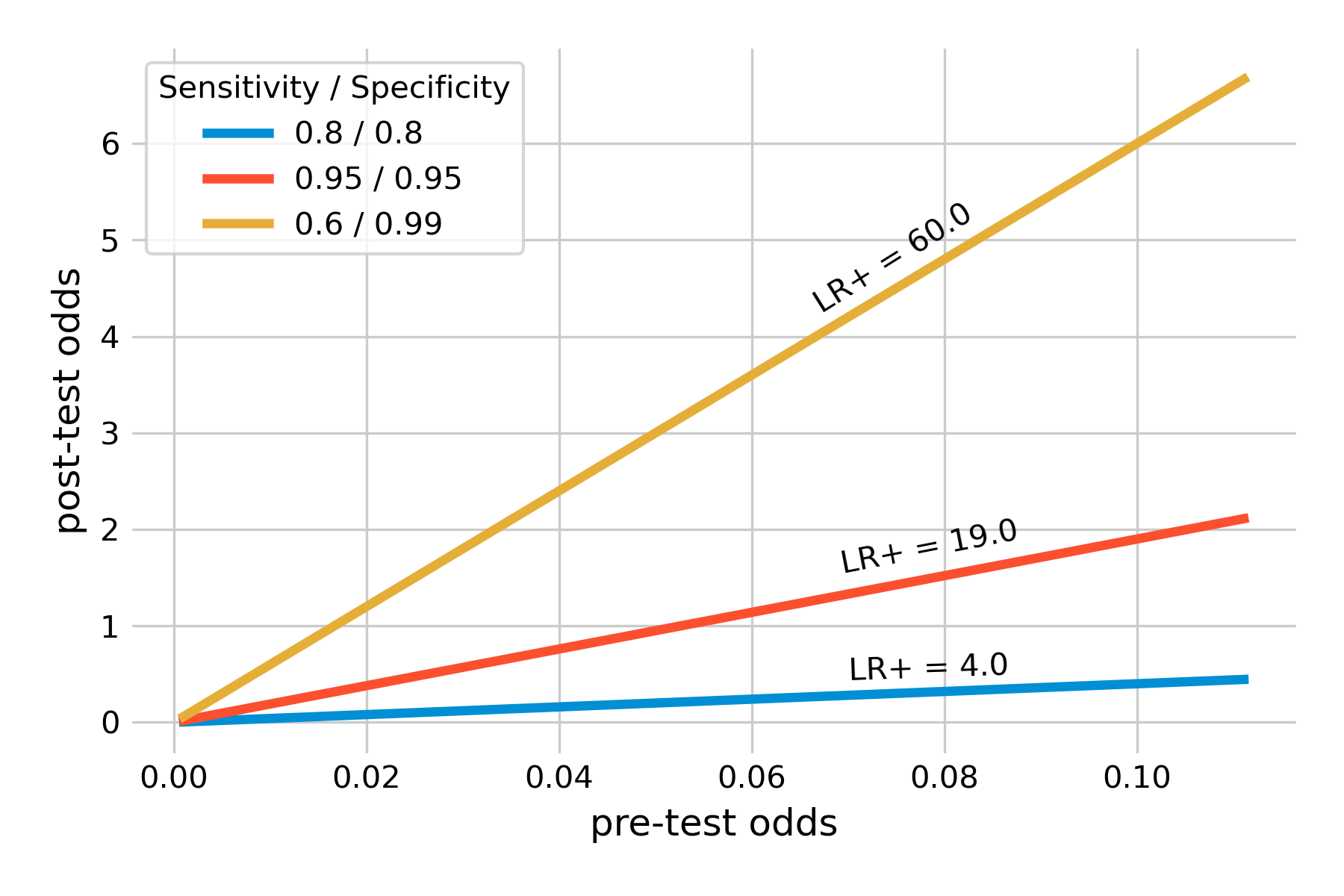
Note in Figure 2.10 how we introduced a highly specific test (specificity 99%) with a sensitivity of only 60%. This is thus a test that produces a lot of false negative results. I am plotting the test for two reasons. First, these values are representative of many SARS-CoV-2 antigen tests (Jegerlehner et al. 2021). Their high specificity means that there are few false positives - a positive test result can thus be taken as a strong signal of a SARS-CoV-2 infection. Their downside is the rather limited sensitivity. This is why public health authorities underline that a negative SARS-CoV-2 antigen test should not be interpreted as a strong and clear signal, as it may be a false negative, particularly with more recent variants such as Omicron (Kritikos et al. 2022). The example also shows that despite the low sensitivity, the positive likelihood is very high, because of the high specificity - not surprisingly, if you recall that the denominator of the positive likelihood ratio formula is \(1 - specificity\). In other words, a positive test substantially increases the pro-test odds, by a factor of 60 from the pre-test odds. Even with relatively low pre-test odds, such a test very strongly indicates an infection.
Another key advantage of likelihood ratios is that they can be defined for different test result values. These so-called multilevel likelihood ratios allow us to express different levels of confidence we have in a test results, depending on the test value. For example, if you look at our example of test results in Figure 2.2, it’s clear that a very low value of the biomarker should give us much more confidence that the disease is absent (and vice versa with very high values and disease presence). Conversely, an intermediate value means a lot of uncertainty in how to interpret the test result. We had to define a cutoff in order to obtain values for sensitivity and specificity. But in doing so, we discarded all the information contained in extremely low and high values. Assigning likelihood ratios at different levels of test results allows us to make use of that information.
2.6 Rule in, rule out
We’ve learned a lot of different concepts that help us to reason about tests, what test results mean, and what they don’t. Even though tests are in principle a simple matter of true or false positive or negative tests, the consequences can often be profound, and somewhat non-intuitive. To simplify things, practitioners have developed a simple rule to help them guide their decision making, which is as follows: “SpPIn, SnNOut”, which stands for “specific, positive, rule in” and “sensitive, negative, rule out”. What it means is that when you have a highly specific test, then you have very few false positives. As a consequence, if you do have a positive result, you can rule in the disease, because there are so few false positives (see for example our discussion about the SARS-CoV-2 antigen tests above). Likewise, when you have a highly sensitive test, then you have very few false negatives. Consequently, if you do have a negative result, you can rule out the disease, because there are so few false negatives.
This rule generally holds well, and we understand why that is the case, given what we just learned in this chapter. But a word of caution is nevertheless necessary. Sensitivity and specificity are evaluated in studies (of which we will learn more in the next chapter), but not all studies are performed under ideal conditions, and some may be biased. Furthermore, as we’ve seen above, likelihood ratios depend on both specificity and sensitivity. A highly specific positive test can have a high positive likelihood ratio, because the denominator for the positive likelihood ratio is \(1 - specificity\). However, the numerator is the sensitivity, and if sensitivity is very low, the positive likelihood ratio can be low as well, even when specificity is high. Thus, ruling in a disease based on high specificity alone should be done very carefully, considering these concerns - specifically if the consequences of a misdiagnosis are severe. The same logic applies to the negative likelihood ratio, and the ruling out of a highly sensitive negative test should equally be done with caution.