6 Spatial Models & Network Models
We’ve seen in the previous chapter how very simple models can give us a tremendous amount of insights into the dynamics of infectious diseases. There is a rich literature on infectious diseases dynamics that build on, and extend, these simple models. Covering this literature would go beyond the scope of this book, but there are two extensions that we want to take a look at. Both of them address the simplifying assumption we’ve made so far that individuals have random contacts with each other. This assumption of homogeneous, random mixing allowed us to keep the models simple, following the logic of mass action in physical and chemical systems. It is clear, however, that we don’t interact with others on a random basis. Our contacts depend instead on where we are, and of the social networks we are embedded in. These two factors will be our focus in this chapter.
6.1 Making models more complex
Before we get started, it’s worth making a more general observation about the level of detail we’d want in a model. Simple models have very clear benefits. Their simplicity makes them relatively easy to understand, and amenable to quantitative analysis that doesn’t require very advanced mathematics. Simple models also have disadvantages. The most obvious one is that they don’t describe reality well, given that they only make very few explicit assumptions. Furthermore, an often overlooked fact is that even though a simple model has only a few parameters, there are many implicit assumptions baked in that are not always appreciated. The assumption about homogenous mixing is a good example: while the model makes no explicit assumption about how contacts come about, it implicitly makes the assumption of random contacts, something that only becomes evident upon closer inspection.
One can therefore be tempted to use ever more detailed, and thus ever more realistic models. But more complex models equally have costs and benefits. The advantage is that more complex models are a more realistic description of the real world. The disadvantage, however, is that they have many more parameters that we can change, which makes the analysis of the full model space increasingly challenging due to the combinatorial explosion of values. Consider for example a model with just three parameters (with values between 0 and 1 for the sake of the argument). If you’d want to understand the system at the resolution of 0.01, you’d have a million (1003) of combinations to consider, something that is feasible computationally even when keeping in mind that we may want hundreds or thousands of repeat runs with the same parameters in case of stochastic models. With 10 parameters, and repeat runs for stochastic simulations, you are already looking at simulation runs that are equal to the number of stars in the known universe (~1023). In other words, a thorough examination of the parameter space very quickly becomes infeasible. And very complex models may have hundreds of parameters.
Thus, we are left with the challenge of finding the ideal middle ground. As Einstein famously noted, a model should be as simple as possible, but not simpler (or, to use his exact words, “It can scarcely be denied that the supreme goal of all theory is to make the irreducible basic elements as simple and as few as possible without having to surrender the adequate representation of a single datum of experience” (Robinson 2018)). A physical map provides the best analogy that I am aware of. The map, a very abstract representation of reality, captures the elements necessary for its purpose - that is, to navigate the space that the map represents. You can of course make more and more detailed maps, at higher and higher resolutions, but at some point, you will begin to realize that the maps become too large, and that the details of the maps stand in the way and are not useful anymore. Finding the ideal middle ground also means deciding on which elements to include. For example, in the previous chapter, we began with the minimal requirements to model infectious disease spread, such as the transmission parameter, and the recovery parameter. If you’d argue that we could have begun with an even simpler model than the SIR model, by ignoring recovery altogether (i.e. start with an SI model), you would of course be absolutely right. I chose the SIR model as a starting point because it is the simplest model to have non-trivial results (e.g. some individuals remain susceptible when the outbreak is over, which isn’t the case in an SI model).
Our goal now will be to add parameters to these simple models, and in doing so, make them more realistic - but only if absolutely necessary. We will be mindful to increasing the complexity in the most minimalistic way possible. For example, as you will see, when we will model space, we will make extremely simplified assumptions about the structure of space, how individuals move in space, and so on. It is important to add one parameter at a time, rather than adding multiple parameters at once. Only by adding one parameter at a time will we understand what the effect of that parameter is on disease dynamics.
6.2 A basic spatial model
As mentioned previously, the infectious disease models developed above assume random mixing, following a mass action approach borrowed from physics and chemistry. In order to model the effect of space, we need to find a way to make some aspects of the model space-dependent. We will start again from the simple SIR model, which has two key processes, disease transmission and recovery. While one may come up with a situation where recovery depends on the location of the individual, it’s rather intuitive that recovery should generally be independent of space. We will thus focus mainly on the disease transmission process.
Disease transmission can happen when two individuals are in contact with each other. The contact, as we’ve seen before, depends on the mode of transmission. Here, we will stick to the assumption of transmission modes that require somewhat close proximity (which is the case for most respiratory diseases). For these diseases, there need to be susceptible individuals nearby an infectious individual for the disease to be passed on. We thus need a concept of spatial proximity. One way to do this would be to think of individuals as having a location in one-dimensional space, along a line. While that would indeed be the most simple way of representing space, it’s much more intuitive - and visually more satisfying - to go straight to two-dimensional models, and to think of individuals as living on a plane defined by x and y coordinates.
We could in principle try to do this with a deterministic approach, in which case we would use partial differential equations. However, this is a good moment to introduce a new type of model, the so-called individual-based model (also called agent-based model). In this model, we are keeping track of every single individual in the population, their location, their states, and their interactions with other individuals. We thus have again a discrete model, similar to the model that used the Gillespie algorithm. But unlike the Gillespie model, where we simply kept track of the number of individuals in each state, the individual-based model that we will develop now will keep track of every single individual.
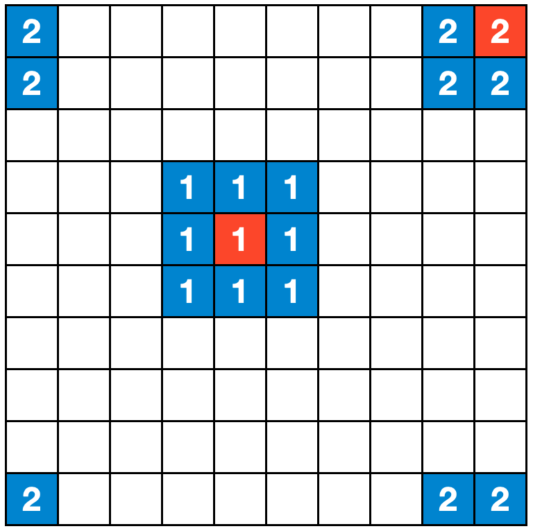
To keep things simple, we will set up a two-dimensional, regular grid, where each grid cell is occupied by one individual. The individuals can be in one of three states, \(S\), \(I\), or \(R\), which correspond to the same states as in the original SIR model described in Chapter 5. We assume for further simplicity that individuals don’t move. We now need to define how individuals interact with each other. The most simple rule we can come up with is that each cell interacts with its 8 neighboring cells, and thus each individual has 8 contacts along which a disease can be transmitted. To make sure we don’t run into any strange border phenomena, we will set up the space such that a cell at the border of the grid has direct neighbors on the other side of the grid - i.e. if you would try and exit the grid by crossing the border on the right side, you would immediately enter the grid at the border on the left side. The same logic applies to the horizontal borders (Figure 6.1).
We are now in a position to set up our model. There is an individual in each cell, and initially , all individuals are susceptible. Next, we randomly select an individual to be infectious. We are now ready to start the simulation. The logic is straightforward. Each infected individual infects their susceptible neighbors with probability \(β\), and recovers with probability \(𝛾\).
Practically speaking, if we implement this in code, then in each timestep, we go through each individual, and check its state. If the state is \(I\), we go through each of the eight neighboring individuals. If a neighboring individual’s state is \(S\), we temporarily set it to \(I_{temp}\) with probability \(β\). Having gone through all the neighboring individuals, we set the state of the current individual to \(R\) with probability \(𝛾\). At the end, after having gone through each individual, we’ll set the state of all individuals who have a temporary state \(I_{temp}\) to \(I\), and discard all temporary states. The reason why we use temporary states is to avoid changing states in the middle of a timestep iteration that could accidentally percolate across cells. In an extreme case, a single individual could infect a neighbor, who would at their turn infect their neighbor, who would at their turn infect their neighbor, and so on, which is not what we want.
In what follows, we will use a transmission rate of \(β = \frac{0.25}{8} = 0.03125\) per contact per timestep, and a recovery rate of \(𝛾 = 0.1\). We’ll assume a timestep to correspond to one day. Given 8 contacts, this should correspond to an R0 of 2.5, and thus generate similar dynamics to the non-spatial SIR from the previous chapter. However, we quickly realize that all of the outbreaks fizzle out, rather than infecting most individuals on the grid (Figure 6.2). Why is that?

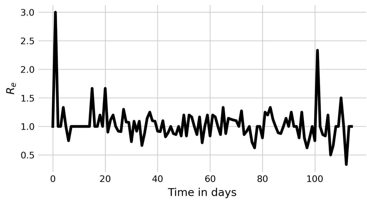
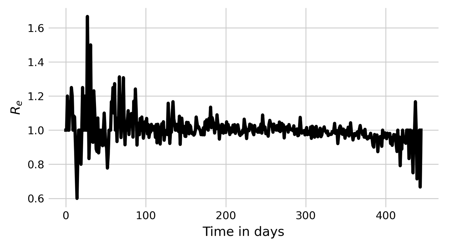
If we look at the pattern by which a spatial outbreak expands, the reason becomes clear. While the initial individual is surrounded by 8 susceptible individuals, the new cases are not surrounded by 8 susceptible individuals anymore, but are neighbors to other infected or recovered individuals. In a deterministic spatial model, the outbreak would expand in a circular fashion, and the outbreak would grow at the edge of the expanding circle. In the non-spatial model, infected individuals are in contact with a practically fully susceptible population, and Re will thus decrease only slowly (see black line in Figure 6.3). In contrast, the number of individuals that an infected individual can potentially infect in the spatial model is severely constrained by its local neighborhood, where many individuals are already infected or recovered. We can measure Re by calculating \(\frac{I_t}{I_{t-1}}\). The results are shown in Figure 6.3. Indeed, we can see that Re hovers more or less around 1 all the time, with a slight tendency to be larger than 1. The outbreak is thus consistently on the verge of dying out, which finally happens at day 117.
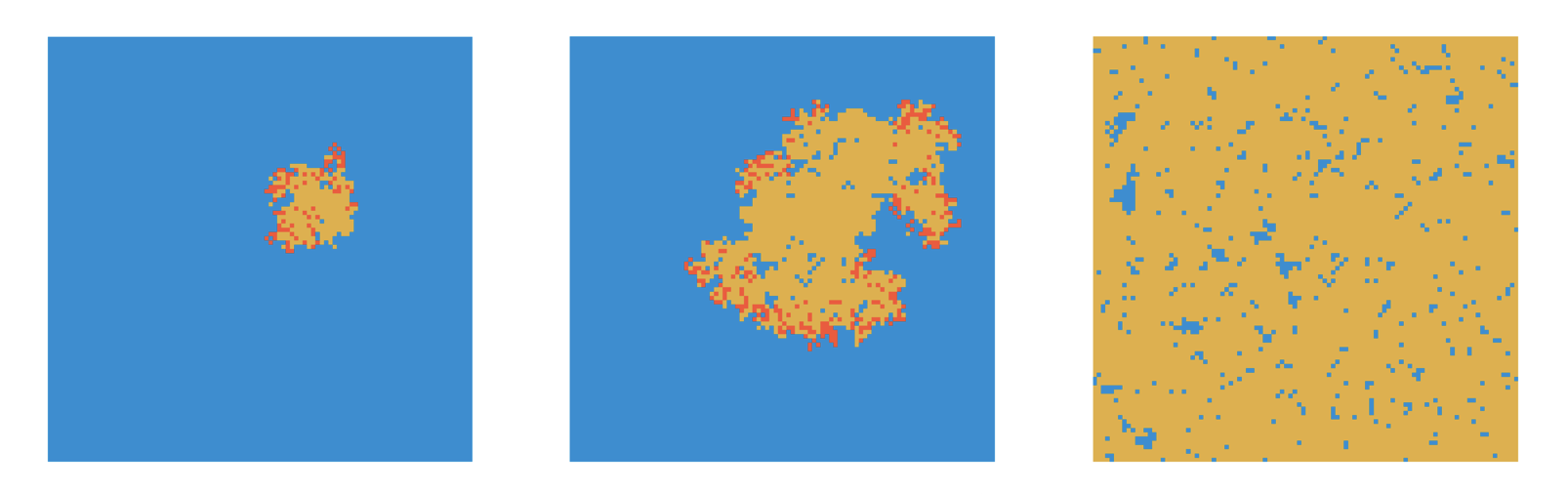
When we increase \(β\) to 0.05, we can observe very different dynamics. Now, the outbreak quickly grows, and keeps growing on the edges (Figure 6.4).
We can once again plot Rs of this outbreak (Figure 6.5), and note again that Re keeps hovering above 1. However, in this case, Re appears to be high enough so that the fate of the stochastic die-out can be avoided.
Also note that due to the limited growth potential - constrained by the local neighborhood - we won’t see the rapid exponential growth in infections as we do in the nonspatial model (contrast Figure 6.6 with Figure 5.2). The growth is more linear, and the outbreaks take longer.
_spatial.png)
6.3 Nonspatial dynamics in a spatial world
When developing spatial models, it is often important to compare their outcomes to those from nonspatial models, in order to understand the effect of space. Because each modeling approach makes slightly different assumptions, it would be very useful to be able to compare these two scenarios, spatial vs nonspatial, without having to switch between modeling approaches.
Luckily, we can “trick” the spatial model into simulating a nonspatial process. The trick consists in keeping the spatial set up with the grid, but to randomize those aspects where location matters. In our simple SIR setup here, the only part where location matters is in the contacts, which are limited to neighboring cells. Thus, if we want to simulate “nonspatial” dynamics within our spatial setup, we simply need to redefine the eight neighbors to be randomly chosen cells in the grid. When we do that, all aspects of the model become independent of location - even though every individual has a specific location.
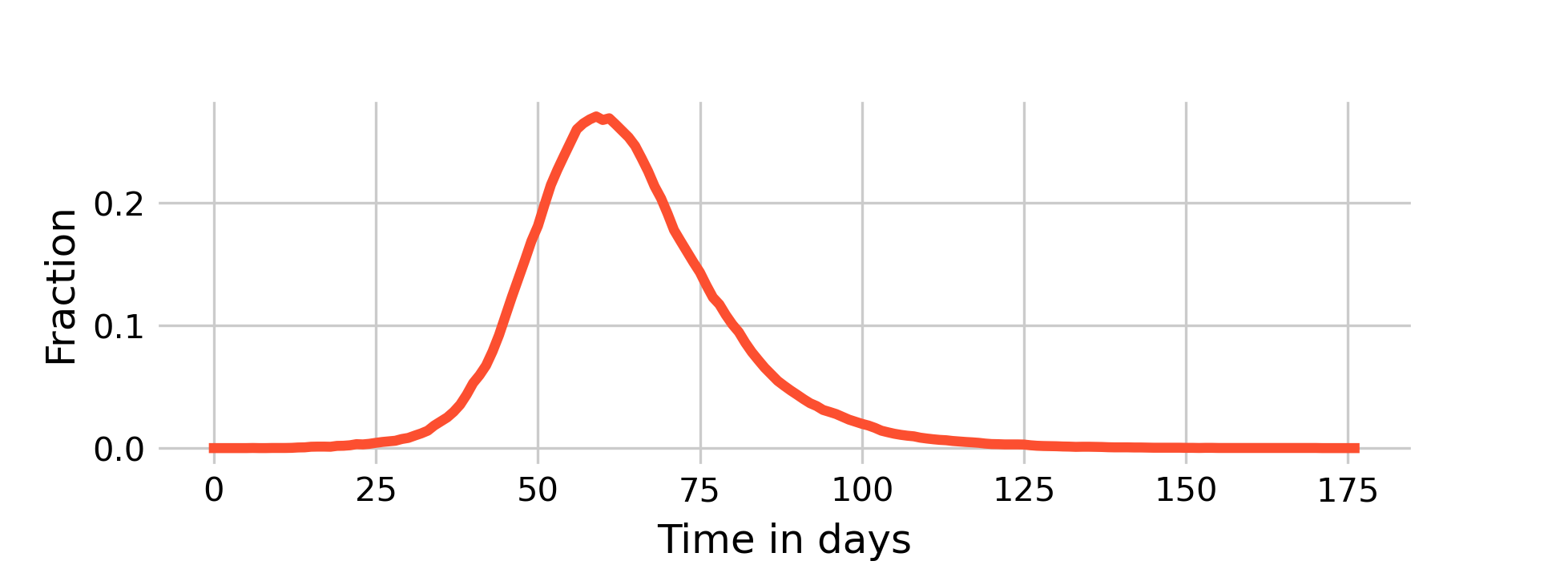
Plotting the dynamics of \(I(t)\) on a grid of size \(N = 10,000\) with nonspatial (i.e. random) contacts, \(β = 0.03125\) and \(𝛾 = 0.1\) (i.e. an R0 of 2.5 given 8 contacts), it is quite clearly visible (Figure 6.7) how closely the dynamics resemble those of the deterministic, nonspatial basic SIR model from Chapter 5 shown in Figure 5.2. The peak of \(I(t)\) is about 24%, at around day 65. By day 120, the outbreak is largely over.
As we can see above in Figure 6.6, the dynamics of a fully spatial model - with even higher \(β\) - are much, much slower.
We will now turn to an intermediary model, which reflects human reality more accurately. While it is true that most of our interactions occur in our local neighborhoods (of which we have many, for example at work, at home, in school, etc.), it is also true that through travel, we occasionally interact with people in other neighborhoods. We are going to implement this idea by returning to our original implementation of eight neighboring grid cells, but by replacing a local neighboring contact with a random contact anywhere on the grid with probability \(p\).
If we use the values above (\(β = 0.03125\) and \(𝛾 = 0.1\)) which rarely lead to large outbreaks under the fully spatial model (\(p = 0\), see Figure 6.2), and add a 1% chance of occasional transmissions randomly anywhere in space, we can observe a new phenomenon of disease dynamics (Figure 6.8).
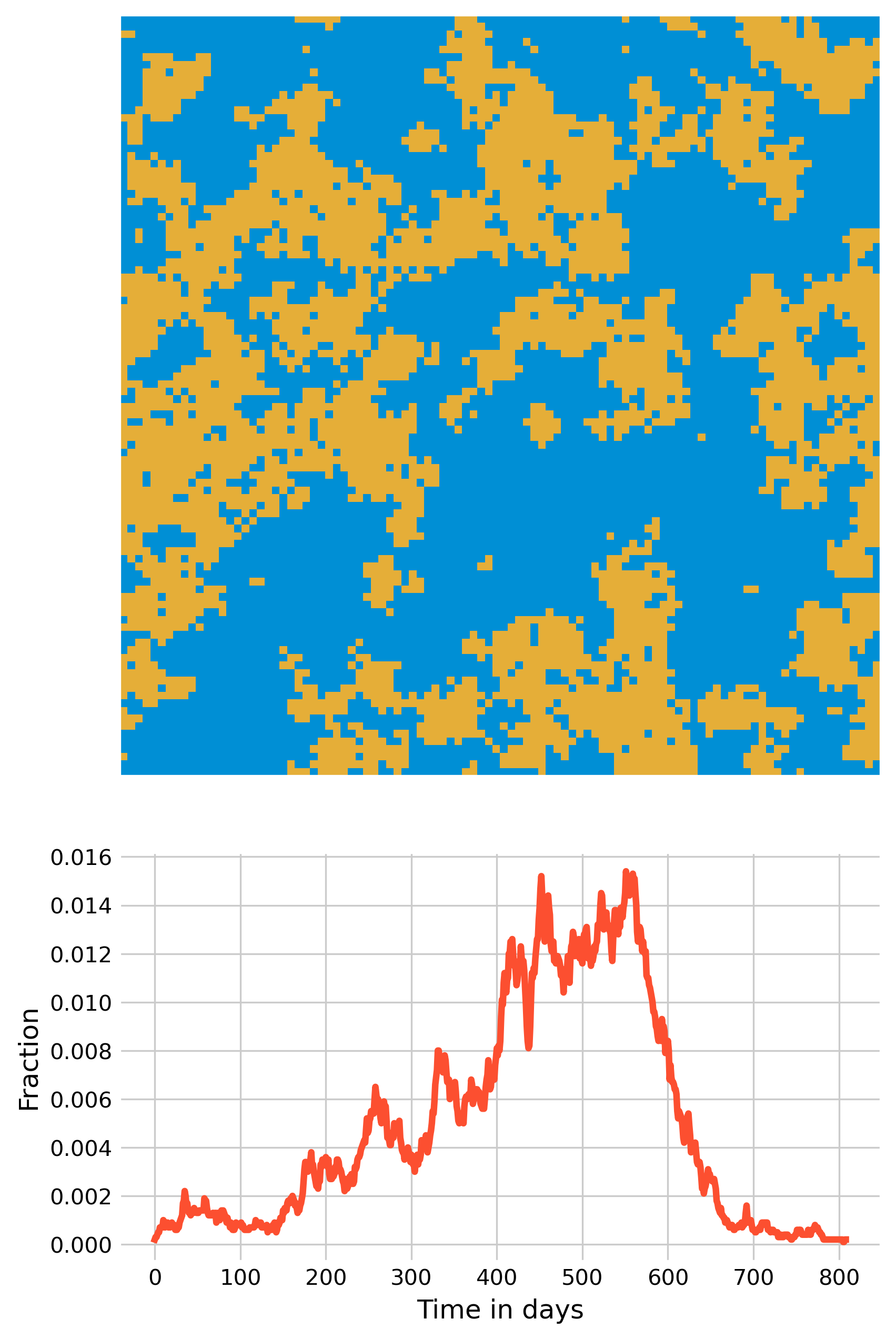
Now, multiple smaller outbreaks can form, which on their own will all die out eventually, but as long as they manage to each spark at least one new small outbreak elsewhere, the overall epidemic can continue for quite some time - the outbreak shown in Figure 6.8 lasts over 2 years. It’s quite remarkable what a few transmissions across space can do.
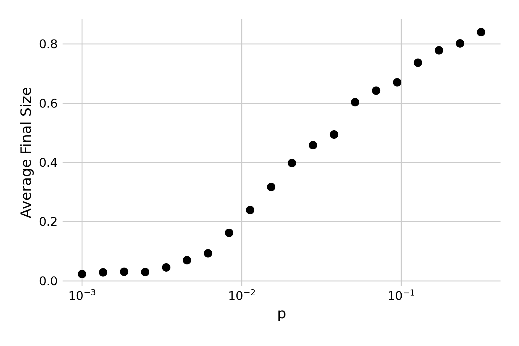
If we increase \(p\), the rate of newly seeded outbreaks will increase correspondingly. Indeed, we can plot the effect of \(p\) on the average outbreak size, and see that there is a continuous increase in the final size of the outbreak (Figure 6.9).
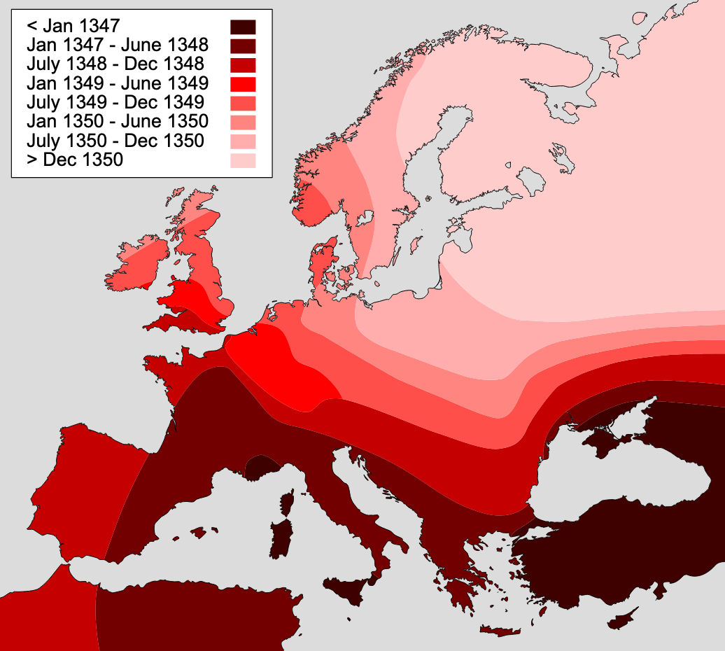
We can thus see the enormous effect of long-distance infections, which could correspond to importations due to travel. One could reasonably ask whether it makes sense to model space without long-distance jumps, as travel is frequent - before the COVID-19 pandemic, the world was approaching 40 million domestic and international flights per year. However, the models developed here can of course also be applied to other animal species, as well as plant species. In addition, it’s worthwhile recalling that widespread long distance travel is still a relatively new phenomenon. If we go back a few centuries, to when diseases like the plague would wipe out large parts of the population, long-distance travel was rather limited, and extremely slow. Correspondingly, infectious diseases would spread in a wave-like fashion, similar to what we see in the spatial models without any long-distance jumps. The map for the spread of the plague across Europe in the 14th century is particularly illuminating in this regard (Figure 6.10).
6.4 Metapopulations
A metapopulation model is a model of a group of subpopulations that are connected to one another through migration. In some sense, the metapopulation model is trying to find a middle ground between the fully mixed model (like the deterministic SIR model in the previous chapter, or the spatial model above with p = 1) and the fully spatial model. It starts with the view that some spatial structure needs to be taken into account, but at the level of groups rather than at the level of individuals. It divides populations into subpopulations, within which the homogenous mixing assumption is a sufficient approximation, and then connects these subpopulations to one another by migration. This way, subpopulations experience a constant in- and outflow of susceptible, infected, or recovered individuals.
Metapopulation models have had their origins in ecology, where they have become an important conceptual tool. In infectious diseases, metapopulations have successfully been applied to a number of diseases, perhaps most notably to measles. We have briefly discussed pre-vaccine measles dynamics in Chapter 4, where we noticed that in populations smaller than a critical community size, measles will spread so fast through the population that it will locally exhaust all susceptible individuals, and thus go extinct. Over the years, the number of susceptible individuals will slowly increase through births until the pool of susceptibles in large enough for even a single imported case to spark a new local outbreak.
Such dynamics can be modeled with a metapopulaion approach, where cities, towns, and villages are subpopulations connected through transportation, creating migration flows between the subpopulations. Modeling has shown that a “gravity model”, which assumes that migration flows depend on distance between subpopulations as well as their population sizes, can capture all the spatiotemporal dynamics of prevaccination measles epidemics in England and Wales (Xia, Bjørnstad, and Grenfell 2004). Epidemic waves spread from large cities to smaller towns, highlighting the importance of “core-satellite” structures, where a few large cities (cores) above the critical community size serve as a constant source to spark new outbreaks in smaller communities (satellites) (Grenfell, Bjørnstad, and Kappey 2001).
The utility of the metapopulation approach is not limited to measles, or measles-like diseases. For example, the approach has been used to demonstrate that in the US, seasonal influenza shows regional spatial spread that correlates closely with movement rates from and to workplaces, which is well described by a gravity model (Viboud et al. 2006). Similarly, metapopulation models were used frequently to model the spread of SARS-CoV-2. One study used mobile-phone geolocation data from 98 million people in the US, overlaying a metapopulation SEIR model (Chang et al. 2021). This digital epidemiology approach showed, among other things, that disadvantaged socioeconomic groups could not reduce their mobility sufficiently, explaining their disproportionally high infection rates. Another metapopulation SEIR model simulated the transmission of SARS-CoV-2 among 3142 US counties, assuming both work commuting and random movement (Pei, Kandula, and Shaman 2020). Metapopulation approaches are quite common in infectious disease models, and digital data sources are increasingly used to parameterize the migration flows.
6.5 A first network model
Spatial models take into account the fact that our contacts are not random, but depend on location, i.e. where we are. Network models take into account that they also depend on the social structure we’re embedded in. But network models go beyond that. Fundamentally, every population structure can be modeled with a network.
Before we get to that, let’s introduce some basic networking concepts. We can represent a network as a graph, which consists of a set of nodes (or vertices) that can be connected to one another by edges (or arcs). The edges can be directional, i.e. going from node A to node B, but not in the other direction, or non-directional. The latter is common when modeling infectious diseases, where nodes represent individuals, and edges represent the contacts relevant to infectious disease spread between them. The number of nodes any given node is connected to is called the node’s degree. The number of edges between any two nodes in the network is called the path length, and a common task in networks is finding the shortest path. The average path length of a network is the average of the shortest path of all possible node pairs in the network.
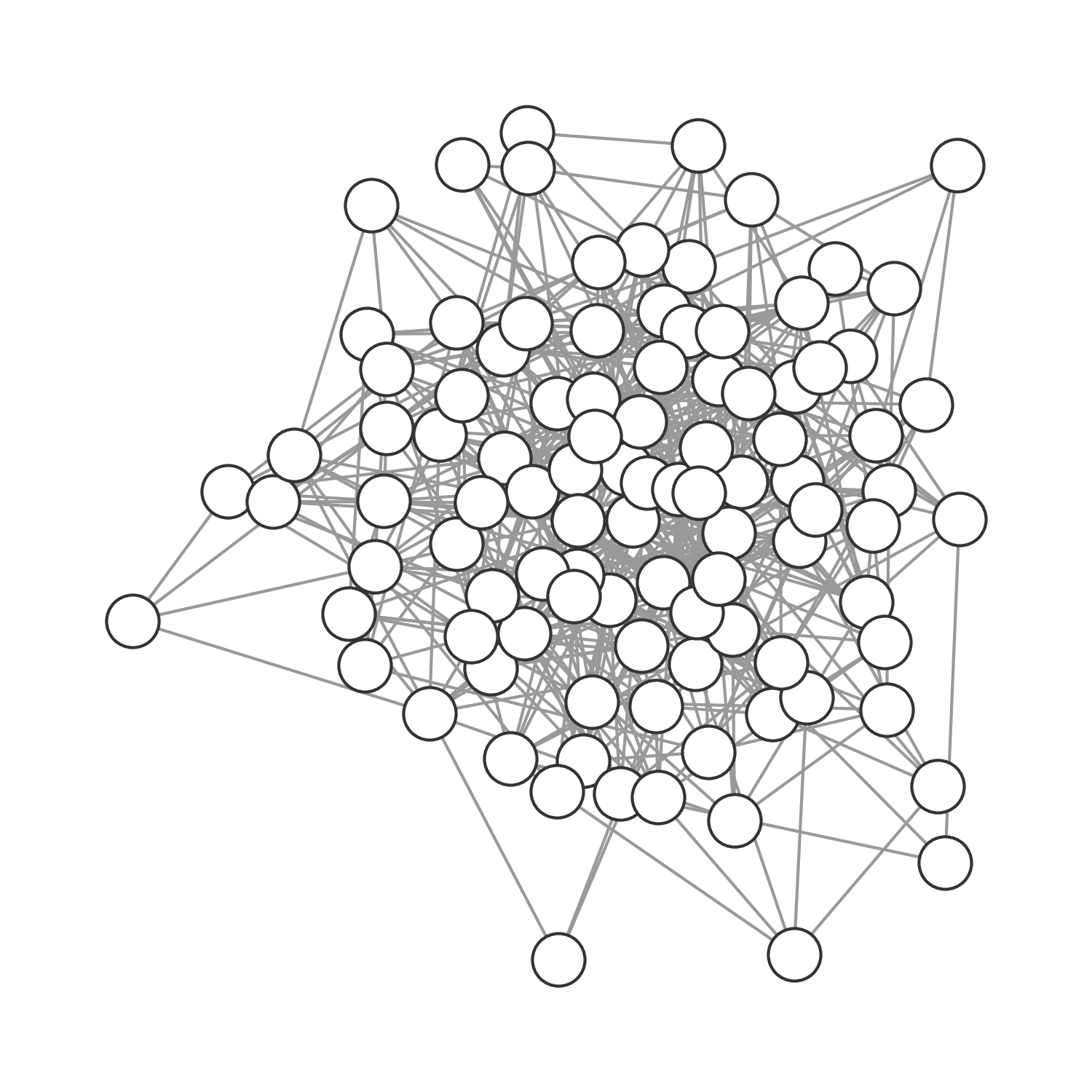
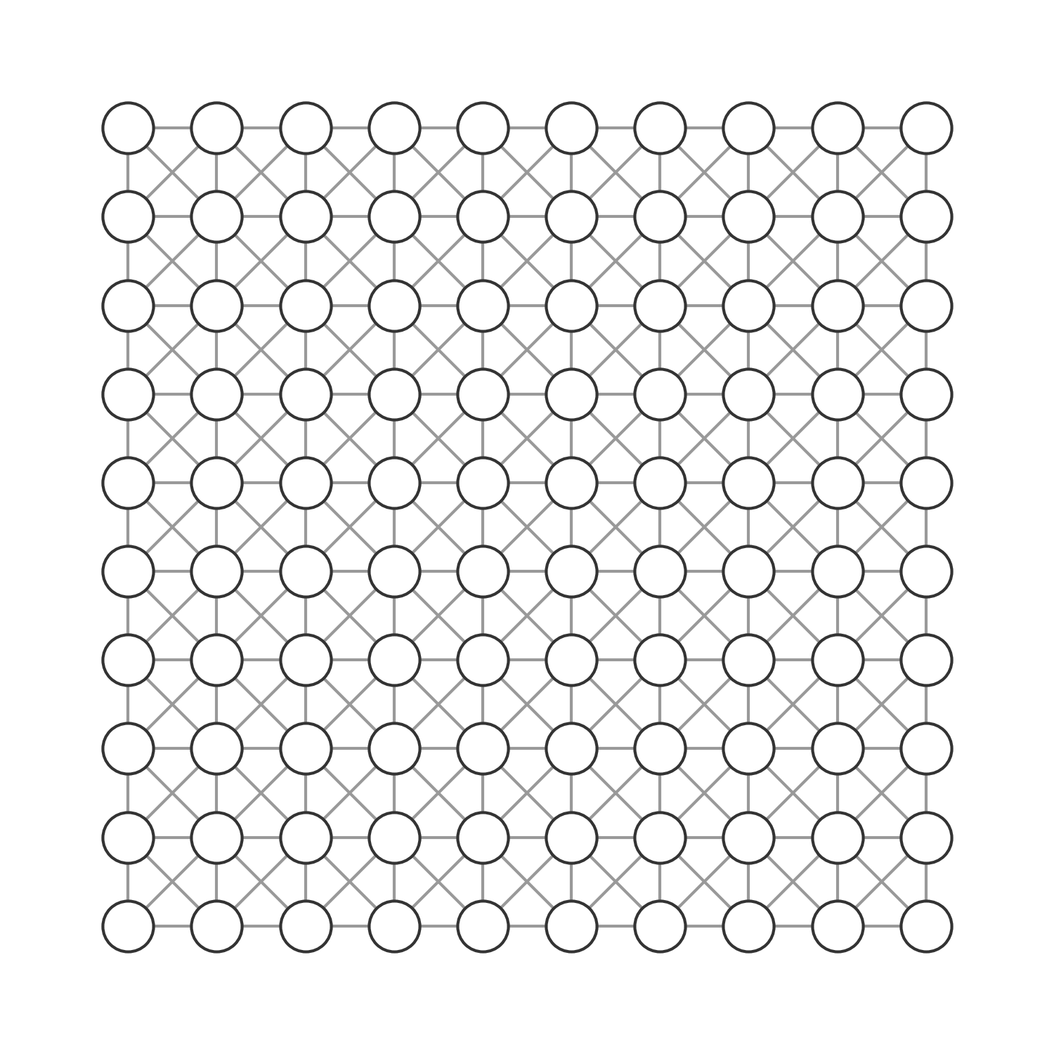
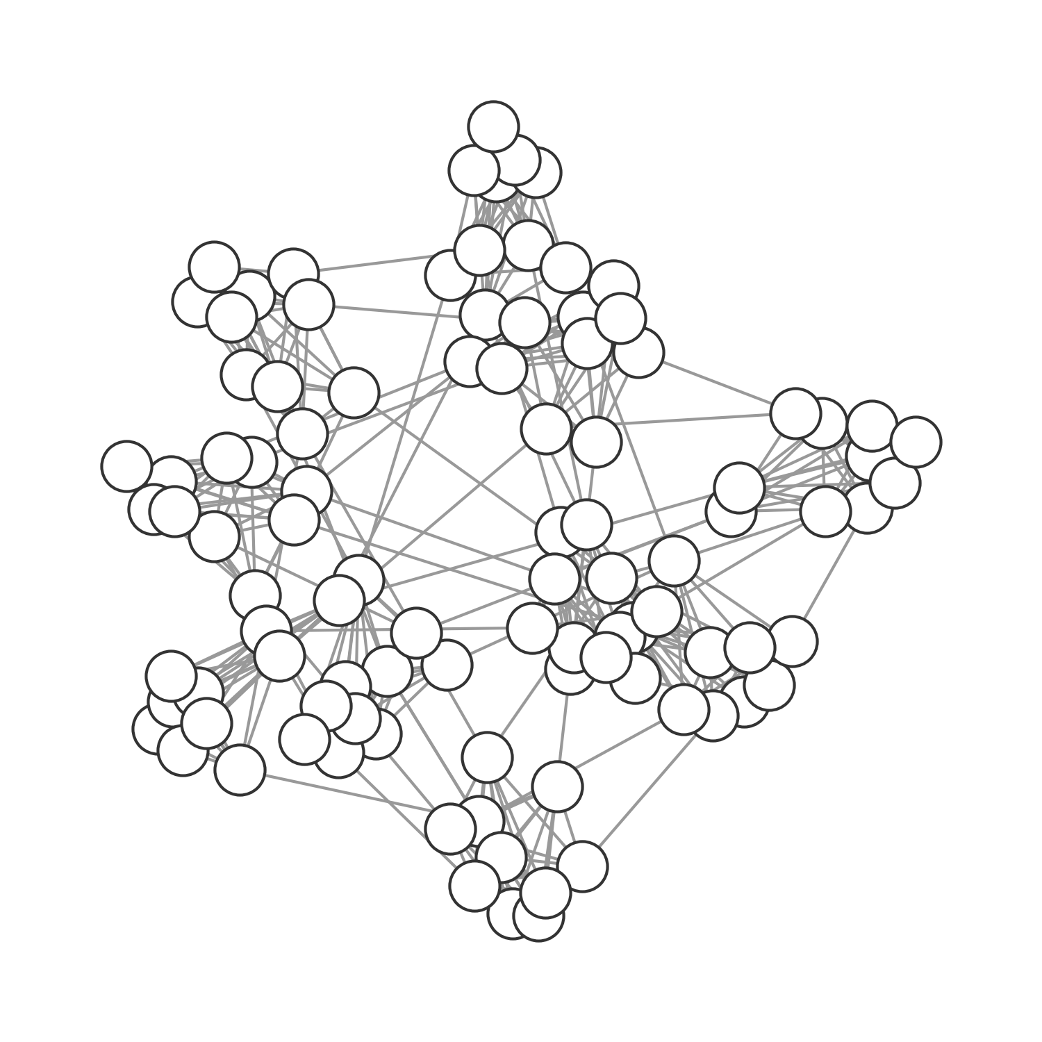
It’s easy to see that we can use the network approach to model all population structures assumed so far (implicitly or explicitly). In the previous chapter, our deterministic models made an implication assumption of random, homogenous mixing. In other words, everybody had the same average number of contacts, and those contacts were random. We could model this assumption explicitly by using a random graph, where nodes are randomly connected (Figure 6.12). In the spatial model above, we connected the individuals (grid cells) in the grid through each other either by direct proximity (see Figure 6.13), or randomly if \(p > 0\). We can model this assumption as a graph, where the nodes span a grid and have occasional random connections. Finally, we can model any structure as a graph, including those that represent social structures (Figure 6.14).
Beyond the conceptual utility of networks that allows us to model any kind of population structure, network structures are useful because they can quite drastically affect disease dynamics. In what follows, we will look at two classes of network structures that have been well described in the past two decades, and that are relevant for a number of social structures: small-world networks, and fat-tailed networks.
6.6 Small-world networks
The small-world phenomenon describes the observation that humans are separated by only a few degrees of separation (often referred to as “six degrees of separation”). This remarkable idea was first experimentally assessed by a research study in the 1960ies now known as Milgram’s experiment (Travers and Milgram 1977), where random people were sent a letter, asking them if they knew a target person in Boston, and if so, to forward them the letter. In the more likely case where they did not know the person, they were asked to forward the letter with their name to a friend who might be more likely to know the target person. Among the letters that arrived at the target destination, the average path length from the origin was about six.
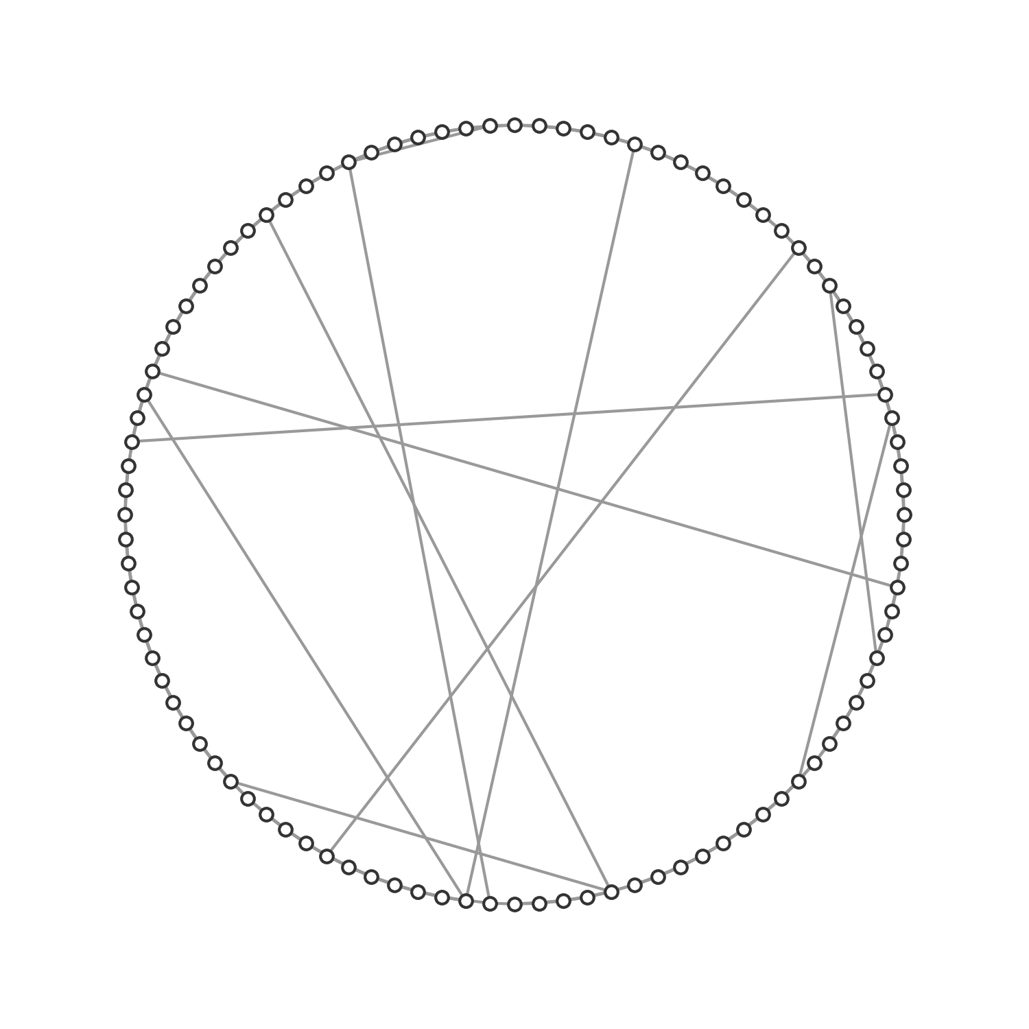
The structural network underlying this phenomenon was described formally in a seminal paper by Watts and Strogatz (1998). The paper introduced a model (now known as the Watts-Strogatz model) to generate small-world graphs by starting with a ring network of n vertices that are each connected to its \(k\) nearest neighbors. Each edge is rewired randomly with probability \(p\). Thus, with \(p = 0\), we obtain a regular, lattice-like ring structure; with \(p = 1\), we obtain a random graph. With \(0 < p < 1\), we obtain a small-world network, which is “highly clustered like a regular graph, yet with small characteristic path length, like a random graph” (Figure 6.15).
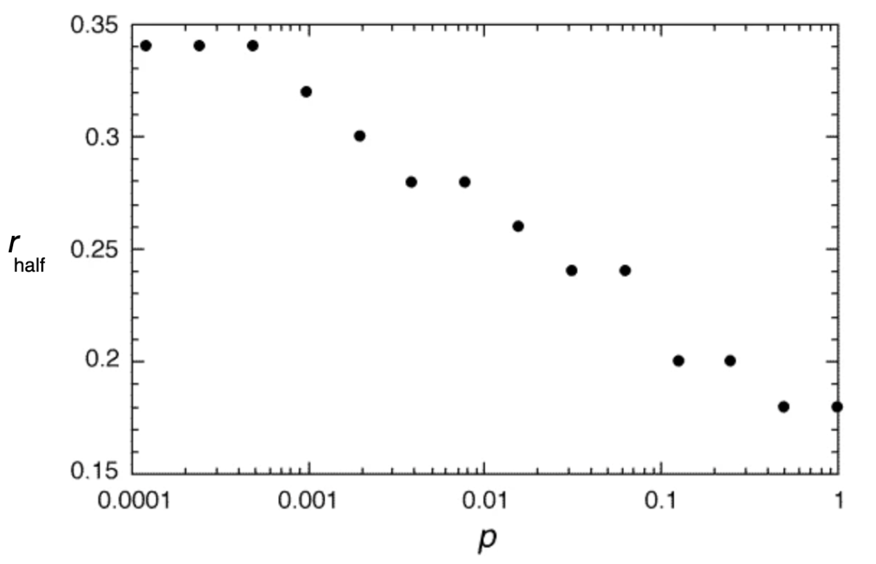
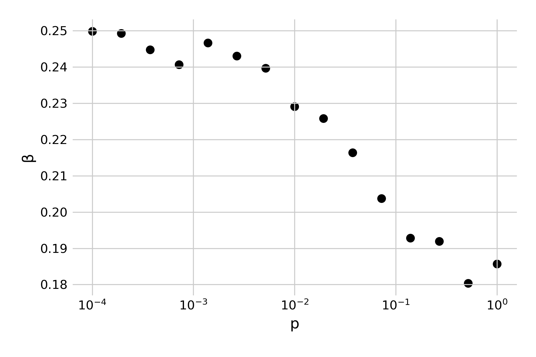
Structurally, the generated graphs are largely identical to the grids from our spatial model from above, where we set up the grid as a two-dimensional lattice, connected each cell to its eight nearest neighbors, and introduced random connections at a rate \(p\). Indeed, we can confirm this by noting that the 1998 paper specifically highlights the role of small-world networks on infectious disease dynamics. It develops a simple SIR model with a recovery rate of \(𝛾 = 1\), and asks what value \(β\) should be in order for a single infected individual to cause an outbreak that infects at least half of the network (Figure 6.16). Note that in the paper, \(β\) is described as \(r\), in that “each infective individual can infect each of its healthy neighbors with probability r”). If we use our spatial model with random rewiring developed above, we can reproduce those results by running a number of independent simulations under different assumptions of \(p\), and randomly vary \(β\). Figure 6.17 shows the minimum number of \(β\) for a given \(p\) where the final epidemic size was at least half of the population.
We have already made a similar observation before, in Figure 6.9, noting how the final size of an epidemic was crucially influenced by the rate of random rewirings. The small-world model provides a structural explanation: random rewirings substantially reduce the average path length in the network, and thus even just a few such rewirings (or long-distance jumps) can distribute an infectious disease outbreak very rapidly all over the network.
The small-world network structure allows us to reflect on another property of the network that is highly relevant to infectious disease spread: that of clustering. Clustering refers to the extent that nodes connected to a given node are connected among themselves. From a social perspective, it asks to what extent your friends are also friends of each other. Watts & Strogatz define the local clustering coefficient of a node as the fraction of realized connections relative to the possible connections among neighboring nodes. For example, if node A is connected to nodes B, C, and D, then there could be three possible connections among the connected nodes (B-C, B-D, and C-D). If all these connections exist, the local clustering coefficient of the node is 1, if none exists it is 0. The global clustering coefficient, or the clustering coefficient of the network, is simply the average of the local clustering coefficient of all nodes.
The reason why that is important for infectious disease spread is that high clustering means that locally, susceptible nodes quickly get depleted. This is exactly the phenomenon we described when we first analyzed why spatial infectious disease spread is slower and less forceful than nonspatial disease spread. We noticed above that the contacts an infected individual can infect in a spatial model are severely constrained by its local neighborhood, where many individuals may already have been infected or recovered. The clustering coefficient provides us with a quantitative measure of this phenomenon. It is therefore interesting to measure the clustering coefficient of different network types. Random networks have low clustering coefficients. The network shown in Figure 6.12 has a clustering coefficient of 0.113. In other words, on average, there is an 11.3% chance that two nodes that are connected to a given node are also connected among themselves. The spatial grid network shown in Figure 6.13 has a clustering coefficient of 0.506. Regular lattices generally have high clustering coefficients. The social graph shown in Figure 6.14 with many densely connected cliques has an even higher clustering coefficient of 0.732. Friendship networks very often have high clustering coefficients, because someone’s friends are likely to be friends with each other. Cliques are highly connected groups with a very high clustering coefficient. Finally, the small-world network shown in Figure 6.15 has a clustering coefficient of 0.444. This is still relatively high, reflecting the regular-lattice-like structure. At the same time, thanks to the random connections, the average path length is short, making disease outbreaks much more likely, and more explosive, than in purely spatial networks.
6.7 Fat-tailed networks
Shortly after the Watts & Strogatz paper, another seminal paper appeared that rocked the network world for good. The paper, by Barabási and Albert (1999), argued that in most complex networks, “the probability P(k) that a vertex in the network interacts with k other vertices decays as a power law, following P(k) ~ k-𝛾”, with an exponent \(𝛾\) typically between 2 and 4. These networks were referred to as scale-free networks because their degree distribution is scale-invariant. Plotting the degree distribution on a log-log scale would show a straight line, meaning that the majority of nodes would have a relatively low degree, but a few nodes would have a very high degree (Figure 6.18). This is a key distinction from all the other networks we discussed so far, which all have fairly narrow degree distributions, i.e. all nodes have roughly the same number of neighbors. The paper also proposed a mechanism by which these networks can be generated, called the preferential attachment mechanism, where, in a growing network, nodes preferentially attach to well connected nodes (i.e. the probability that a new node will attach to an existing node depends on the degree of the existing node in the network).
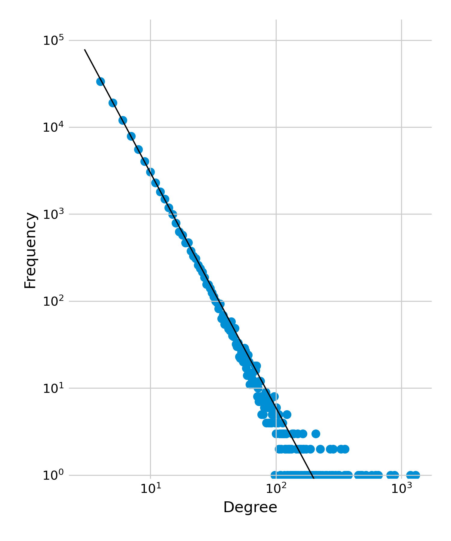
Today, we know that strictly scale-free networks are relatively rare (Broido and Clauset 2019). However, many networks show a fat-tailed degree distribution, where most nodes have few connections, but a few nodes have many connections (these distributions can also be described with a log-normal or exponential distribution). This phenomenon is very important for infectious disease dynamics, in that the degree distribution affects R0. We noticed in a previous chapter that the correction estimate for R0 is \(R_0 = rk(1 + CV^2)\), where \(r\) is the probability of transmission (over the entire infectious period) per contact, \(k\) is the average node degree, and \(CV\) is the coefficient of variation of the degree distribution. Thus, the critical quantity is the coefficient of variation, i.e. the standard deviation divided by the mean.
The network plotted in Figure 6.18 has a mean of 8, but a standard deviation of = 13.3. The coefficient of variation \(CV\) is thus 1.66, and the correcting factor \((1 + CV^2) = 3.76\). This means that if we would estimate R0 based solely on the mean degree, not considering the variation around that mean, we’d underestimate it by almost factor 4, which is enormous. Even in a network with an exponential distribution - which also has a fat tail, but not as extreme - where the \(CV\) is 1, we would underestimate R0 by factor 2 if we ignored the variance of the degree.
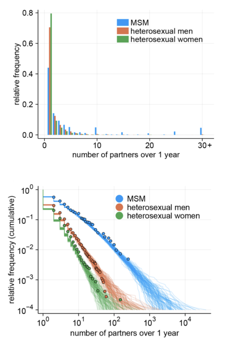
Networks with fat-tailed distributions can be particularly important in sexual contact networks, where most individuals have a relatively small number of sex partners, while a few individuals (such as sex workers) may have an enormous number of sexual contacts. As the high degree variance leads to large increases in R0, this poses challenges to the control of the disease on such contact networks. Recent work (Endo et al. 2022) during the mpox outbreak of 2022 demonstrated how the fat-tailed distribution in the sexual contact network of men who have sex with men (MSM, Figure 6.19) could explain the sustained growth of the disease, despite previous estimates of \(R_0 < 1\). Luckily, the highly connected nodes that drive the increase in R0 also provide a solution, in that they are ideal targets for vaccination (or other protection) campaigns. It is intuitive that in a network where all nodes have roughly the same number of contacts, prioritized vaccination based on the node degree alone may not make a big difference. However, in networks where some nodes have a very high number of contacts, focusing on those nodes early on can have quite dramatic epidemiological consequences.
This phenomenon was first observed in a study on error tolerance and attack vulnerability in scale-free networks (Albert, Jeong, and Barabási 2000). Thinking about networks as functional structures, we can imagine attacks on nodes resulting in nodes effectively being removed from the network, which may disturb the functioning of the network. Looking from the perspective of disease dynamics, we note that giving nodes sterilizing immunity through vaccination is a kind of attack on the network (the good kind!), effectively removing nodes from the contact network, as immune nodes cannot transmit the infection anymore. Removing highly connected nodes in this way breaks the contact network apart into many smaller sub-networks, such that an outbreak in one part of the network cannot easily - or at all - spread to other parts of the network.
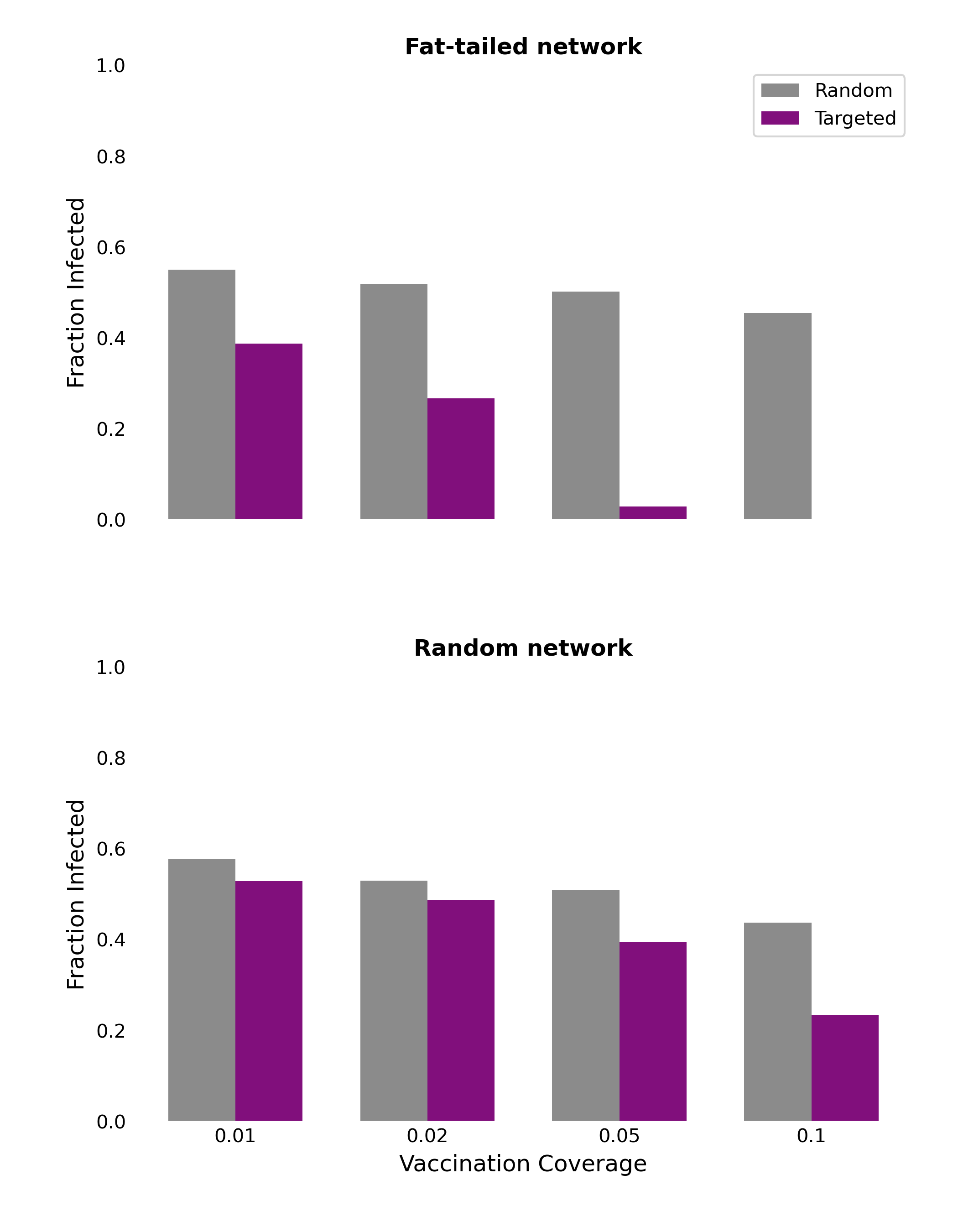
We can demonstrate this effect by comparing disease dynamics on different network structures. To do this, we can simulate the spread of a disease - following the SIR model - along the edges of the network, starting from a single, randomly chosen, infected individual. Once the network has no more infected individuals, we can count the total number of recovered individuals, giving us the final epidemic size. In order to simulate vaccination, we simply select certain nodes in the network to be vaccinated before the spread of the disease, by setting their status to “recovered” before the epidemic begins. When we calculate the final epidemic size, we then simply have to subtract the number of vaccinated individuals from the total count of recovered individuals. This will give us the total number of individuals infected by the disease.
Figure 6.20 shows the results on two types of networks: the fat-tailed networks generated through a preferential attachment algorithm, and random networks. All networks are of size \(N = 5,000\) and have an average degree of 4. The vaccination coverage is relatively low, between 1% and 10%, and we compare two vaccination strategies, random and targeted. Random vaccination simply means that nodes are chosen at random to be vaccinated. Targeted vaccination means that we target those nodes that have the highest degree. We can see clearly that targeting vaccination according to degree - i.e. vaccinating high-contact nodes first - can have a dramatic effect on the final epidemic size in the fat-tailed networks. The effect is already quite strong at 1% and 2% vaccination coverage; at 5%, the average final size is substantially reduced, and at 10%, it has all but disappeared. This is markedly different in the random networks, where these low vaccination rates do have some impact, but not as dramatic as in the fat-tailed networks. These results highlight the importance of focusing public health measures on high-contact individuals.