5 Modeling Infectious Diseases
In the past chapter, we’ve learned some of the basic concepts of disease epidemiology. As we’ve seen, there are numerous factors that can influence the emergence, the spread, and the potential control of infectious diseases. In order to understand the dynamics of infectious disease spread, we now need to turn to models, as we clearly cannot experiment with epidemiological dynamics in empirical studies.
Epidemiological models have a long history. One of the first published models on infectious diseases is by the famous Swiss mathematician Daniel Bernoulli. In 1766, he published a paper on the effects of variolation against smallpox on gained life expectancy (see Bernoulli and Blower (2004)). More than 150 years later, Ross & Hudson (Ross 1916; Ross and Hudson 1917), and Kermack and McKendrick (Kermack and McKendrick 1927), developed the foundational mathematical models of infectious disease dynamics by describing the dynamics of people moving from a susceptible (S) to an infected (I) state, and from there to either recovery or removal, i.e. death (R). These so-called SIR models are still the basis of an enormously rich literature on models of infectious disease dynamics. In the past few decades, such models have become increasingly complex, and have begun to be implemented using computers. Today, complex computational models simulating the entire globe including population movements between and within countries are increasingly common, but not yet widely used in public health practice. Computational models have become standard tools in practically any other prediction scenario (e.g. meteorology), and their widespread use in public health is but a matter of time. Indeed, the COVID-19 pandemic has substantially accelerated the use of such models in public health practice.
Complex models have, by definition, numerous assumptions built in, and thus model outcomes can strongly depend on these assumptions. In addition, as opposed to meteorology, for example, infectious disease dynamics is not a purely physical process, but very much a biological process with a lot of additional psychological factors playing a critical role. Modeling the long-term dynamics of human behavior is not easy, and a key difficulty is that we often do not know the values for the model parameters. We will later see how new digital data streams can potentially help address these problems.
In the following chapter, our key concern will be to develop a basic understanding of the SIR model, and variants thereof. Our goal will be to derive some key insights using these simple models.
5.1 The basic SIR model
The basic SIR model is a so-called compartmental model, where every individual in a population is assumed to be in one of three compartments:
\(S\): Susceptible individuals. These are individuals who have not been exposed to the disease yet, or have lost any immunity against it.
\(I\): Infected individuals. These are individuals that have been infected with the pathogen, and can transmit it to other, susceptible individuals (i.e. they are infectious).
\(R\): Recovered (or removed) individuals. These are individuals who have recovered from the disease, after having been affected. They cannot be infected anymore due to immunity. Alternatively, the individuals have died of the disease. In either case, from the perspective of disease dynamics, they haven removed from the system.
Individuals can move from the \(S\) compartment to the \(I\) compartment, but not back. They can also move from the \(I\) compartment to the \(R\) compartment, but not back. The rates at which these movements between compartments occur determine the dynamics of the model.
There are two other ways that individuals can enter or leave compartments. The first way is death: there is a probability of death for individuals from each compartment, independent of disease. The second way is birth, which in most cases means that individuals enter the \(S\) compartment. If we ignore such births and deaths, which is a reasonable simplification for rapid outbreaks, we speak of a closed epidemic model. Unless specified otherwise, we will focus on closed models.
Let us now look at the transitions between compartments. First, consider the rate of infection by which individuals leave the \(S\) compartment and enter the \(I\) compartment. We denote the number of individuals in each compartment simply as \(S\), \(I\) and \(R\); the total population size is \(N = S + I + R\). For a transmission to occur, an infectious individual must get in contact with a susceptible individual and transmit the disease. Let us denote the per capita contact and disease transmission rate per unit time as \(β\). The fraction of susceptible individuals is \(\frac{S}{N}\). Thus, the total number of disease-transmitting contacts will be \(β*I*\frac{S}{N}\). Note that this assumes that contacts happen randomly, similar to a mass action model. We will later modify this assumption when looking at specific contact patterns.
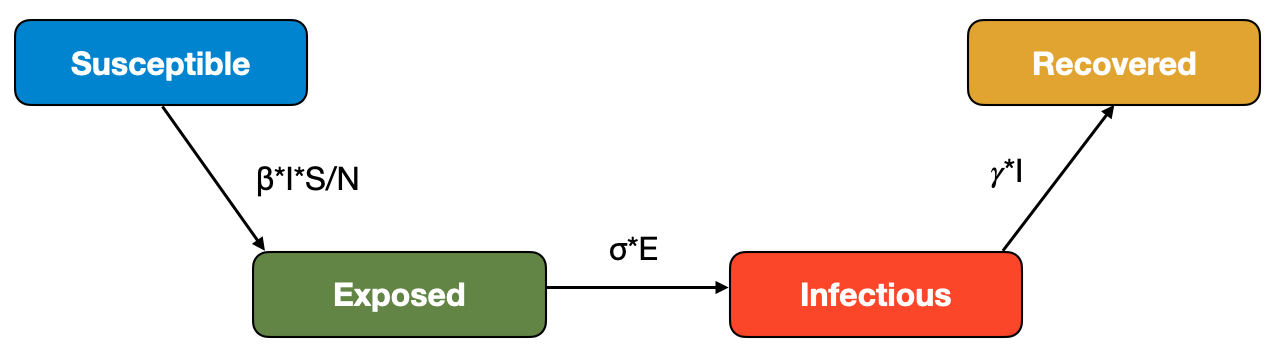
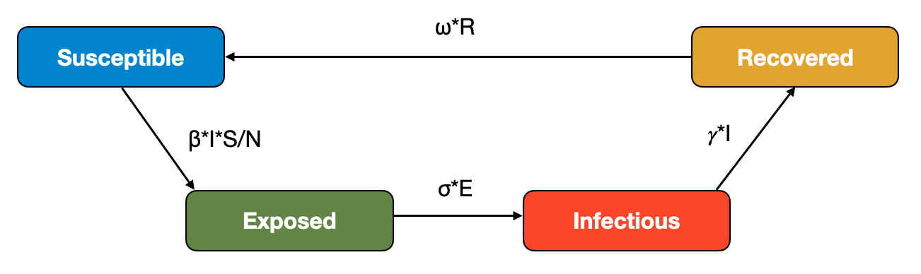
Next, we will consider the rate of recovery for the transition between the \(I\) compartment and the \(R\) compartment. Here, we denote the recovery rate per unit time as \(𝛾\). The reciprocal, \(\frac{1}{𝛾}\), corresponds to the average recovery time. The overall recoveries per time unit will be \(𝛾I\). We can now draw the compartmental model as a flow diagram shown in Figure 5.1.

We can transform this model into a set of ordinary differential equations (ODE) as follows:
\[\frac{dS}{dt} = -βI\frac{S}{N}\]
\[\frac{dI}{dt} = βI\frac{S}{N} - 𝛾I\]
\[\frac{dR}{dt} = 𝛾I\]
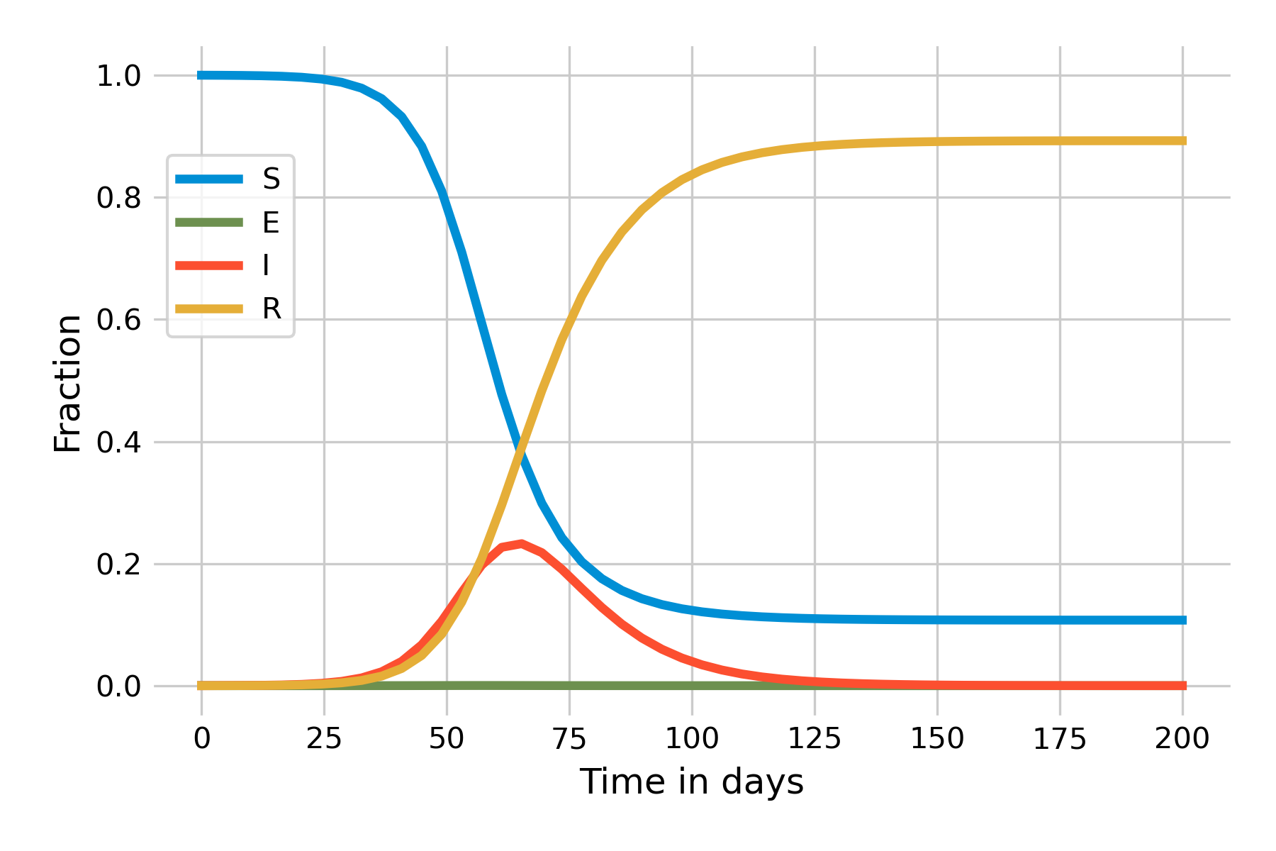
These equations follow directly from the flow diagram. We can already make a number of interesting observations. The first is that since there is no inflow into the \(S\) compartment (recall that we ignore births, and deaths not related to the disease), the number of susceptible individuals will only ever decrease. The second observation is that there is no outflow from the \(R\) compartment, and thus the number of recovered individuals will only ever increase. The interesting part is with respect to the \(I\) compartment, which experiences both inflow and outflow. Depending on the sizes of those flows, the number of infected will increase or decrease. Indeed, it is this dynamic that gives an epidemic curve its shape. In Figure 5.2, we can see the dynamics of an implementation of this basic SIR model in a population of \(N = 10,000\), a recovery rate of 0.1 / day (i.e. \(𝛾 = 0.1\)), and \(β = 0.25\). For the remainder of this chapter, we will use days as our unit time.
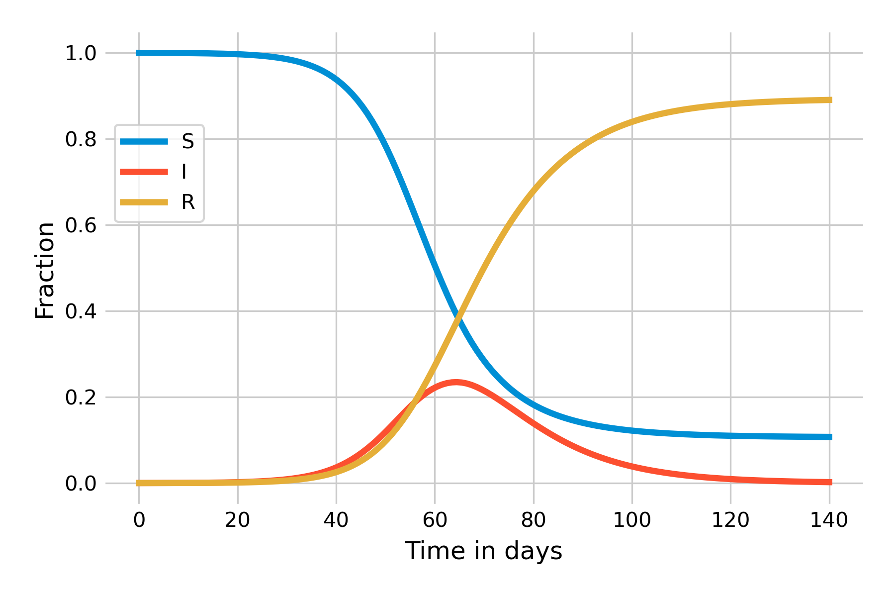
This simple model allows us to derive a number of key insights of infectious disease dynamics. Let’s begin by investigating the shape of the epidemic curve, \(I(t)\). We can see that in the beginning, as the outbreak is taking off, \(I(t)\) is increasing exponentially. Eventually, growth starts to slow down, and around day 50, the outbreak begins to recede. We know from previous discussions that effective reproduction number Re must be greater than 1 for an outbreak to grow. We can see from the equations above that an outbreak will grow if \(\frac{dI}{dt}\) is positive, i.e. if
\[βI\frac{S}{N} - 𝛾I > 0\]
and therefore, with a bit of algebraic rearrangement, if
\[\frac{β}{𝛾} \frac{S}{N} > 1\]
Recall also that in Chapter 4, we said the effective reproduction number Re is simply the basic reproduction number R0 scaled by the fraction of susceptible individuals in the population:
\[R_e = R_0 * \frac{S}{N}\]
Combining these two, it becomes clear that
\[R_0 = \frac{β}{𝛾}\]
This also makes intuitive sense: As R0 is the number of secondary infections from the first infected individual in an otherwise completely susceptible population, this corresponds to the infection rate per unit time (\(β\)) times the number of timesteps the individual is infectious (1/𝛾). Thus, in our example above, we have \(R_0 = \frac{0.25}{0.1} = 2.5\). Over time, as the fraction of susceptibles will decrease, Re starts to decrease correspondingly. Let us investigate this further by plotting Re over the time of the outbreak. You can see in Figure 5.3 that the moment when Re falls under 1 (around day 65) is the moment the outbreak begins to recede.
It is worth reflecting again on this dynamical pattern. Initially, an outbreak grows because R0 is larger than 1. In our example, it is 2.5, which, together with an average recovery time of 10 days (\(𝛾 = 0.1\)), corresponds roughly to the initial situation of the COVID-19 pandemic in late 2019. As the outbreak progresses, there will be fewer and fewer susceptibles. Eventually, once the fraction of the susceptible population hits 40%, Re falls below 1. The outbreak is running out of susceptibles, so to speak. But that is not the end of the outbreak. As you can see in Figure 5.3, at that moment, the number of infected \(I(t)\) is at its maximum value, the peak of the epidemic. This means that there is a lot of momentum in this outbreak, which will continue for quite some time, even though each individual on average infects less than one other individual. During the COVID-19 pandemic, there has often been a public misconception that once the reproduction number falls below 1, the disease will be gone. As Figure 5.3 shows, nothing could be further from the truth - and this isn’t even accounting for waning immunity or new variants.
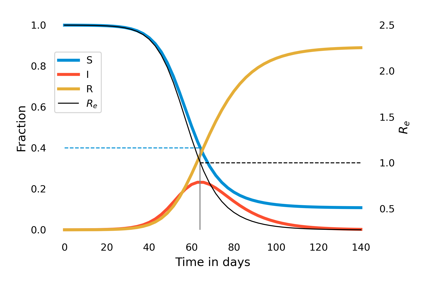
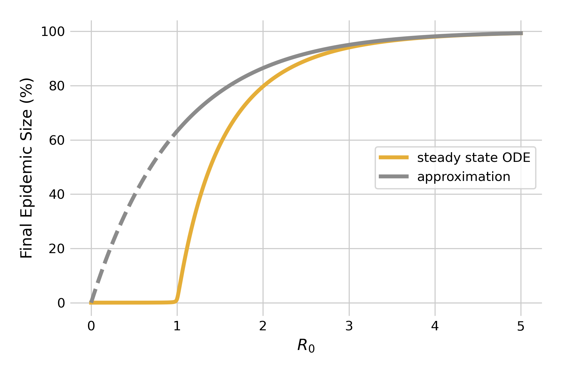
We can make another interesting observation when looking at this graph. Note how \(R(t)\) does not attain 1, and \(S(t)\) does not attain 0. In other words, once the outbreak is over, not everyone will have been infected, and subsequently recovered - some people are still susceptible. In other words, the idea that the outbreak is running out of susceptibles doesn’t hold towards the end of the outbreak - rather, it is running out of infectious individuals. We can quantify the final epidemic size, i.e the total number of people that will have been infected once the outbreak is over. For moderately large values of \(R_0 > 1\), we can approximate the final epidemic size by
\[S(∞) = 1−e^{−R_0}\]
We can plot this approximation, and compare it to steady state solutions of the system of differential equations using a fixed value of \(𝛾 = 0.1\) (Figure 5.4). As we can see, the approximation fails miserably for \(R_0 < 1\) (dashed line), as there will be no outbreaks in the model. For values of \(R_0 > 1\) close to 1, the approximation is rather bad, but rapidly improves as R0 increases. Eventually, it will be of limited value as the final epidemic size approaches 100% anyways.
5.2 Mitigating infectious disease spread
Using the basic SIR model, we can now look at a number of mitigating effects on the dynamics of epidemics. We’ve discussed the most common control measures in the last chapter. All of them are designed to either reduce contacts (e.g. closures), to reduce the possibility of transmission given a contact (e.g. masks), or to reduce the duration of infectiousness (e.g. treatments). These effects will always impact \(β\) and \(𝛾\) in such a way as to reduce R0. We can therefore simplify the discussion by looking at what happens when R0 is reduced.
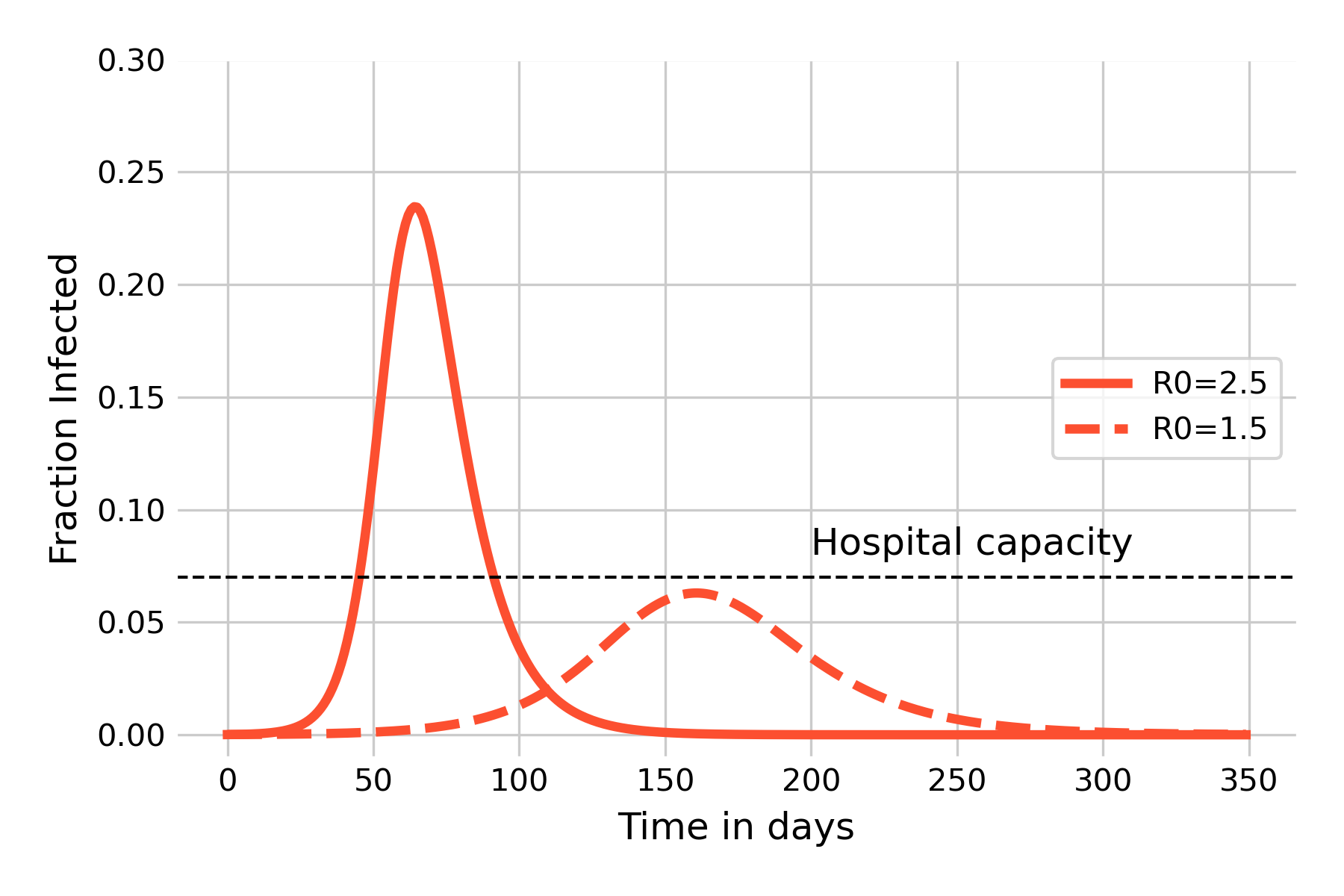
We begin by comparing two outbreaks with the same properties, but where one has a reduced value of \(β\), for example by reducing contacts. We will use the values from the basic SIR model above, comparing \(β = 0.25\) (\(R_0 = 2.5\)) with \(β = 0.15\) (\(R_0 = 1.5\)). As we can see in Figure 5.5, the reduction has two major effects. The first effect is to slow the outbreak, with the peak being pushed back from day 64, to day 161. This is important as it provides precious time to prepare the healthcare system for what’s coming. The second effect is arguably even more important, which is to reduce the peak of infections by a considerable amount, from 23.4% to 6.3%. This effect, colloquially referred to as “flatten the curve” during the COVID-19 pandemic, serves to keep the number of sick people under a given threshold that avoids an overburden or even collapse of the system. The figure shows a horizontal line for hospital capacity (note that the value is chosen arbitrarily for illustrative purposes), as an overwhelming of hospital capacity would have catastrophic consequences beyond the burden of the infectious disease alone. Correspondingly, many countries designed their strategies around this goal. However, it would be just as appropriate to write “system capacity”, because if large parts of the population are away from work sick, the consequences on issues like food provisioning, transportation, or education may be equally bad.
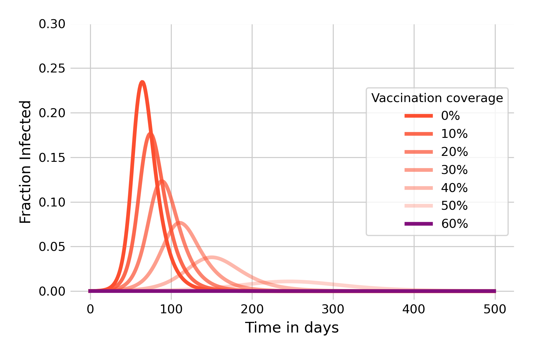
We are now also in a position to model the effect of vaccination. We saw earlier that infection-blocking vaccines can have a strong effect on infectious disease dynamics, and that herd immunity can be sufficiently strong to prevent an outbreak in the first place if the vaccination coverage attains at least the critical threshold \(1 - (\frac{1}{R_0}\)). We can verify this by modeling the disease outbreak under different assumptions of vaccination coverages. We model vaccination coverage by moving vaccinated individuals directly from the \(S\) compartment into the \(R\) compartment, as they can’t be infected after vaccination. Figure 5.6 shows that herd immunity kicks in very quickly, underlining the idea that its protective effects begin immediately once people start to vaccinate. We can further see that once the vaccination coverage reaches 60%, there is no more outbreak. This is exactly what we should expect, given that the vaccination coverage has reached the critical threshold of \(1 - (\frac{1}{R_0})\) with \(R_0 = 2.5\), and thus \(R_e = 1\). It’s also worth noting the strong mitigating effect that a vaccination coverage of 30%, for example, can already have. It is comparable to reducing R0 to 1.5 (see Figure 5.3), which would normally require quite substantial individual and group effort to achieve with NPIs only.
5.3 The SEIR model
The SIR model above is the backbone of infectious disease models - a minimalistic model that nevertheless already contains all the essential aspects of infectious diseases, and that can already provide deep insight into the dynamics of epidemic spread. In what follows, we will extend this model and modify some of the simplifying assumptions that implicitly went into the development of the SIR model.
Our first modification concerns the assumption that infected means infectious. In the SIR model, we make a distinction between these two states: once an individual is infected, it is immediately infectious. We know however that this is generally not true. Once an infection establishes itself in a host, it needs some time to get to the stage where it is strong enough to be passed on to the next host. We learned above that we denote the period between getting infected, and becoming infectious, the latent period. In the modeling literature, hosts that are in the latent period are exposed, rather than infectious, and we can take that into account by adding a corresponding \(E\) compartment to the model. We also need to consider the transition from the \(E\) compartment to the \(I\) compartment, which we can model with an latency parameter \(\sigma\). The reciprocal, \(\frac{1}{\sigma}\), corresponds to the average latent period.
We can then adjust our flow diagram in the following way:
which leads to the following equations:
\[\frac{dS}{dt} = -βI\frac{S}{N}\]
\[\frac{dE}{dt} = βI\frac{S}{N} - \sigma E\]
\[\frac{dI}{dt} = \sigma E - 𝛾I\]
\[\frac{dR}{dt} = 𝛾I\]
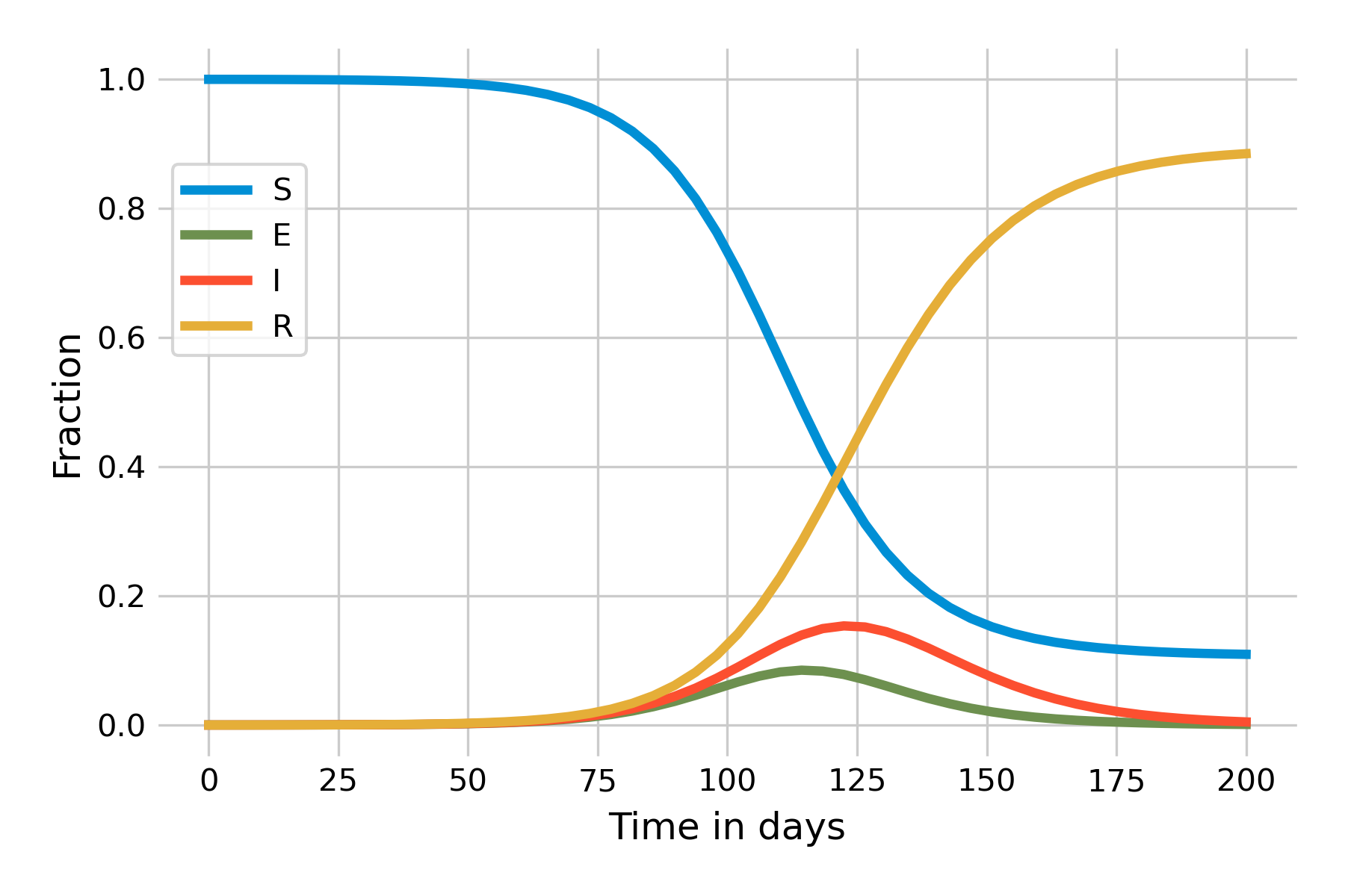
We can now implement this model based on the previous SIR model. Let us start with the assumption of an exceedingly high incubation rate \(\sigma = 100\) such that the average incubation period, \(\frac{1}{\sigma}\), is practically 0, i.e. exposed individuals will immediately become infectious. This should recreate the same dynamics as the SIR model, which is indeed the case (Figure 5.8):
Let’s now assume a more realistic incubation period and set \(\sigma = 0.2\). The immediate effect is that the outbreak will now take longer to unfold, due to this additional delay in the \(E\) compartment, and we thus need to increase the time on the x-axis in Figure 5.9:
5.4 The SEIRS model
We will now extend the model one step further by taking into account that immunity may not last forever. Waning immunity is a common phenomenon, as everyone who gets reinfected by the many common cold viruses can attest to. Indeed, the COVID-19 pandemic has highlighted this phenomenon to the great frustration of practically everyone, and it is now known that immunity against seasonal coronaviruses is short-lasting (Edridge et al. 2020).
Waning immunity can be implemented by adding a waning immunity rate \(ω\) at which individuals in the \(R\) compartment transition back to the \(S\) compartments, as shown in Figure 5.10:
This flow diagrams leads to the modified ODE:
\[\frac{dS}{dt} = ωR - βI\frac{S}{N}\]
\[\frac{dE}{dt} = βI\frac{S}{N} - \sigma E\]
\[\frac{dI}{dt} = \sigma E - 𝛾I\]
\[\frac{dR}{dt} = 𝛾I - ωR\]
Data on waning immunity from coronaviruses suggests that reinfection occurs frequently 12 months after infection (Edridge et al. 2020). When we set \(ω\), whose reciprocal value corresponds to the average duration of immunity, to \(\frac{1}{365}\), we obtain the dynamics shown in Figure 5.11:
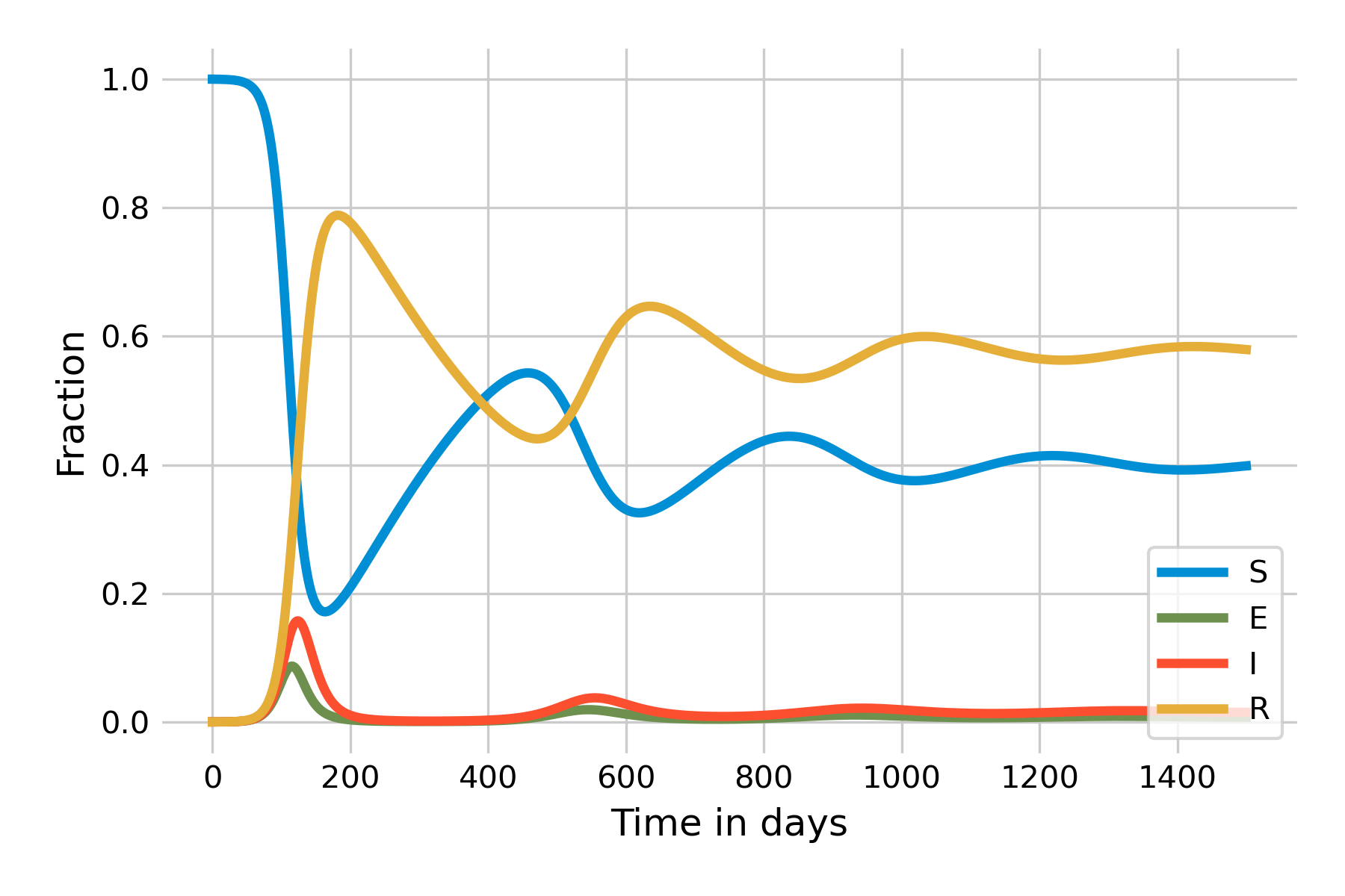
As we can see, the number of susceptibles starts to grow slowly after the initial wave. Once it reaches a certain size, there is again enough “fuel” for a peak to occur. Because there are fewer susceptibles than at the beginning, the peak will be smaller, and run out of steam quicker. The system will eventually reach a stable state which it attains through a damped oscillation. An important insight becomes more clearly visible when we plot the system using a logarithmic y-axis (Figure 5.12):
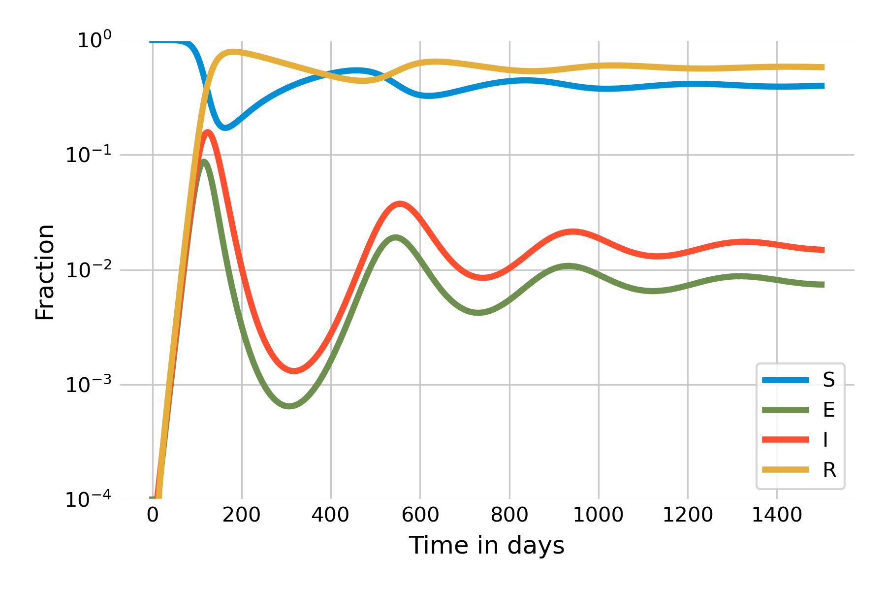
It is clearly visible here that the steady state of \(I(t)\) will not be 0, but around 0.01. In other words, the SEIRS model leads to a situation where the infection will remain endemic at around 1% of the population. This is a new phenomenon that we have not observed yet in the other models. The key difference is that there is a process that generates new susceptibles. In the case of the SEIRS model, the process is the waning of immunity. In practice, there can be different reasons why immunity wanes, but by and large, it is either because the immune system loses memory, or because new variants of the pathogen manage to escape recognition.
Another major source of new susceptibles are newborns. So far, we have looked at closed epidemics, meaning that we ignored births and deaths. In the next section, we will investigate what happens when we take these demographic processes into account.
5.5 Open epidemics
Births are a major source of susceptible individuals. To understand its effect on disease dynamics, we will now look at the dynamics of a measles-like pathogen. Since a measles infection provides lifelong-immunity, we can ignore waning immunity, and adjust our SEIR model by introducing births and deaths in such a way as to keep the population size constant, which will make the model easier. Let’s define a birth and death rate \(μ\), such that the number of births per unit time is \(μN\), and the number of deaths per compartment is \(μS\), \(μE\), \(μI\), and \(μR\) (Figure 5.13). Because \(N = S + E + I + R\), births and deaths are quantitatively equal, and the population size will remain constant. Note that the death rate is the same in all compartments; in other words, we are ignoring disease-induced deaths.

To see the dynamics, we’ll parametrize the model with values from the measles, where we assume a latent period of 8 days, and an infectious period of 5 days, with \(R_0 = 20\). We further assume an average life span of 50 years. To hone our modeling skills, we will this time choose years as our unit of time. Thus, \(𝛾 = \frac{365}{5}\), \(β = 20 * \frac{365}{5}\), \(\sigma = \frac{365}{8}\), and \(μ = \frac{1}{50}\). When starting with \(R(0) = 96\%\) and \(I(0) = 0.1\%\) (chosen for visibility purposes), we will obtain the dynamics shown in Figure 5.14. Our ODEs as thus as follows:
\[\frac{dS}{dt} = μN - βI\frac{S}{N} - μS\]
\[\frac{dE}{dt} = βI\frac{S}{N} - \sigma E - μE\]
\[\frac{dI}{dt} = \sigma E - 𝛾I - μI\]
\[\frac{dR}{dt} = 𝛾I - μR\]
Note that in the paragraph above, we have continued with the finding from the SIR model that \(R_0 = \frac{β}{𝛾}\). We would need to adjust this formula to take into account \(μ\), but the effect of \(μ\) on \(R_0\) for diseases with short latent and infectious periods (relative to life expectancy) is negligible.
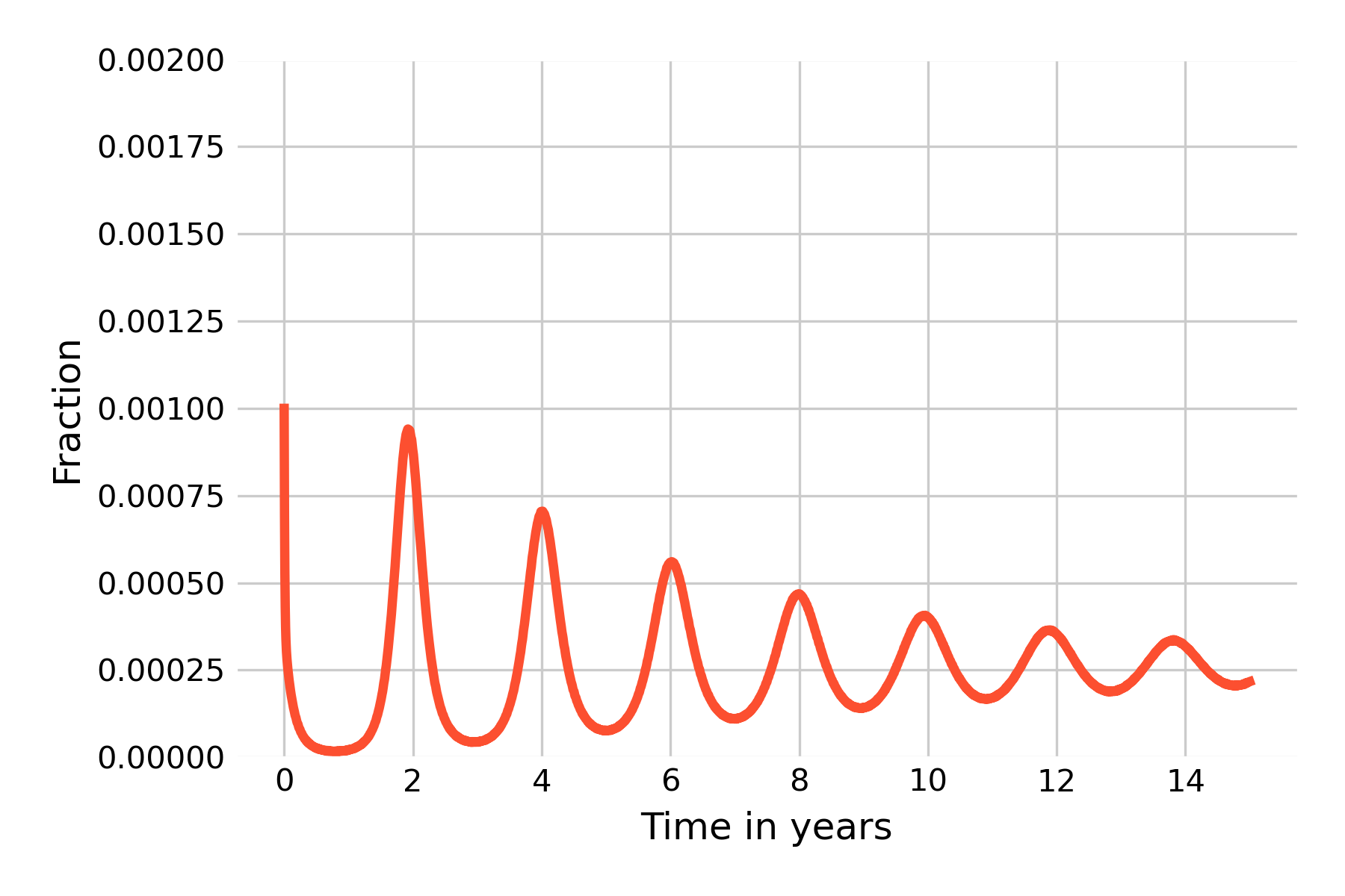
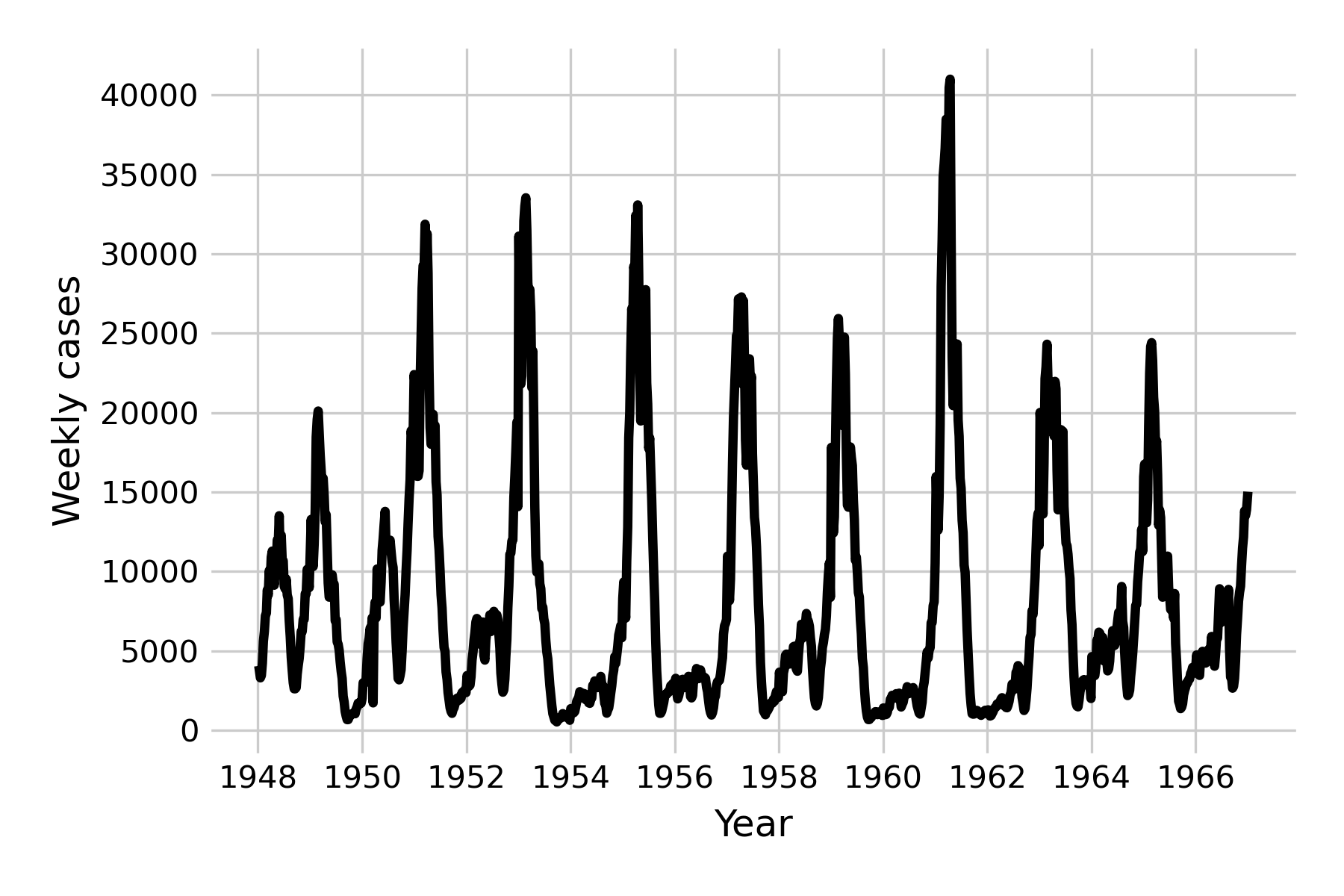
We can once again see damped oscillations, which suggests that the system eventually reaches a steady state. This is clearly not what happens in reality for a measles-like pathogen (see Figure 4.10), and we are therefore left with having to identify the forces that can maintain oscillations in the long run. One of those forces is seasonality, which refers to the fact that the rate of disease transmission can depend on the season, for example because there are more contacts indoors during the cold season. Seasonal effects are well described in many diseases (Altizer et al. 2006), including those transmitted by vectors which can depend on the seasonal life cycles of the vectors, or of waterborne diseases which may depend on seasonal rainfalls.
We can adjust the model by making \(β\) seasonally oscillating. To do this, we introduce a seasonal factor, \(β_S\), and replace \(β\) with \(β (1 + β_S\ cos(2πt))\). The two equations containing the term \(β\) will thus become
\[\frac{dS}{dt} = μN - β(1 + β_S\ cos(2πt))I\frac{S}{N} - μS\]
\[\frac{dE}{dt} = β(1 + β_S\ cos(2πt))I\frac{S}{N} - \sigma E - μE\]
The results of this seasonal adjustment (with \(β_S = 0.05\)) is shown in Figure 5.15.
We can now see the emergence of (yearly) minor and major outbreaks in line with the data (Figure 5.16) from the pre-vaccine era, and the dampening effect has disappeared.
The mathematical analysis of these systems is of great interest to the field of infectious disease models, but beyond the scope of this book. The interested reader is referred to excellent texts such as those by Bjørnstad2, Vynnycky & White3, or Keeling & Rohani4.
Another force that can maintain oscillations in the long run is stochasticity. Indeed, so far in this chapter, we have looked exclusively at deterministic models. It is time to consider a major force in infectious disease dynamics: random chance.
5.6 Stochastic models
Stochastic models are models that take into account random processes. Our previous models are all deterministic: once the initial conditions are set, the model will behave in the exact same manner every single time it is run. A benefit of these deterministic models is that they are mathematically tractable, which makes them amenable to further analysis. However, in reality, random processes can play a very large role in shaping the dynamics of a system.
Consider the following simple example. Let’s say we are looking at the early dynamics of a disease outbreak with \(R_0 = 1.5\). The prediction of the deterministic model is clear: this outbreak will always grow, because \(R_0 > 1\). However, a stochastic model could for example implement disease transmission as a random process with probabilities. It is entirely possible that the first infected individual would fail to infect other individuals, simply due to random chance, in the same way that you could flip a coin three times, and the number of heads could be 0, even though the deterministic prediction is 1.5. If we simulate the dynamics of a disease outbreak in a stochastic way, each simulation run will look different, and some will even produce dynamics - such as a stochastic die-out early on - that we would never observe in a deterministic model.
There are many ways to implement stochastic models. For systems of equations with known transition rates between states (as is the case for our model here), one of the most commonly applied algorithms to model the system stochastically is the Gillespie algorithm. The Gillespie algorithm works by setting up the states of a system, and then modeling the next event (i.e. a change in the states) to happen. When we do this iteratively, we can track the states of a system over time. In our case, if we model for example an SEIR system, the states we are interested in are \(S\), \(E\), \(I\), and \(R\), which each corresponds to a number of individuals in each state. Thus, the compartments of our models so far nicely map onto states.
There are a number of ways to implement the Gillespie algorithm. In its most basic form, we calculate a waiting time until the next transition occurs, which we can randomly draw from an exponential distribution with a rate parameter equal to the sum of all transition rates (see Table 5.1). If we have four states \(S\), \(E\), \(I\), and \(R\), we have eight transitions and their corresponding rates: for an increase in \(I\), for a decrease in \(I\), for an increase in \(E\), for a decrease in \(E\), etc.
| Transition | Rate |
|---|---|
| \(S → S + 1\) | \(μN\) |
| \(S → S - 1\) | \(βI\frac{S}{N} + μS\) |
| \(E → E + 1\) | \(βI\frac{S}{N}\) |
| \(E → E - 1\) | \(\sigma E + μE\) |
| \(I → I + 1\) | \(\sigma E\) |
| \(I → I - 1\) | \(𝛾I + μI\) |
| \(R → R + 1\) | \(𝛾I\) |
| \(R → R - 1\) | \(μR\) |
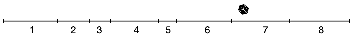
At each timestep, we recalculate the value for these rates (as the value of the states may have changed), and we then choose one of the transitions randomly, weighted by their rates. We can make a visual argument by adding up all the rates on a line, where the length of the line corresponds to the sum of all rates. A random transition is chosen by drawing a random value, sampled uniformly from the line (Figure 5.17).
Because stochastic simulations can be quite slow, other methods of implementing the Gillespie algorithm have been developed. One of the most efficient methods is called “tau leaping”. This method uses a fixed time step, \(\tau\), and then determines the number of state transitions by sampling from a Poisson distribution with a mean of the product of \(\tau\) and the rate at which a transition occurs.
Implementing the Gillespie algorithm with \(N = 10,000\), and values chosen for the open SEIR epidemic of a measles-like pathogen as shown in Figure 5.14, we get the following dynamics:
This clearly doesn’t look anything like the results from the deterministic model shown in Figure 5.14. However, as we noted above, because each simulation run has stochastic elements, each run will look different. We will thus run 20 independent simulations, and plot the results in Figure 5.19 with reduced opacity to see all lines.
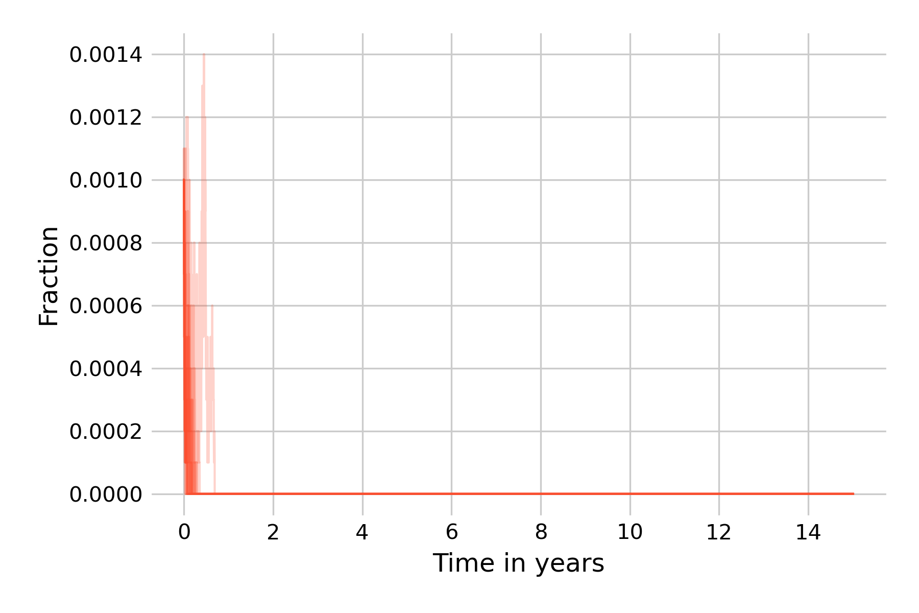
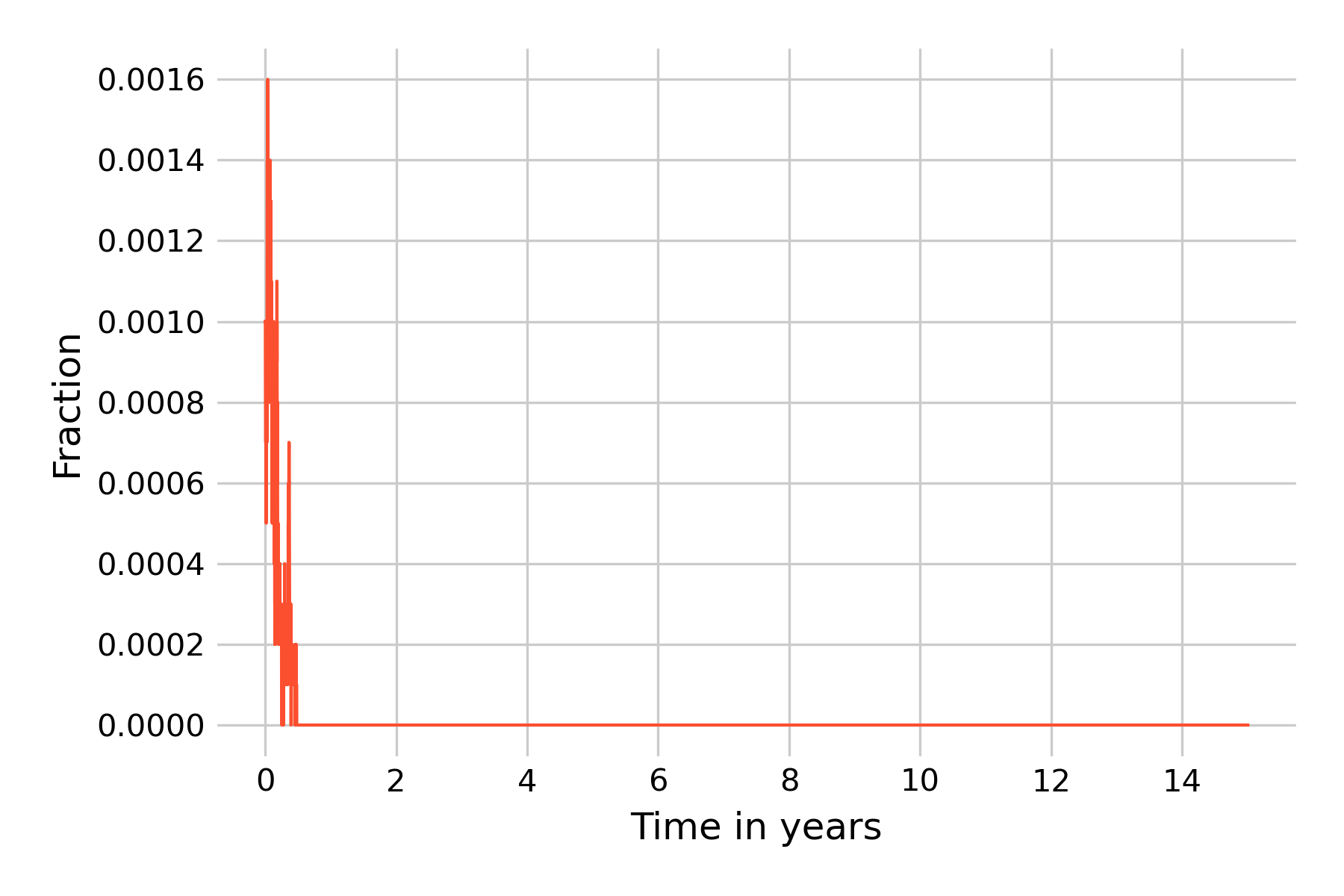
We can see that the epidemic dies out in all simulation runs before even the first year ends. It is instructive to reflect on what is happening here. A key aspect of Gillespie’s algorithm is that states are modeled discretely, not continuously, as they are in ODEs. The states are actual numbers of individuals, and can increase or decrease by 1 per timestep. In this simulation, we start with \(I(0) = 0.1\%\), i.e with 10 infected individuals, and with \(R(0) = 96\%\), i.e. with 9’600 recovered individuals. In this regime, the downward trend of \(I(t)\) is strong, as the results from the deterministic models (Figure 5.19) show. The same is true for \(E(t)\), even though we don’t show it in the plots. The result from the deterministic model shows that \(I(t)\) gets very close to 0 before it reverses direction. For a continuous-state model, this is not a problem, as the states can reduce to levels far below \(N=1\) before increasing again. Indeed, the minimum value of \(I(t)\) in the model shown in Figure 5.14 is 0.000016. In a model with discrete states, however, it is not possible to go below one individual, and once all exposed or infectious individuals are lost, the epidemic is over.
The reason is that the population size in our example, \(N=10,000\), is too small. An \(I(0) = 0.1\%\) corresponds to 10 individuals, which we can lose rapidly in a strong downward trend, as we can see in Figure 5.19. Thus, our next attempt is to increase the population size to \(N=100,000\), keeping the same fractions of \(I(0) = 0.1\%\) and \(R(0) = 96\%\) (Figure 5.20).
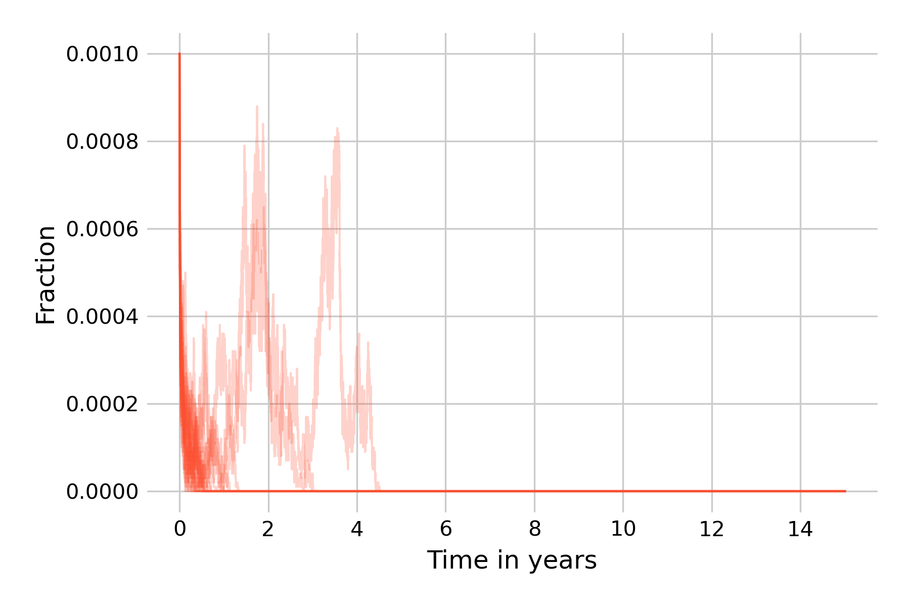
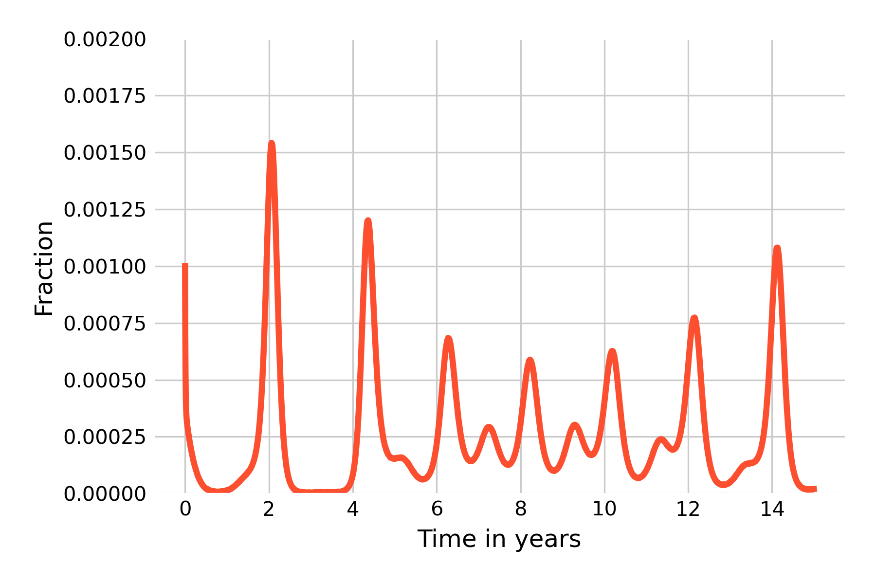
We can see that the situation improves somewhat. Starting from 100 infectious individuals, most simulation runs can still not avoid the extinction of all infected states, even though two runs show post-initial peaks that then die off around years 3 and 5. We will now go one step further, and increase our population size to \(N=1,000,000\) (Figure 5.21).
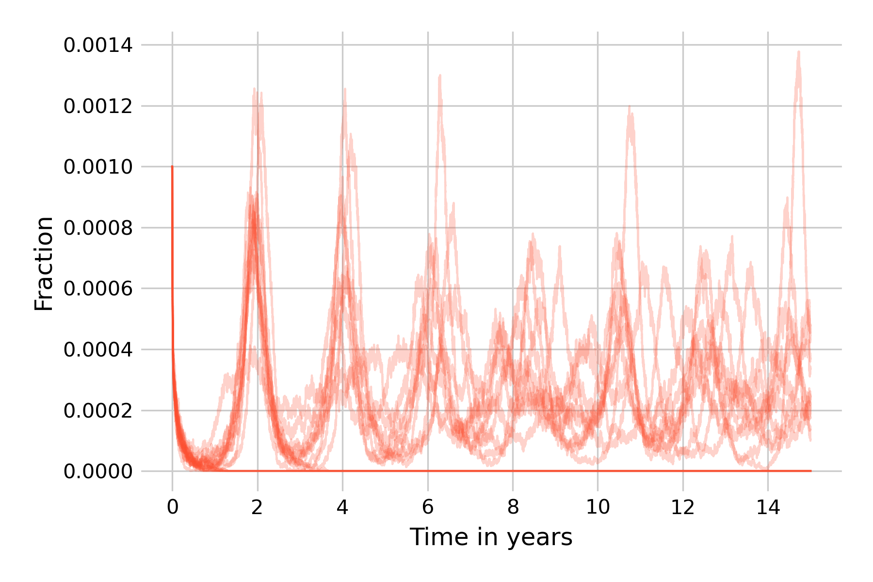
At this population size, about half of the simulation runs don’t go to extinction within 15 years, and indeed show non-damping oscillations, corroborating our earlier notion that stochasticity is a force that can maintain them. This is our encounter with the concept of the critical community size, which we introduced earlier as the size of the population above which a disease will avoid local extinction as it doesn’t run out of susceptible individuals to infect. Also note that while the 20 simulation runs in Figure 5.21 are largely similar in the first wave in year 2, they will increasingly differ from each other due to the cumulative effects of stochasticity.
We can go even further and increase the population size to \(N=20,000,000\), or even beyond (if you want to run this on your machine, you will need to implement the tau-leap version of the Gillespie algorithm). In Figure 5.22, we can see that the differences in simulation runs become rather small, due to the law of large numbers (i.e. the effects of stochasticity will begin to average out). We can also observe that the dynamics are beginning to be very similar to those of the deterministic model.
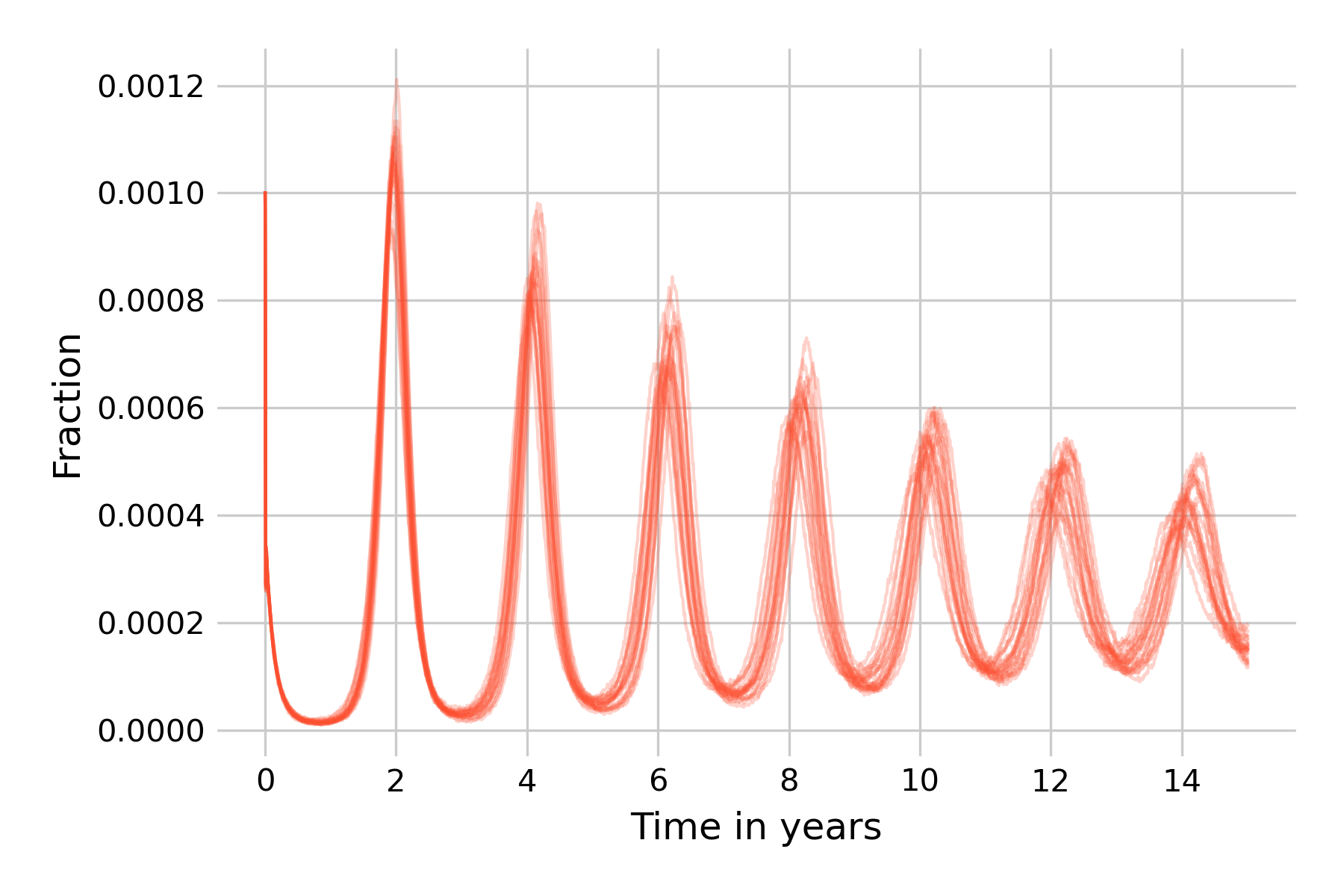
We thus see that for this particular model and parameter values, stochasticity can maintain sizeable oscillations when it is intermediate. Too much stochasticity (i.e. small population size) and the disease will go to extinction. Too little stochasticity (i.e. very large population size) and the dynamics will approach those of the deterministic model, which cannot maintain oscillations in the long run.