1 Epidemiology
1.1 What is epidemiology?
Epidemiology is a very broad field. Yet, before the COVID-19 pandemic, most people alive today have happily gone about their lives without ever hearing the word epidemiology. The word comes from the Greek “epi” (upon), “demos” (the population), and “logos” (subject matter), indicating that it’s concerned with what’s going on in the population. Very broadly speaking, we can define epidemiology as the study of the distribution and determinants of health and disease in the population. As a field, it is interested in who is sick (what) or healthy, when, where, and why - with the ultimate goal of reducing disease burden, either through prevention or treatments.
Epidemiology is thus about population groups, not about individuals. One of the key tasks of any epidemiological undertaking is to define which group it is focusing on - the who. For example, the distribution of heart diseases will be very different depending on whether one is looking at healthy teenage boys, menopausal women, or smoking road construction workers. It is of course also possible to focus on the entire population. Thus, one of the first questions one should ask when looking at an epidemiological result is, “to which group does this apply?”.
Once the target population group is defined, it’s important to check whether the sample of a study is representative of that group, or whether it is biased. Clearly, most target populations are so large that it is not feasible to collect data on all group members. For example, even if your target group description is fairly specific, e.g. “male obese smokers living in the US over the age of 65”, it’s unlikely that you will be able to obtain data from all of them, given that your target group size is over one million (Healton et al. 2006). Thus, a study must obtain a representative sample of the target group to be able to extrapolate to the entire target group. Because we almost always work with samples, we need to have a set of tools that allows us to say something about the target population group. That set of tools is inferential statistics. This is in contrast to descriptive statistics, which is a set of tool that allows us to describe the sample. Both are important, which is why you will be hard pressed to find an epidemiological study without any statistics in it. Whenever necessary, we will touch on statistical issues here, but this is a book about concepts, not about methods. If you are interested in a more formal treatment of statistics, an enormous number of books on statistics is yours to explore.
Once we know whom we’re talking about, we must be clear about what we’re looking at. Very broadly speaking, there are two main classes of outcomes that epidemiology is looking at: morbidity, i.e. suffering from a non-lethal reduction in health either through disease or injury; and mortality, i.e. death. At first, this may seem like a slightly odd classification. The range of possible disease outcomes is enormous, from acute to chronic, from asymptomatic to severe. Why juxtapose this entire complexity to death? There are likely several reasons. First, for most of human history, death was a fairly common outcome of many diseases, especially childhood diseases. In European countries with historical data going back a few centuries, we know that up to one in two children would die before reaching the age of 5. Second, while the definitions of illnesses and their impacts (i.e. hospitalisations) may vary across countries, the definition of death is universal. Last but unfortunately no least, death is final, and thus worthy of special consideration.
Both disease and death ultimately lead to the most pressing questions of all: why? The causes of disease and death, and their distributions, are at the core of epidemiology. Only when we understand where diseases are, why they befall people, and how they can lead to health reductions and death, do we have the best chance of trying to do something about it. It is worth mentioning that quite a substantial part of modern medicine consists of remedies that are either still poorly understood, or at least were poorly understood at the time of their discovery. For example, while there are a multitude of drugs that are known to be effective against certain diseases, the mode of action of many of these drugs remains unclear. Understanding the why behind death and disease naturally involves many more fields than just epidemiology. But epidemiology has over decades developed thorough methods to investigate the distribution of diseases, their association with other factors, and their causes and consequences: surveillance methods, case-control studies, cohort studies, randomized trials, causal inference, or mathematical and computational modeling, just to name a few. We’ll look at each of those in some detail later on.
Last but not least, the when and where of any epidemiological study are critical components. For example, exposure to an environmental factor leading to an increased risk of cancer will lead to different policies depending on whether the onset of cancer is already frequently observed early in life, or only among the very old. But the when does not only refer to a time point in a person’s life, but also to dates: we’d like to know when people became ill so that we can understand the dynamics of an outbreak, for example. Many people getting ill around the same time suggests that there is substantial exposure to a disease-causing agent, such as an infectious disease pathogen, or a new environmental exposure.
Likewise, understanding the spatial epidemiology - the where - of a disease is critical in understanding the possible sources of exposure, and in developing the appropriate prevention methods, among many other things. To give an example, let us briefly discuss the perhaps most cited epidemiological outbreak investigation in history: the cholera outbreak in the Soho district of London in 1854. Deadly cholera outbreaks were a common and serious health problem in London at the time. Just five years earlier, in 1849, a cholera outbreak killed 14,137 residents (in a city of roughly 2.5 million people at the time - proportionally the equivalent of 2 million deaths in the contemporary US). The English physician John Snow had already hypothesized during earlier outbreaks that cholera was caused by agents in polluted water. When an outbreak struck the Soho district in 1854, Snow drew a map (Figure 1.1) showing the location of the cases and concluded from it that the water pump on Broad Street, drawing water from a contaminated well, was the source of the outbreak. Sadly, despite his correct conclusions, it would take a long time before they were universally accepted. But the outbreak investigation, and the map, are now commonly seen as symbolic of the birth of epidemiology.
Notably, the germ theory was just slowly beginning to come of age, and the causing agent of cholera, the bacterium Vibrio cholerae, was only described in the 1880s. It would take more than another half-century to understand that the deadly diarrheas of a cholera infection are caused by a toxin produced by the bacteria. Thus, the Soho outbreak demonstrates that epidemiological investigations can lead to correct conclusions, and propose useful, preventative courses of action even with an initially limited understanding of the biological details involved.

1.2 Public health surveillance
The example of John Snow and the Soho cholera outbreak demonstrates something else: the importance of good data. Without the detailed knowledge of the location and timing of the cases, John Snow would not have been able to draw the conclusions he ultimately became famous for. He might not even have known that there was a cholera outbreak in Soho. But he was able to rely on data from both the Registrar General Office in London and from reports of the local residents, collected with the Reverend Henry Whitehead.
Today, providing timely and accurate data on the extent of disease spread, morbidity, and mortality is a core task of public health and is generally referred to as surveillance. As a term, surveillance has acquired a rather negative connotation in the past decade, when reports of digital mass surveillance began to emerge. Public health surveillance, however, is a much older concept, giving policymakers critical information needed to protect the public from ongoing or emerging health threats. Nevertheless, with the potential of digital surveillance increasing steadily, the risk of misusing data collected as part of digital public health surveillance is very high. This is a topic we will come back to later in the book.
Public health surveillance has no universally accepted, precise definition. The WHO - the World Health Organization, the UN agency for international public health - defines it as “the continuous, systematic collection, analysis and interpretation of health-related data”1. As with all verbal definitions, we could quickly go down a recursive rabbit hole by arguing about the definitions of “continuous”, “systematic”, etc. We won’t engage in such a futile exercise here, but simply note that there is an ongoing discussion about what exactly qualifies as surveillance. For the purpose of this book, we will use surveillance as a relatively broad term, meaning any data collection process whose results can then serve as input for public health decision-making. This notably includes data generated in studies. The COVID-19 pandemic is a great example for this point of view: while various continuous surveillance systems were already in place, studies rapidly provided critical input for public health decision-making, even though those studies were neither continuous, nor systematic. Public health surveillance is best thought of as a Swiss army knife, i.e. a set of diverse tools designed for specific problems, such as those related to disease detection, assessing disease severity and disease burden, or aiding disease treatment and prevention.
Public health surveillance can be done in multiple ways. Ultimately, the biggest challenge is that reporting on the entire population on all health issues all the time and in great detail is prohibitively expensive, both in terms of monetary and human resources (again, we will discuss privacy concerns later in the book in a dedicated section). Public health has thus devised a number of approaches (J. Murray and Cohen 2017) to get the most bang for the buck, so to speak. First, most surveillance is passive surveillance, which simply means that data is reported on an ongoing basis by the medical system. For example, if you come down with cholera, in most countries, the healthcare provider diagnosing the disease will have to alert the local health authorities, as cholera is a reportable disease. In the US, the National Notifiable Disease Surveillance System2 lists about 120 diseases, of which around 2.7 million cases are reported yearly through about 3,000 local public health departments. The local health departments then notify the US CDC - The Centers for Disease Control and Prevention, which is the national public health agency of the United States - of the cases that have been reported to them.
In contrast, active surveillance occurs when public health officials proactively engage and search for cases - often hiring staff in the process - in order to respond to a public health threat. Recently, the emergence of the COVID-19 pandemic triggered numerous active surveillance programs, especially in the early phases of the pandemic. In Italy, the first COVID-19 death in the country occurred in the small community of Vo’ (near Venice), which then triggered an epidemiological investigation (Lavezzo et al. 2020) where data on demography, infection status, viral load and symptoms were collected from most residents on two consecutive time points two weeks apart. This data allowed the researchers to assess the efficacy of control measures, and also provided early important information on the frequency of asymptomatic SARS-CoV-2 infection. In Iceland during the early months of 2020, 6% of the population was screened for infection with SARS-CoV-2 in order to understand how the virus enters and spreads in the population (Gudbjartsson et al. 2020). In India, a large active surveillance program with over 3 million people in the district of Madurai tested symptomatic cases as well as risk groups. Combining it with demographic and morbidity and mortality data allowed the researchers to assess predictors of infection, disease, and death (Laxminarayan et al. 2021).
Second, there is the question about how groups should be surveilled. As we’ve just learned, the groups under surveillance can be very small (as in the example of the small community in Italy), or very large (as in the example of the entire country of Iceland). We might decide that the best way is to surveil everyone in a given population - country, region, towns, or other specified groups, which would be called population-based surveillance. This type of surveillance, however, can be rather resource-intensive. To address this problem, public health has developed the concept of sentinel surveillance. In this context, a sentinel is typically a health facility, voluntarily participating in a sentinel network, but can include anything from individual physicians to large hospitals. In many countries, influenza surveillance is done using a sentinel system, where 1-5% of physicians report cases of influenza-like-illness (ILI) to the health authorities3. But as the COVID-19 pandemic has shown, good case numbers are hard to come by through the healthcare system alone. People may not go to see a doctor, and diagnostic tests may be in short supply. Thus, random sampling of the population may be used to get a representative view of the population (Dean 2022).
Third, when speaking about surveillance, we also need to define what is being reported. Case-based surveillance means that the system reports on individual cases, so that we have information at the patient level, the time, and the location. This information can be very important in an outbreak, but at times, it is either unnecessary or not feasible to get case-based information. In those circumstances, a system can instead switch to aggregated surveillance, which means that we lack information on individual cases, but instead get numbers of cases for a specific location and time period. This typically happens when there are two many cases to handle in non-aggregated form, or when the healthcare system is under severe stress from other diseases. For example, during the COVID-19 pandemic, some countries reverted from case-based surveillance to aggregated surveillance for diseases like measles because of the reallocation of resources (Masresha et al. 2021). Additionally, countries or local regions may have data in case-based form, but they share it as aggregated data.
What triggers the reporting in the first place can vary substantially. Fundamentally, we can make a distinction between syndromic surveillance and laboratory-confirmed surveillance. In the former, a case is defined by the symptoms the individual expresses. This is easier to collect, but not as precise as having a case confirmed by a lab test, which is required for laboratory-confirmed surveillance. The issue of what triggers the reporting was clearly on display during the COVID-19 pandemic, where numerous tests were available, from RT-PCR to antigen tests, from lab tests to at-home self tests. The distinction is also important in the context of digital surveillance that we will cover in more detail later in the book. Most digital surveillance does not yet have access to laboratory data and is therefore a type of syndromic surveillance, but this is in the process of changing, as we will see later in the book.
Finally, when healthcare providers report on known diseases, typically with clearly defined case definitions, it is called indicator-based surveillance. This is in contrast to event-based surveillance, which includes official and unofficial reports on any event potentially relevant to a disease outbreak, including from sources such as news media, social media, and other sources online and offline. Many of the systems we will discuss later on digital public health surveillance are event-based surveillance systems.
1.3 Incidence and prevalence
We’ve learned above that epidemiologists want to know how many cases there are, and we’ve learned that the “when” matters. Putting these two things together, we arrive at two key statistics of epidemiology that are easily - and therefore often - confused: incidence and prevalence.
Generally, incidence refers to the number of new cases of a disease during a specified period of time, while prevalence refers to the total number of cases present, also during a specified period of time. Thus, if we assume that the specified period of time is the same, the key difference is that incidence is a measure of influx (how many new cases do we have?), while prevalence is a measure of presence (how many cases do we have in total?). Coincidentally, this provides us with a nice mnemonic: INcidence for INflux, PREvalence for PREsence. Incidence and prevalence can also be expressed as fractions or percentages, where the denominator is the population at risk. In the case of incidence, this fraction would be called attack rate. That is, the attack rate is the number of new cases during a specified period of time, divided by the population at risk. For prevalence, there is no specific term - prevalence can simply be expressed either as an absolute number, or as a percentage of the population.
The two statistics describe very different things. As incidence measures new cases in a given time period, it quantifies the transition from non-infected, or non-diseased, to infected, or diseased. It is therefore a measure of risk. Prevalence, however, does not quantify this transition - it doesn’t care whether the cases are new or whether they already existed in previous time periods; all it cares about is how many there are at present, in the given time period, and thus is a measure of disease pressure in the system. This can lead to the seemingly paradoxical situation where a public health improvement can lead to an increase in prevalence. How is this possible?
Let’s develop a hypothetical example. A new disease X emerges. Before that moment, the prevalence of disease X is of course zero. Every month, 10,000 new cases of disease X appear. The incidence is thus 10,000 per month. Let’s further assume that this is unfortunately a fatal disease - everyone who gets it dies after a few years. Thus, after 1 year, assuming the same constant incidence of 10,000 new cases per month and no deaths, the prevalence is 120,000. Over the coming years, the prevalence will grow, but eventually people start dying from the disease. If the incidence remains constant, eventually, the prevalence will stay constant as well, because the number of people that are dying each month from the disease (those who got it a few years ago) equals the number of people who get the disease each month.
Now let’s assume that a medical breakthrough leads to a therapy that does not cure the disease, but prevents people from dying. The disease becomes a chronic disease, which isn’t perfect, but at least it is not a death sentence anymore. What happens to prevalence in this case? It will grow, because people are still getting the disease, but they are (thankfully) not removed from the pool of infected people by death. Thus, just looking at the prevalence and its increase, one could assume that something bad has happened, when indeed the opposite is the case.
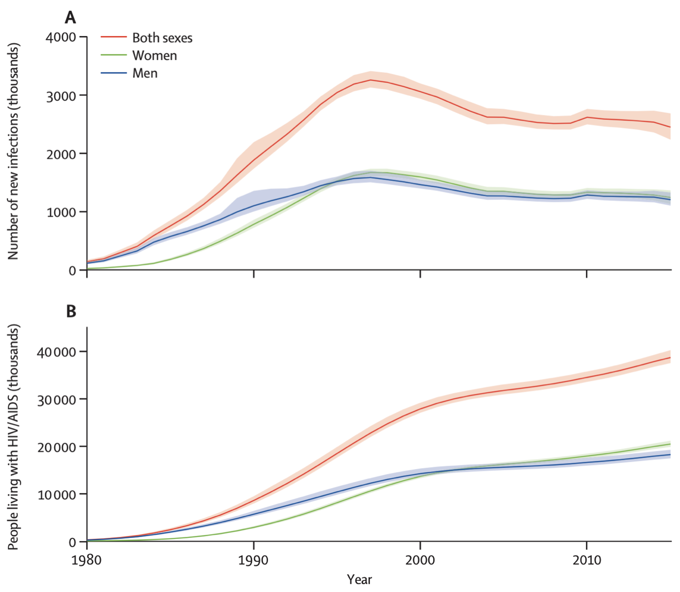
This hypothetical example is a rough analogy for the HIV epidemic. The human immunodeficiency virus HIV, the causative agent of the disease AIDS, emerged in Africa in the early 20th century, and began spreading to the Western hemisphere in the second half of the century. By the time it was identified, its prevalence had already soared to over 2% in some communities (Jaffe et al. 1985). In 2021, the global prevalence of HIV infections was estimated to be 38.4 million, and the incidence was 1.5 million in the same year4. Untreated, an HIV infection will lead to AIDS, defined as the state where either the immune system is critically weakened, or diseases associated with an HIV infection appear. The weakened immune system then leads to the emergence of opportunistic infections and cancers that a healthy immune system would normally be able to clear. Without any intervention, most infected patients die within about 10 years. Thankfully, antiretroviral therapy (ART) now prevents the progression to AIDS, meaning that people with an HIV infection can lead long and healthy lives, provided they have consistent access to ART. Thus, even with a relatively stable or even decreasing yearly HIV incidence in the past two decades, the prevalence of HIV has actually increased. Figure 1.2 shows the global incidence and prevalence of HIV, highlighting this phenomena.
Both incidence and prevalence are either expressed in absolute terms, i.e. total number of new or already present cases, or as rates per group size. For example, assuming a global population of about 8 billion people, the global HIV prevalence in 2021 could also be expressed as a rate of about 4,850 per million, or 4.85 per 1,000. The incidence in 2021 could be expressed as 189.4 per million, or 1.894 per 10,000. The choice of the group size is arbitrary. It can also be expressed as a percentage. For example, the 2021 prevalence of HIV in the world was 0.485%. There is huge geographic variation, with some countries in Sub-Saharan Africa having an HIV prevalence of over 10%. For example, South Africa has a prevalence of about 17%, while Eswatini (formerly known as Swaziland) has the highest prevalence in the world at about 26%. The US has an HIV prevalence of 0.36%, the UK has 0.2%, and Germany has 0.1%5. Finally, the literature sometimes makes a distinction between point prevalence - the prevalence at a very specific point in time, like today - and period prevalence, such as the prevalence in a given year, as we’ve seen above with the HIV statistics. However, most of the time, the simpler term prevalence is used, and we need to figure out from the context whether the prevalence is a point prevalence or a period prevalence, and in the latter case, what the time period is.
Given these concepts, it’s clear why prevalence is an important and often used concept in chronic diseases such as cancer, or HIV/AIDS, while it is generally less important for rapidly clearing infectious diseases, such as respiratory diseases like influenza or COVID-19. However, even for such diseases, prevalence can be important, for example when we are trying to understand how many people have already been infected during a particular outbreak. In this case, seroprevalence, i.e. the number of infected people based on antibodies in the blood serum, becomes highly relevant. The COVID-19 pandemic once again provides a great example of this concept.
In the first half of 2020, as the COVID-19 pandemic was beginning to sweep around the globe, it was rapidly becoming clear that the vast majority of cases went undetected, because there were not enough tests, and because the symptoms were mild for many. Furthermore, even when testing was available, access was often restricted to certain levels of disease severity. After the first wave in the spring, there was an enormous interest in understanding how many people had truly been infected, given that the case counts were likely a severe underestimate. Seroprevalence was able to provide an answer to this question. When people get infected with SARS-CoV-2, they may experience a mild disease course and might therefore not get tested, but the immune response will leave a signature in the blood in the form of antibodies. By surveying the population for the presence of such antibodies, an estimate of the fraction of the population that had been infected previously can be made. This can then be compared to the fraction of the population tested positive in the same period. Thus, this comparison will provide the answer to the question of how many people have been missed per positive test.
One of the first insights into this question came from Geneva, Switzerland (Stringhini et al. 2020). A team around researchers from the Geneva University Hospitals performed weekly serosurveys on people from a random, representative sample of the population, and their household contacts older than 5 years of age. At week 5 of the study in early May 2020, the seroprevalence was at 10.8% - much lower than many people had hoped. In other words, only about 10% of the population had an antibody signature in their blood, showing that they had been infected by SARS-CoV-2. This meant that conversely, the vast majority, about 90% of the population, were still fully susceptible to the virus, and thus at risk of infection with all its potential negative health consequences. Comparing this to the number of reported cases until that time in Geneva, the researchers were able to conclude that there were 11.6 infections for each reported case, which meant that there was severe underreporting. Both types of information - the estimate on the fraction of the population who had been infected, and the estimate on the extent of underreporting - were highly relevant to the authorities and provided critically important insights into the dynamics of the spread of COVID-19 in Geneva, and likely elsewhere.
1.4 Case definition
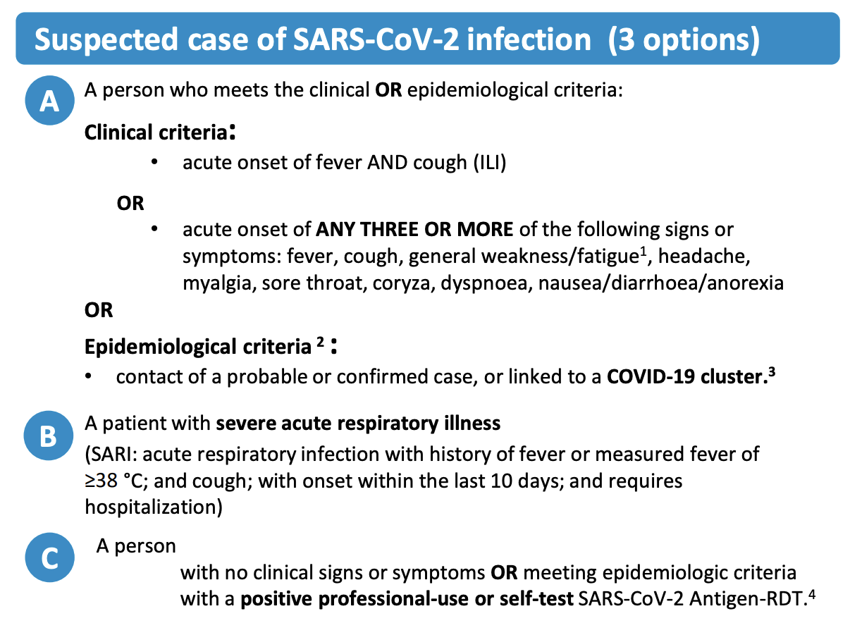
So far, we have used the term case without defining it. But since epidemiology is all about cases, it’s worth looking more closely at what we mean by a case. While it seems intuitively clear what is meant when we read “52 cases of influenza”, or “122 cases of COVID-19”, what exactly is it that is being quantified here? Is it influenza when someone thinks they have the flu? What about when a doctor says that it’s the flu? What if there are two doctors and one says it’s the flu, while the other says it isn’t? Things could get messy quickly. This is where the concept of a case definition comes in. A case definition is a set of criteria that defines a case for a given health condition. Ideally, there would be a standardized and commonly agreed upon case definition, which would make it easy to compare cases in different geographic locations and at different time points. However, case definitions may be adjusted locally, and they may change over time. The COVID-19 pandemic once again provides us with a highly instructive example. Early on, case definitions of COVID-19 were quite unspecific, because little was known about the disease, and the virus causing it. Over time, as the scientific understanding evolved, case definitions became more and more precise. But no matter how much we understand about a health condition, we may never have the necessary data for everyone to come to a definitive conclusion about a case. To handle this uncertainty, case definitions commonly define three sets of criteria for suspected, probable, and confirmed cases.
Let us take a look at the case definition of COVID-19 by the WHO as of early 2023. Figure 1.3 shows the suspected case definition, which includes either clinical criteria, i.e. certain symptoms, or epidemiological criteria, i.e. contact with other probable or confirmed cases, or a positive antigen test for asymptomatic people.
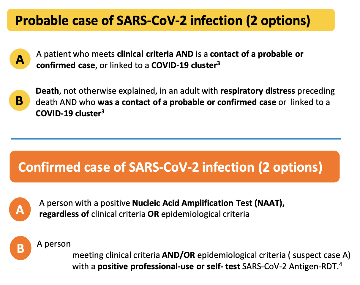
In order to be considered a probable case (Figure 1.4), multiple of these criteria must be met. A confirmed case requires an even stronger combination of criteria, or evidence of the presence of genetic material of the virus (Figure 1.4). Note, for example, that an antigen test itself - which does not measure the presence of viral genetic material, but rather viral proteins - is not sufficient for a confirmed case, even if conducted professionally. The person must also show symptoms or be epidemiologically linked to other probable or confirmed cases. The US CDC has very similar criteria, where only a confirmed presence of viral genetic material is sufficient to qualify as a confirmed case7. In contrast, the ECDC - the European Centre for Disease Prevention and Control - includes positive antigen tests in their confirmed case definition8. Thus, even for a disease like COVID-19, case definitions can vary from place to place.
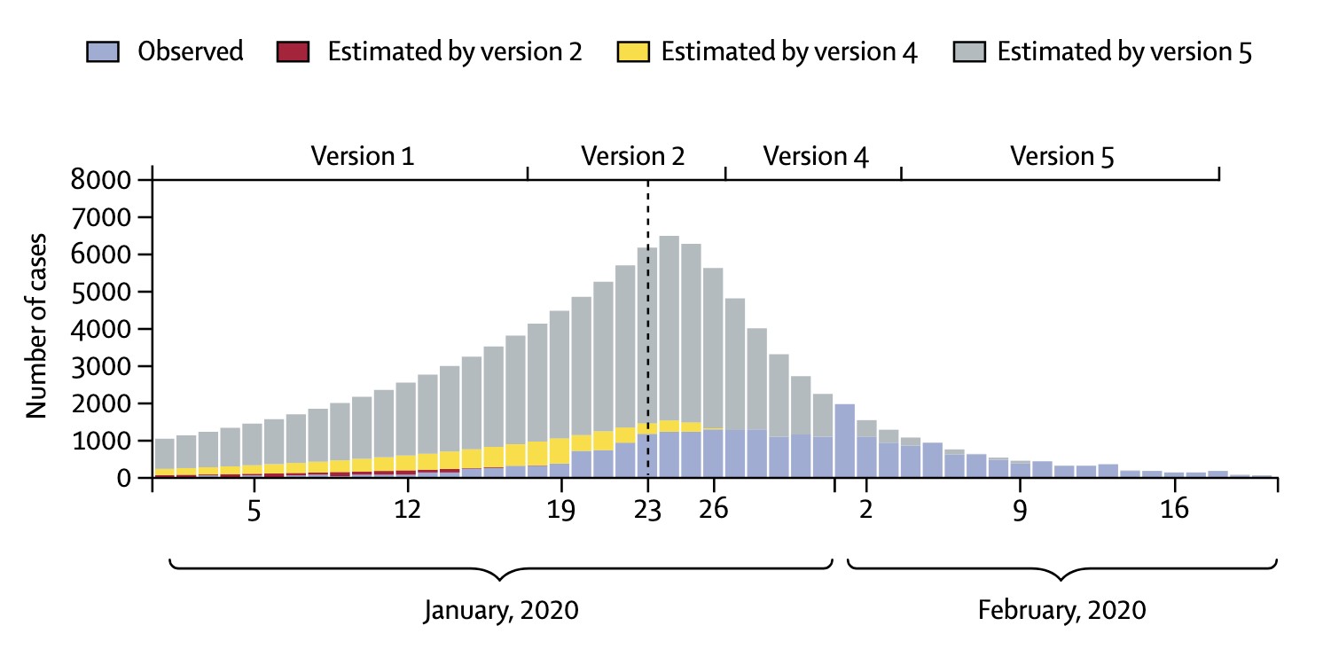
In addition, case definitions can change over time. The latest description of a COVID-19 case the US CDC is more than twice as long as the first description from April 202010. The situation can be particularly dynamic during the very early stages of an outbreak of a new disease. In the winter of 2020, the National Health Commission in China issued seven versions of the case definition for COVID-19 within seven weeks (Tsang et al. 2020). In each of the changes, the case definition broadened. A broader case definition would increase the number of cases, which could have strong impacts on the estimation of various epidemiological parameters, as we’ll see later. China reported 55,508 cases by February 20, 2020, but had - hypothetically of course - the latest case definition been applied since the very beginning (also assuming enough testing capacity), the number of cases by February 20 would have been more than 4 times higher (Figure 1.5). This example strikingly shows the importance of case definitions, and that numbers early on in an outbreak have to be treated with extreme caution.
1.5 Morbidity
When talking about incidence and prevalence, the key questions were “how many people got the disease recently?”, and “how many people have the disease in a given time period?”. But why do we care about this in the first place? Ultimately, having a disease means experiencing a reduction in health due to a biological factor. This factor can be a transmissible microorganism - a pathogen - in which case we talk about an infectious disease, or it can be a biological factor related to our own body, in which case we talk about a non-communicable disease. Examples of infectious diseases are COVID-19, influenza, AIDS, tuberculosis, or the plague. Example of non-communicable diseases are heart diseases, cancers, strokes, or diabetes (although note 10-15% of human cancers are known to be caused by viruses (Moore and Chang 2010)).
A reduction in health can take many forms. Many infectious diseases have a relatively high range of disease severity, from completely asymptomatic to lethal. COVID-19 is a striking example of the variance in disease severity. In unvaccinated individuals without any background immunity (i.e. with no previous SARS-CoV-2 infection), about 20% remain completely asymptomatic (Buitrago-Garcia et al. 2022), meaning that they will never experience any symptoms. On the other side of the spectrum, some people have such a severe illness that they require hospitalization or intensive care treatment, and some even die as a consequence of COVID-19. COVID-19 symptomatic illness is typically separated into the categories mild, moderate, severe, and critical, with severe illness typically requiring hospitalization, and critical illness requiring treatment in an intensive care unit (ICU). It is important to have good estimates on disease severity rates, as they will translate directly to the pressure that society in general, and the healthcare system in particular, will experience. Even a small fraction of severe and critical illness can translate into very high absolute numbers of patients requiring medical assistance. This was an enormous problem in the pre-vaccination phase of COVID, when healthcare systems around the world struggled to ensure capacity to treat patients. In later waves, mounting population immunity through infections and vaccination lowered this concern, but the high transmissibility of new virus variants such as Omicron meant that even mild illness was so frequent at times that societies would sometimes struggle with providing basic infrastructure services (such as public transportation).
Despite the importance of knowing disease severity rates, their measurement is a challenge. A key difficulty is knowing how many people are infected in the first place. Asymptomatic and mild diseases often go unnoticed, or uncounted. Consider dengue, a viral disease transmitted by mosquitoes which is spreading rapidly. Similar to COVID-19, a dengue virus infection will generally go unnoticed in an asymptomatic infection, but can otherwise manifest in a range of illnesses, including severe dengue that can result in death. Despite its ubiquity, a systematic assessment of the global distribution and burden of dengue was only published in 2013 (Bhatt et al. 2013). It estimated about 400 million dengue infections per year, with only a quarter of those manifesting with symptoms strong enough to be captured by public health surveillance. This represented an estimate over three times higher than the official WHO estimates at the time. While three quarters of infections may thus go unnoticed or unreported, they are likely the silent majority that dominates dengue virus transmission (Ten Bosch et al. 2018). As we’ve seen above, seroprevalence studies can give us critical insights to estimate the number of infections, even when they cause no or mild illness only.
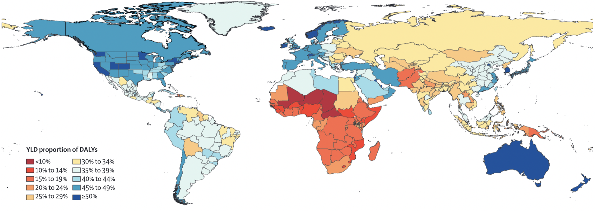
While some diseases may only cause a short, acute bout of illness, many cause longer-term problems, or may even be chronic. In the case of COVID-19, acute infections are known to give rise to longer-term health problems, commonly known as “Long COVID”. Long COVID is not the first post-viral illness to be described, but certainly one of the most well-known, despite still being poorly understood. To understand disease burden in a population, we thus need to know not only the severity of illness, but also the duration. Together, they can be combined into a quantity known as the years of healthy life lost due to disability / disease, or YLD (years lived with disability). This allows for a comparison of the different diseases with respect to their health burden beyond death. This quantity can also be combined with the years of life lost due to premature death, or YLL, into an overall unit called DALY, or disability-adjusted life year lost. These quantities have been popularized by a study that began in the early 1990ies, the Global Burden of Disease (GBD) Study (C. Murray and Lopez 1994). Diseases have often only been compared by the number of years of lives lost when the disease causes premature death. However, diseases can often have long-lasting health consequences that need to be taken into account as well. A DALY is a lost year of healthy life. In the case of death, the calculation is simple - any year of life lost due to premature death (YLL) is counted in full. For the years of reduced health, diseases will be weighted according to their severity in order to calculate YLD (Lopez et al. 2006). From there, DALY = YLL + YLD. Figure 1.6 shows a global map of the proportion of YLD for each DALY. The higher this number, the higher the impact of diseases and injury, rather than premature death, on years of healthy life lost. It is strikingly visible how the populations in the poorest countries of the world still lose most of their healthy years due to premature deaths.
Finally, morbidities often don’t come alone. Comorbidities, the presence of more than one health condition in an individual, are common. A recent analysis by the US CDC indicated that 27.2% of US adults had multiple chronic conditions (Boersma, Black, and Ward 2020).
1.6 Mortality, lethality, fatality
Let us now tackle the issue of mortality, where the key question is, “how deadly is the disease”? As you can imagine, this is a key question in epidemiology, and we need good statistics to address it. First, we need to make a crucial distinction between two terms, those of mortality and lethality. Typically, mortality measures how deadly a disease is in a population, while lethality measures how deadly a disease is for the individual who has the disease. In other words, mortality is asking, how much death is a disease causing in the population, while lethality is asking, how deadly is the disease for those who have it?
In the context of mortality, the quantity most often used is the mortality rate (also simply called death rate), which is the number of people dying of a given disease, divided by the size of the population of interest, in a specified period of time. Let’s take a look at a concrete example: cancer. It is commonly known that cancer is a fairly common disease, especially later in life, and that it is unfortunately still too often fatal. We can thus ask ourselves the question, what is the mortality rate of cancer in any given year? In the US, the CDC tells us11 that in the year 2020, a staggering 602,350 people died of cancer. In a population of 329.5 million, that corresponds to a mortality rate of roughly 0.18%. The general mortality rate (all causes combined) is just slightly higher than 1%, meaning that cancers are responsible for almost a fifth of all deaths. Indeed, cancer as a leading cause of death is only surpassed by heart diseases, which had a mortality rate of about 0.21% in 2020. As a side remark, let us note that the numbers for 2020 and 2021 may be a bit different from previous years due to the COVID-19 pandemic, but the focus here is not on the precise values of the quantity, but on the concept of the quantity itself.
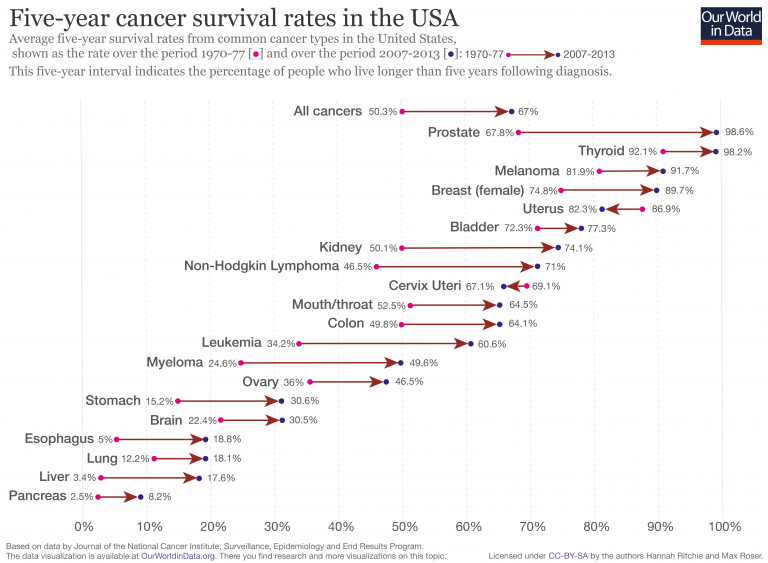
Lethality asks how deadly a disease is once you have it. For chronic diseases, we typically use survival rates in a given time period, such as the 5-year survival rate. The lower the survival rate, the more lethal the disease. Figure 1.7 shows 5-year survival rates of common cancer types in the US. We can see that the 5-year survival rates vary considerably, from less than 10% for pancreatic cancer, to over 90% for prostate, thyroid, and skin cancer (melanoma). We can also see how 5-year survival rates have improved for most cancer types, due to better prevention and treatment.
For acute diseases, the most common statistic used to measure lethality is the case fatality rate (CFR). It denotes the numbers of deaths due to a disease, divided by the confirmed number of cases who have the disease. The key challenge with CFR is the denominator, i.e. the confirmed number of cases. As we’ve just seen above with the example of COVID-19 in Geneva, our knowledge about the true number of cases - not only those who got tested, or have sufficiently severe symptoms - can be extremely limited. Very often, the confirmed number of cases represents only a fraction of the true number of cases, especially in diseases where the symptoms can also be mild, or in those where an infection can even be asymptomatic. This problem is addressed by the quantity IFR, which stands for infection fatality rate. The IFR measures the number of deaths due to a disease, divided by the number of all infected cases, not just the confirmed cases as in the CFR. But how can we know the true number of infected cases? The answer is that in general, we cannot know the true number - so we have to try and estimate it.
Once again, the COVID-19 pandemic provides a highly relevant example of the importance of these quantities. At the end of January 2020, i.e. only one month after the first report of COVID-19, the CFR was reported to be 2% (i.e. 2 out of 100 confirmed cases had died)13. But what about the IFR? A number of factors lead to the CFR being different from the IFR. Let’s first consider the numerator, which is the number of deaths. In the beginning of an outbreak, this number is likely too low, for the simple reason that a sizable fraction of those infected that will eventually die, simply haven’t died yet. Compared to the IFR, the CFR is thus likely an underestimate. A numerical example will demonstrate this easily. Let’s say we’ve discovered and confirmed 1,000 cases (for simplicity, let’s also assume that this is the true number of cases, i.e. we are not missing any). Let’s further assume that the true IFR is 3%. As we are early in the outbreak, so far only 10 people have died. If we could prevent any and all new cases - i.e. if we could bring the incidence to zero - 20 more people among those infected would still eventually succumb to the disease. But at the time when we calculated the CFR, it was 1% (10 deaths out of 1,000 cases). Compared to the IFR of 3%, this was indeed a rather severe underestimation. In principle, the CFR could also be an overestimate if deaths are counted that are not actually due to the disease. But especially in the early days of an acute outbreak of a potentially severe disease such as COVID-19, this is very unlikely.
Let’s turn our attention to the denominator, the number of cases. As we’ve discussed before, the true number of cases is almost certainly higher than the confirmed number of cases, as we’re missing many cases who are either very mild, or are not tested for a number of different reasons. Thus, the CFR will be an overestimate. Going back to a numerical example, if 10 people have died out of 1,000 confirmed cases, but the true number of cases is actually 10,000, then the CFR of 1% is a severe overestimate of the IFR of 0.1%.
This was a critical debate in the spring of 2020 that made global headlines. As the world was stopping in its tracks and asking, how dangerous is COVID-19, the IFR became the center of attention. Given the apparent similarity of COVID-19 to influenza - another respiratory disease that countries normally let spread through their populations without any countermeasures - the central question was whether the IFR of COVID-19 was much higher than that of influenza. This was not an easy question to answer. First, given that COVID-19 was a very new disease, estimating the IFR was challenging for the reasons just described above. Second, the IFR of influenza varies considerably from season to season. Most estimates put the IFR of influenza between 0.03% and 0.1%. These values depend not only on the season, but also on the country (as the quality of healthcare, the demographics, and other factors vary). In contrast, most estimates of the IFR of COVID-19 in the spring put it between 0.5% and 1% (although some went as low as 0.01%). If one accepts these estimates, one would instantly see that COVID-19 was about one order of magnitude more lethal than seasonal influenza. Even after 2 years of extensive research, with dozens or even hundreds of different serological studies available helping us to more accurately estimate the true number of infections, most studies estimating the IFR of COVID-19 come to the conclusion that the early estimates were quite accurate, while acknowledging the high geographic variance (Brazeau et al. 2022).
Because CFR is much easier to measure, it is a quantity known for most diseases. CFR varies widely, from virtually 100% in rabies after onset of symptoms, to < 0.001% for certain childhood diseases. High CFRs are typically found in diseases that are rare, or only for cases that are either not vaccinated or treated (such as the case of rabies - vaccination or rapid treatment brings the CFR close to 0%). Relatively small CFRs can still be an issue, if the disease is very widespread. For example, Malaria has an estimated CFR of 0.3%14, but because it infects so many people, the death rate can be relatively high. The biggest problem are diseases that have both high CFRs and are widespread. This is the concern particularly with emerging diseases, where neither treatments nor vaccines are available, and that have the potential to spread rapidly due to the lack of immunity in the population. This is (among many reasons) why the COVID-19 pandemic was a major concern. The HIV pandemic was similarly an enormous concern before the advent of antiretroviral therapy - untreated HIV/AIDS has a CFR of over 99%.
https://www.ecdc.europa.eu/en/seasonal-influenza/surveillance-and-disease-data/facts-sentinel-surveillance↩︎
https://www.who.int/teams/global-hiv-hepatitis-and-stis-programmes/hiv/strategic-information/hiv-data-and-statistics↩︎
https://www.who.int/teams/global-hiv-hepatitis-and-stis-programmes/hiv/strategic-information/hiv-data-and-statistics↩︎
https://www.who.int/publications/i/item/WHO-2019-nCoV-Surveillance_Case_Definition-2022.1↩︎
https://ndc.services.cdc.gov/case-definitions/coronavirus-disease-2019-2021/↩︎
https://www.ecdc.europa.eu/en/covid-19/surveillance/case-definition↩︎
https://www.who.int/publications/i/item/WHO-2019-nCoV-Surveillance_Case_Definition-2022.1↩︎
https://ndc.services.cdc.gov/case-definitions/coronavirus-disease-2019-2020/↩︎
https://ourworldindata.org/cancer-death-rates-are-falling-five-year-survival-rates-are-rising↩︎
https://www.who.int/docs/default-source/coronaviruse/transcripts/who-audio-script-ncov-rresser-unog-29jan2020.pdf?sfvrsn=a7158807_4↩︎